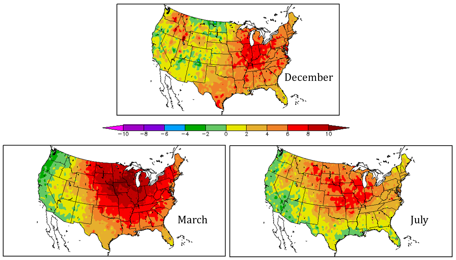
if each year is a competition to be hotter than the previous, then in the USA, 2012 is the winner! the final month of the year was unusually warm and didn’t even make the “competition” a close one. the exact numbers will roll in soon enough, but below is the visual comparison of December 2012 with the other two record hot months in the USA – March and July. The figures are from the HPRCC visualization tool and show temperature departure in degrees F
 Usually NCDC finalizes its wonderfully complete monthly analysis by the first week of the month and since 2012 is such a special year in the 118 year historical temperature record, I like to imagine that the NCDC scientists will be putting in a little extra effort to highlight 2012 for December’s State of the Climate report. Regardless, while science relies on the numbers (quantitative analysis), qualitative analysis in this case is quite powerful. Comparing the colors, my first guess is that December’s anomalous warmth is similar to July’s anomalous warmth. Guessing is the hallmark of qualitative analysis, but my guess is testable (once the temperature data is finalized) and that’s why I’m throwing it out there. My second guess is that December 2012 was the warmest December on record to cap off the warmest year on record. Here is the figure from HPRCC showing the temperature departure for the year as a whole.
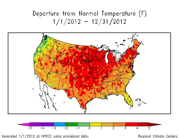 Again, this is a qualitative analysis, but remember from previous posts that in order for 2012 to NOT be the warmest year on record, December 2012 would have had to have been a record COLD December. This is clearly not the case. The record warm year was driven by the record warm months of March, July, and December as shown in the figure at the top.
2012 is the winner!
Categories: Earth System Observer