2012

USA in December remains much warmer than average

A blowout in sports – whether it’s baseball, football, basketball, or soccer – is usually boring to watch. By blowout, I mean a game when one team obliterates the other. You know, 14-2 in baseball, 40-7 in football, etc. But in climate, the month-to-month ups and downs in temperature departures, are one example when a blowout is actually more fascinating to watch than another month of the “climate normal“.

As I mentioned earlier, December 2012 is setting the year 2012 to be a blowout in terms of the “competition” between years to be the warmest on the 118 year record. Here’s the updated evolution of December 2012 temperature departures from figures I got from the HPRCC map maker and laced together for an animated look at the month.
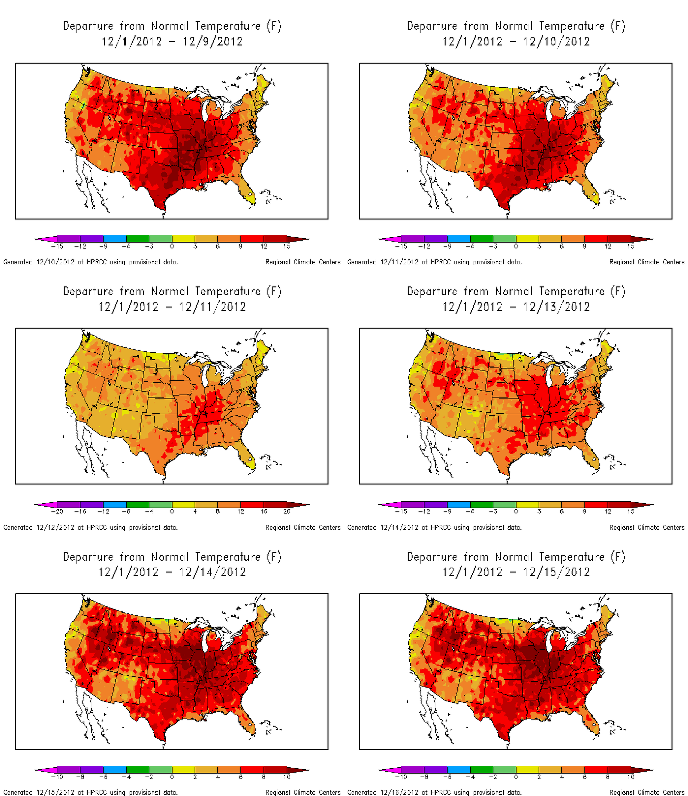
The most obvious feature is the continuing large and positive temperature departures for most of the country. You have to be a little careful because the figures have shifting colorbars on the bottom. Dark red doesn’t mean the same thing on every figure, but the message is clear as day. December is much much warmer than usual. The last week or so has continued the trend, although you do see the effect of the cold frontal passage around December 11-12 in the animation. Stay tuned, but based on a quick look at long-term weather model forecasts, I wouldn’t expect a dramatic change in the weather regime until at least December 25.
Temperature departures discussion

I wanted to have a reference for any posts that talk about temperature and temperature departure (aka: temperature anomaly). This post shows an example of the calculation of a “temperature departure”.

Temperature departure is referring to the difference between temperature in the given month and the average temperature of that month over a range of years. For example, as shown in the table below, the average temperature for the month of November 2012 in the USA was 44 F. I got this from NCDC time series data which I downloaded a couple of weeks ago. You can calculate an average November temperature as well if you choose different average periods. Using the NCDC data, I calculated the 1981-2010 and 1900-1999 average November data, also shown in the table below.

                     T (F)   TD 81-10 (F)   TD 00-99 (F)
 November 2012       44.05   +1.28          +2.03
 November 1981-2010  42.77   N/A            N/A
 November 1900-1999  42.01   N/A            N/A

How does November 2012 compare to past Novembers? Well, it doesn’t make much sense to choose just any November unless you have a specific reason, such as comparing November 2012 to November 2011 so you can remember why you wore a sweater on Thanksgiving last year and didn’t have to this year. From a climate standpoint, it’s more informative to choose a LOT of Novembers and average those November temperatures together. How many is enough? A good place to start is 30 years. This is the length of time that the climate system typically needs to average out natural variations in temperature, such as effects of El Nino-Southern Oscillation and the corresponding La Nina, cooling from a large volcanic eruptions like in 1991-1992, or a less famous (than El Nino) form of variability that affects regional or global temperatures. NCDC uses the last century as a time length for calculating the “average” temperature. HPRCC and NCDC also use the 30 year average period between 1981-2010 and call this the “Climate Normal”. Both are completely valid as long as you understand what the temperature in any particular month is being compared to. The temperature departure for November 2012 (TD in the table) is calculated as T in November 2012 (44.05 F) minus the average November temperature. Comparison to 1981-2010 gives 44.05 F minus 42.77 F = +1.28 F. Similarly, comparison of November 2012 to 1900-1999 gives 44.05 F minus 42.01 F = +2.03 F. Hence the USA had a +2 F temperature departure in November 2012, as pointed out in a different post.

A discussion of temperature departures is peppered with specific statements of time and space scales. In November 2012 then, nothing changes about the average temperature (44 F), but if we compare this to the climate normal of 1981-2010, we (most likely) get a different departure than we would compared to 1900-1999. This is clear in the table. More to the point, temperature departure is a relative metric and temperature is an absolute metric. Temperature departures are usually more informative since it’s hard to just remember if it’s a little cooler or warmer any particular month, but temperature itself is of course more intuitive.

Shattering the temperature record?

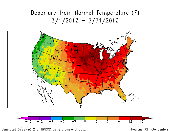
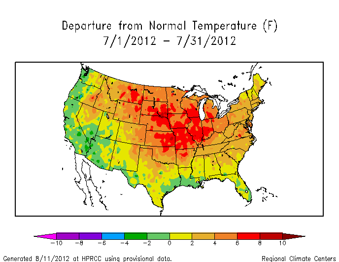
Glancing through the temperature anomalies of the last year, it’s clear we’re heading – barrelling really – towards a record hot year. Temperature data is collected and archived very quickly through various climate centers. The High Plains Regional Climate Center (HPRCC) has a particularly fluid interface for quickly assessing the state of the climate over different time and space (or spatiotemporal) scales. The USA as a whole experienced a record hot March and July in 2012, as listed in the table here. Records weren’t broken in every single state of course, but the records were broken when all the temperatures were averaged together. Here’s the story though. December 2012 is set to be the final nail in the plaque on the wall that says “HOTTEST YEAR ON RECORD: 1998 2012” and at this point (9 days into the month), December 2012 will not only be the nail, but will help 2012 shatter the temperature record. Look at these anomalies figures produced using the HPRCC tool for March, July, and so far for December:


Without even reading a number, you know that the deep red color for the anomaly from December 1-9 implies that it’s much hotter than the average temperature for December 1-9**. There’s hardly a speck of any the green or yellow that represents near normal temperature! But let’s not overreact. Whether this early trend will continue depends on the weather. All things being equal, weather over the entire month will probably moderate the unusual warmth seen so far in December. However, human activities have fundamentally changed how the concept of “all things being equal” applies to weather, so better to look at what weather models are saying rather than just assuming… Near-term weather forecasts suggests that the first half of the month will be more of the same. Long-term weather forecasts for the month (for example, clicking on the options for 100 hr+ forecast times) suggest a nor’easter may develop around Dec 16 and subsequently affect the mid-Atlantic Dec 17-18, but even that weather system seems to bring rain rather than snow (use the same forecast tool and “precip type” option to see that). Regardless, there is no chance of widespread snowmen to cool things down before at least December 15. Odds are in favor of a shattered temperature record on New Years Day.

*on record is the 118 year temperature record
**1981-2010 is the period that any month on the 118 year record is compared to. HPRCC call it the Climate Normal. NOAA NCDC call it the base period. Both use the same range of 30 years, which is a typical length of a climate-relevant – as opposed to weather – temperature dataset

2012 Temperatures in North Carolina and USA

The big news, if you’re paying attention the inexorable increase in temperatures, is that the biggest contributor to fossil fuel carbon (the USA) is experiencing the hottest year in 118 years. We have one month remaining this year, but the record will be set unless the USA suddenly experiences the coldest December in 118 years (it won’t – we’re well on our way to a warmer than average December and there’s a weak-moderate El Nino in place right now too which tends to result in more mild winters for at least part of the USA). Certainly many locations in the contiguous USA will be cold, but it’s not the cold that matters though. It’s the comparison of the current temperature to an average of past temperatures that really highlights relative warmth or cold. Mining what has quickly become my favorite climate data source, at least for the USA, i went to the NCDC website and pulled down the data to look at how temperatures of our home state compare to those of our home country. Here’s what I got:

             North Carolina   NC Climate Division 5*  Contiguous USA
  January    +2.9 (92)        +3.1 (94)               +5.8 (115)
 February    +2.7 (88)        +2.3 (83)               +3.9 (104)
    March    +8.7 (117)       +9.8 (117)              +8.8 (118)
    April    +1.1 (80)        +1.7 (88)               +3.7 (116)
      May    +2.9 (108)       +2.9 (106)              +3.3 (117)
     June    -1.5 (21)        -1.5 (26)               +2.1 (107)
     July    +3.2 (117)       +2.4 (111)              +3.3 (118)
   August    -0.4 (50)        -1.3 (22)               +1.7 (106)
September    -0.9 (47)        -1.6 (36)               +1.4 (96)
  October    -0.6 (54)        -1.5 (38)               -0.3 (46)
 November    -3.6 (11)        -3.6 (10)               +2.0 (99)
 December    TBD (TBD)        TBD (TBD)               TBD (TBD)

*includes Charlotte and Mecklenburg County

The numbers with the + and – are the anomaly (departure) of that month’s temperature from the 20th Century average for that month. The numbers in parentheses are how the particular month for the particular region ranks (118 is hottest, 1 is coldest following NCDC protocol). The regions are NC, a smaller part of NC that includes CharMeck, and the USA minus Hawaii and Alaska. So, if you’re from North Carolina and can’t wait to have the dinnertime conversation with your friend/relative about how global warming is a joke/hoax/conspiracy, here is what you do. Pull up that table and you can heartily agree that, yes, North Carolina has been cooler than average, particularly since August. CharMeck (middle column essentially) has pretty much been the same, maybe even cooler. But then there’s the USA. The USA had below average temperatures in October, but the warmth has otherwise been shockingly constant. March and July 2012 were both the hottest in the 118 year record. On January 1, it’ll be clear that the USA has been warmer than it has been in over a century. North Carolina has finished cooler than average, but as I pointed out before, it was the warmth in the beginning of the calendar year that set the stage. And GLOBAL warming has never been about the warming or cooling of a particular US State – it is the response of an entire planet to the energy imbalance imposed on it by human activities. The data is mounting up though and the temperature trends of regions like the USA are slowly creeping out of the noise of the day-to-day variability.

Cool in North Carolina, but not the USA

Between all the various climate excitement in the news – like record-low Arctic sea ice – temperature measurements continue to be collected. A really great webpage to actually examine the temperature data is at the NOAA National Climatic Data Center. The NCDC data shows that in 2012

           North Carolina   NC Climate Division 5*  Contiguous USA
     July  80.5 (+3.2)      81.1 (+2.4)             77.2 (+3.3)
   August  75.7 (-0.4)      76.1 (-1.3)             74.6 (+1.7)
September  69.8 (-0.9)      70.3 (-1.6)**           67.0 (+1.4)

*includes Charlotte and Mecklenburg County
**corrected after an NCDC website glitch which originally had values of 74.1 (-1.5)

where the bigger number under each header is the avereage temperature for the particular month in degrees Fahrenheit, while the number in the parentheses is the departure (or anomaly) of the month to the average temperature for that month for the 20th century (1900-1999). North Carolina, like most of the USA, had a really warm July 2012 and the country experienced the warmest July in the 118 years of records. On the other hand, August and September temperatures in North Carolina this year were about a half degree to nearly a full degree less than the 20th century average temperatures. These much cooler-than-average temperatures were even more pronounced in southern North Carolina, which I show above as NC Climate Division 5. This climate division includes Charlotte and Mecklenburg County.

This is a great example of how even when the local temperature for a particular month is below or above average, this may not be true when you examine other parts of the country, or in the case of Charlotte, other parts of the state. This same analogy is true when comparing regional (like USA) to global temperature trends. The summary is that even though NC had a cooler than average Aug-Sep, the USA on the whole still experienced a warmer than average August and September to pile on to the warmest July on record.