An interesting article about the amazing climate change humans are causing was published by the UNC Charlotte campus newspaper back in Spring 2014, but it’s worth re-visiting as our atmosphere once again reached 400 ppm CO2 concentration. The piece was published as a point-counterpoint discussion, but as many scientists (include myself) point out, science is not about considering all sides – it’s about considering what the evidence suggests. I wrote a letter in response to the viewpoint that climate change is no big deal. If the evidence from multiple experiments/studies suggests a single point is true, then that’s where the scientific community will tend towards when explaining that science. As the evidence builds and builds with no one finding counter-evidence, the conclusions become more and more robust*. If the evidence suggests mixed or nuanced results, then scientists will talk about that science as inconclusive and continue to try to design better experiments or get more data or both. Most importantly, perhaps, if counter-evidence arises repeatedly, scientific conclusions will change in response. Science is a beautiful, self-correcting process.
In Spring 2014, I sat down with a Niner Times reporter and Twitter friend Ed Averette and talked with him about how I see climate science, and how I talk about the science of climate change in my classroom (most prominently in ESCI 3101, Global Environmental Change). I had a lot to say, mostly because I had just returned from a wonderful conference called the Carolinas Climate Resilience Conference in April 2014, where I talked about Climate Change in the University Classroom (presentation here!), and I met some amazing outreach-oriented people (Kirstin Dow, Greg Carbone, Jim Gandy), and learned a climate change song that could be played on a dulcimer sung by this NPS Ranger. The article Averette wrote is available online and includes a figure I made for my class lectures.

The amazing correlation between Earth’s temperature and CO2 concentration in the atmosphere, as derived from multiple ice core datasets shown in the graph itself.
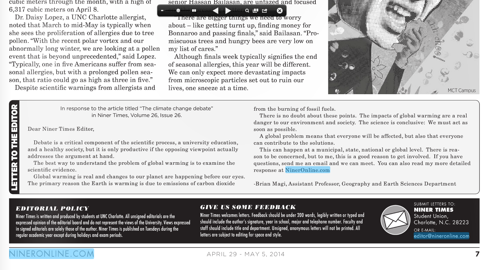
Screenshot of the print version of my letter that had a limited number of words I could include. Hence the online letter is longer.

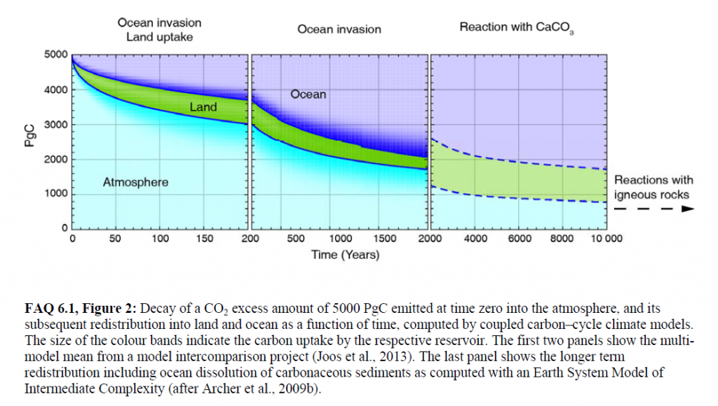
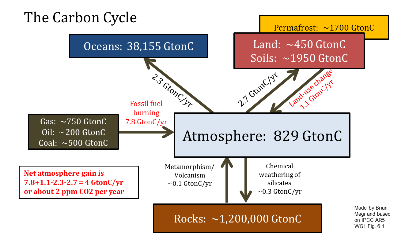 The reason that CO2 goes up and down
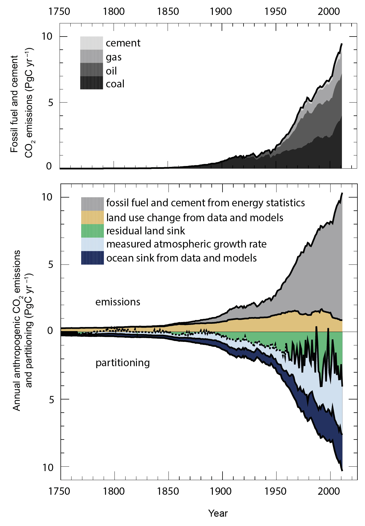
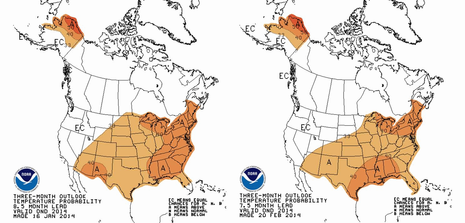
 Watch the figures carefully. All the animations start with a forecast for 3-month averaged T and PCP for March-April-May (MAM). Then, they step forward to April-May-June (AMJ)The CPC data product seems intended to provide an idea of whether T and PCP will be above or below average for the USA (including Alaska). In a previous discussion,
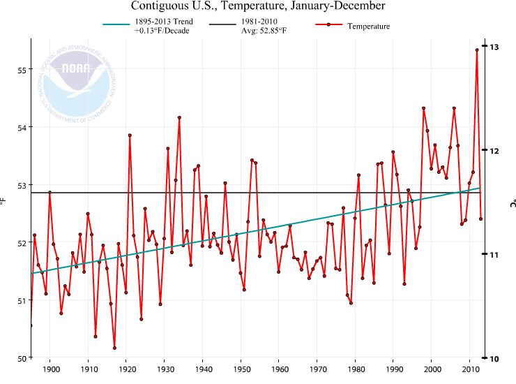
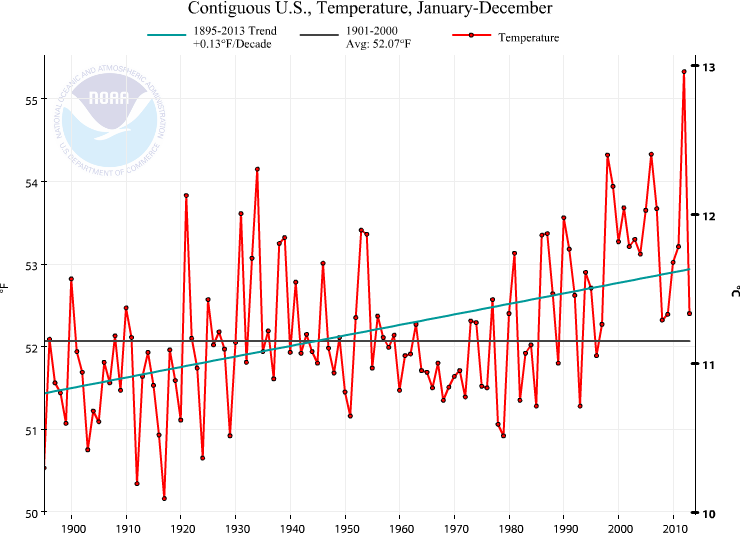
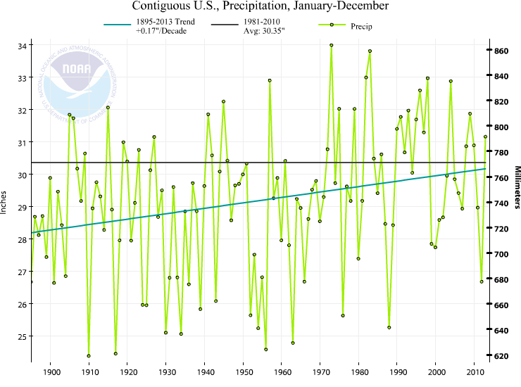 The precipitation is not the story, in my mind. The story is that we should expect a warmer than 1981-2010 year. The average of 1981-2010, without doing any math, is clearly warmer than most of the years this past century. Quickly eyeballing this number says that 82 of the 100 years in the last century are colder than the 1981-2010 average. This is really important in terms of perception of the significance of a warmer than “average” year. 1981-2010 is not a very good choice for the “average”. Gonna be a warm year according to CPC. Nowhere is there a robust and spatially significant feature suggesting below average temperatures, by the way.
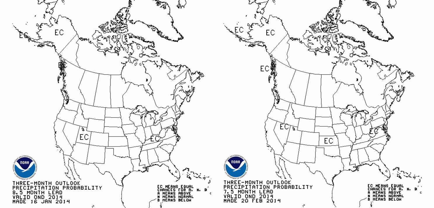
 and precipitation is slightly below average for the Eastern USA, above average for Colorado-Wyoming-Idaho, and well below average for the Southwestern USA.
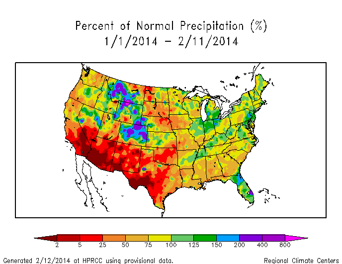
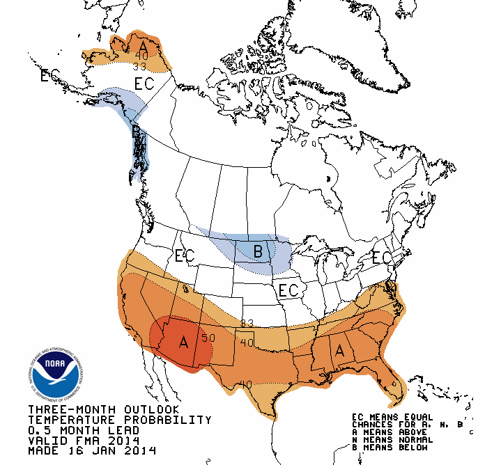 where, once you wrap your head around what I call the “geography” of the figure, you see that NOAA CPC is predicting whether the temperature over successively farther 3-month periods (Feb-Mar-Apr, Mar-Apr-May, etc.) will be above, at, or below the average temperature for 1981-2010 (
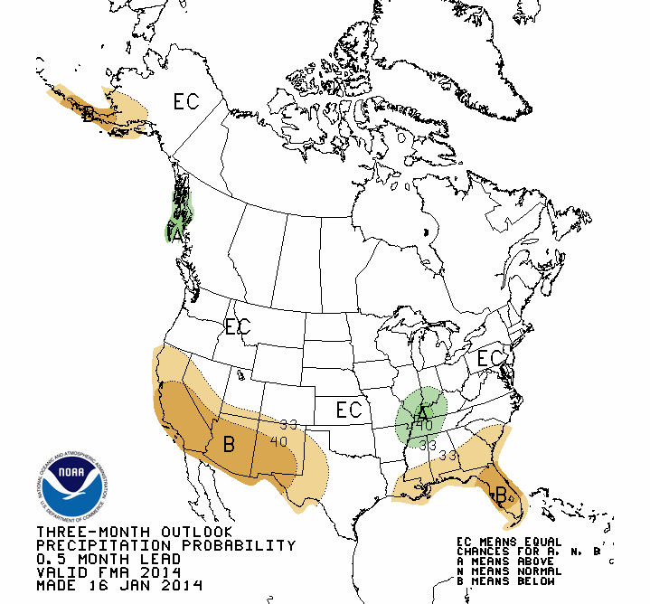
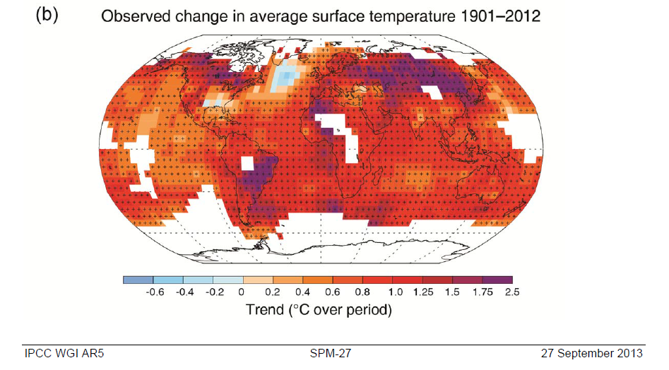
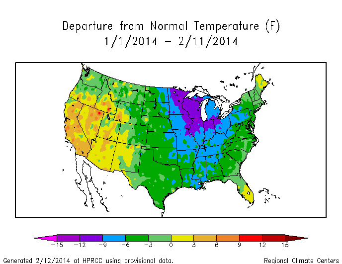
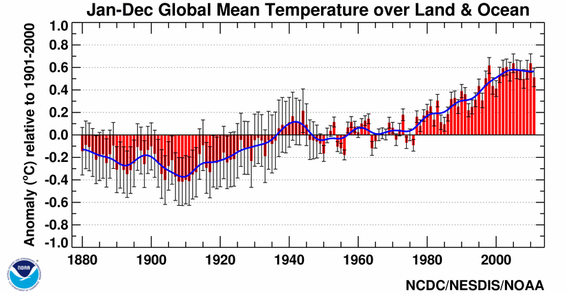 As real as global warming (figure above from