climate

Carbon dioxide concentrations are nearly 400 ppm

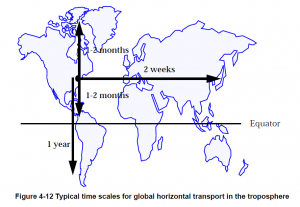
The latest reported value from 4th of May 2013 was 399.68 ppm. That’s as close to 400 ppm as we (our civilization and planet, that is) have gotten.The Earth The best place to see the rapidly updated CO2 concentrations is at the Scripps/UCSD website – the curve seen at the link is of course the famous Keeling curve, named after the scientist (Charles Keeling) who began the systematic monitoring of CO2 gas concentrations in our atmosphere back in the late 1950s. CO2 is measured at sites all around the world (choose a site from the map, then click on Carbon Cycle Gases, Time Series, Submit to see CO2), but the remote ocean sites like Mauna Loa, Hawaii provide the background concentration. This means that the concentration represents the average concentration around the world, as opposed to putting the instrument that measures CO2 concentration right next to a power plant or a fire or some other direct source of CO2. Once CO2 is emitted from a source, it mixes throughout the atmosphere fairly evenly because the molecule has a long (100-1000 year) chemical lifetime before it is drawn out of the atmosphere and into the oceans, forests, or rocks. This long life in the atmosphere means that CO2 accumulates in the atmosphere. The Northern Hemisphere has a slightly higher CO2 concentration than the Southern Hemisphere because there are more CO2 emission sources in the north (more human activity) and because mixing across the Northern and Southern Hemispheres is relatively slow – it takes about a year for a gas molecule to float across the equator, as shown in the figure to the right from Daniel Jacob’s atmospheric chemistry textbook. transport You can also see in the figure that it takes much less time to mix East-West and to the North for a molecule emitted in the Northern Hemisphere. Go to the link at NOAA Earth System Research Lab (ESRL) to see this mixing/emission effect play out. I chose to compare Mauna Loa in the remote Pacific and Crozet Island which is southeast of Africa in the even more remote southern ocean. Crozet Island is well behind Mauna Loa in data processing but we can compare July 2012 CO2 concentrations, which are about 396 ppm at Mauna Loa and 391 ppm at Crozet Island.
Getting back to the 400 ppm, we can expect this value to be drawn down as the biosphere – plants – breathe in the CO2 during the summer growth period. This happens every year, but our fossil fuel emissions are overwhelming that breathing cycle. Science always boils down to context, and in this part of the global warming problem, the context is simple. CO2 concentrations are much higher than anything ever seen in since human civilization emerged. Note the time scales on the graphs below are the past 300 years and past 800,000 years. As many times as I have seen different versions of these figures, I still am in utter shock at how much we’ve altered the chemical composition of our planet’s thin atmosphere. co2_800k_zoomco2_800k

North Carolina climate compared to the USA and globe

The first months of 2013 here in Charlotte have seemed unusually cool, but rather than relying on our gut feeling, let’s look at the numbers. Start by going to the NCDC website and mine out the data to find that in Charlotte, January was the 27th warmest in 118 years, February was the 40th coolest, and March was the 4th coldest in 118 years. Now a fair second question is how does Charlotte fit into the big picture? Namely, is Charlotte’s temperature ranking similar to that of the whole state of North Carolina, the USA, and even the world? With only a little bit of work, we can figure this out. The data below shows temperature anomaly compared to the 20th Century average as a +/- number, and the parenthetical numbers are the ranking in the overall temperature record (1 is hottest). USA has 119-120 years of data, while the global time series begins in 1880.

                  Charlotte*    North Carolina   USA**        Global Land   Global***
    April 2012    +1.7 (31)     +1.1 (39)        +3.7 (3)     +1.1 (6)      +0.6 (7) 
      May 2012    +2.9 (13)     +2.9 (11)        +3.3 (2)     ? (7)         +0.5 (10) 
     June 2012    -1.5 (93)     -1.5 (98)        +2.0 (12)    +0.9 (4)      +0.6 (7) 
     July 2012    +2.4 (8)      +3.2 (2)         +3.3 (1)     +0.8 (5)      +0.6 (7) 
   August 2012    -1.3 (97)     -0.4 (69)        +1.7 (13)    +0.8 (2)      +0.6 (8) 
September 2012    -1.6 (83)     -0.9 (72)        +1.4 (23)    +0.9 (4)      +0.5 (8) 
  October 2012    -1.5 (81)     -0.6 (65)        -0.3 (73)    +1.1 (2)      +0.6 (8) 
 November 2012    -3.6 (109)    -3.6 (108)       +2.0 (20)    +1.1 (6)      +0.7 (5) 
 December 2012    +5.1 (8)      +5.5 (8)         +3.3 (10)    +0.2 (49)     +0.4 (18)
  January 2013    +2.8 (27)     +3.5 (24)        +1.5 (42)    +0.9 (13)     +0.5 (9)
 February 2013    -2.0 (80)     -0.8 (70)        +0.9 (49)    +1.0 (11)     +0.6 (9)
    March 2013    -6.7 (116)    -5.9 (114)       -0.8 (77)    +1.1 (11)     +1.0 (10)

What’s remarkable is that at first glance, it seems like the rankings of Charlotte and NC are essentially on the opposite end of the spectrum of rankings compared to the global rankings in the last 12 months. There’s an easy way to quantitatively evaluate the relationship between sets of numbers and that is by using the statistical correlation coefficient, usually represented by the variable r. A positive r value means the numbers go up and down together, while a negative r means one set of numbers go up while the other goes down. When r is +1 or -1, that means the two sets of numbers are perfectly correlated and perfectly anti-correlated, respectively. Perfect correlation or anti-correlation never happens with data, unless you calculate the correlation of a dataset against itself which isn’t very interesting. That being said, r near +1 or -1 usually indicates that the two datasets being compared are statistically related. To quantify “usually” from the previous sentence and to contextualize the r value, a corresponding statistic that accompanies r is the p value. The p value is a way to quantify the statistical significance of the r value and depends. A p value less than 0.05 means there’s a 95% chance that a random set of numbers is not better related than the numbers you are testing. Thus when p is less than 0.05, you can be confident there is “statistically significant” relationship – remembering that correlation does not imply causation. This kind of analysis is done all the time in all fields of science, which speaks to the idea that math is the universal language. In the table below, r is the +/- number, p is the parenthetical number.

                NC              USA           Global Land    Global
    Charlotte   +0.97 (<0.05)   +0.52 (0.08)  -0.43 (0.16)   -0.43  (0.16)
           NC   -               +0.48 (0.11)  -0.39 (0.21)   -0.44  (0.16)
          USA   -               -             -0.10 (0.77)   +0.002 (0.99)
  Global Land   -               -             -              +0.92  (<0.05)

Now we’re getting somewhere. Over the last 12 months, Charlotte and NC temperatures are, as expected, significantly correlated (r = +0.97, p < 0.05). If Charlotte sets a cold or warm record, so does NC. Global land and ocean ("global" in the table) and global land are significantly correlated (+0.92, p < 0.05) as well. Not that shocking. What I didn't expect until I started comparing the trend in the rankings is that NC and Charlotte rankings are not significantly related to the USA or global temperature rankings. This is evident by the high p values in parenthesis in the 1st and 2nd rows. Surprisingly, NC and Charlotte are nearly significantly anti-correlated (negative r values, see above) with global rankings, something that might be worth looking into with more data. What’s perhaps even more surprising to me is that USA temperature rankings are essentially unrelated to the either of the global temperature rankings. This means that any given month in the USA tells you absolutely nothing about the global ranking for the same month – you might as well just guess. More data will tell the a more complete story here (and provide better stats), but over the last 12 months, there are some interesting possible relationships (Charlotte and NC similar to the USA, but opposite of the globe), and then occasions where the two datasets have no idea the other exists (USA and the globe). No wonder people get mixed up when looking at the news about global warming and then try to relate it to what’s going on in their backyard.

* NC Climate Division 5
** Contiguous USA
*** Combined land and ocean since 1880, as opposed to “global land” which is only land surfaces. Note May 2012 T anomaly wasn’t listed on NCDC site, but the ranking was. My stats analysis was based on the ranking, so the “missing” data point is not relevant.

Thin Ice film screening

I watched the soon-to-be-officially-released new film about climate science and climate scientists called Thin Ice today. I read about Thin Ice on the RealClimate blog, where the blog author (an Atmospheric Scientist who is interviewed in the film itself) posted that screenings of Thin Ice were being planned for Earth Day 2013 (22 April). Great idea! The film makers say

Join us on Earth Day, April 22nd, 2013 for the global launch of Thin Ice: The inside story of climate science. The film will be available for free online here or can be seen in person at various screenings around the world from April 22nd-23rd.

Since I teach a course about global warming in the Spring and Fall semester here at UNC Charlotte, I immediately thought that this would be a valuable multimedia way to incorporate more than just me talking about the world of climate science with my 12 students. Turns out the documentary-style film is really accessible. A geologist named Simon Lamb starts the movie by talking about his motivation – kind of like you would if you were writing a scientific paper intended for publication. Namely, Lamb poses the hypothesis that climate scientists are “peddling a lie” – a hypothesis that any person in the world could arrive at fairly easily given the way that climate science is discussed outside the scientific world at times. Lamb tests his hypothesis by talking with climate scientists and learning about what they do and, more importantly in my opinion, WHY. The answer to why isn’t stated explicitly, but I think it is the common thread linking the scientists working on understanding the amazing climate system. Certainly, the movie and the conclusions resonate with me. The Earth is an amazing place, and humans working for the greater good truly raise the collective level of optimism about the future.

If you want to sit in on the UNC Charlotte screening, I will show the movie from 11:00-12:15 on Monday April 22 (Earth Day). No admission. Send me an email if you plan to be there. I signed up for the screening via the Thin Ice website, so you can see the official screening annoucement here if you search Charlotte.

Resources for learning about the state of the climate

An atmospheric scientist likes to talk about the “state” of the atmosphere. A “meteorological state” usually means knowing the temperature, pressure, dewpoint temperature (moisture), and maybe the wind speed and whether there is precipitation. Climate state is similar but usually presented as a comparitive. I’ve talked about this before, but the essential calculation to understand in climate is the idea of a “departure” or an “anomaly”.*

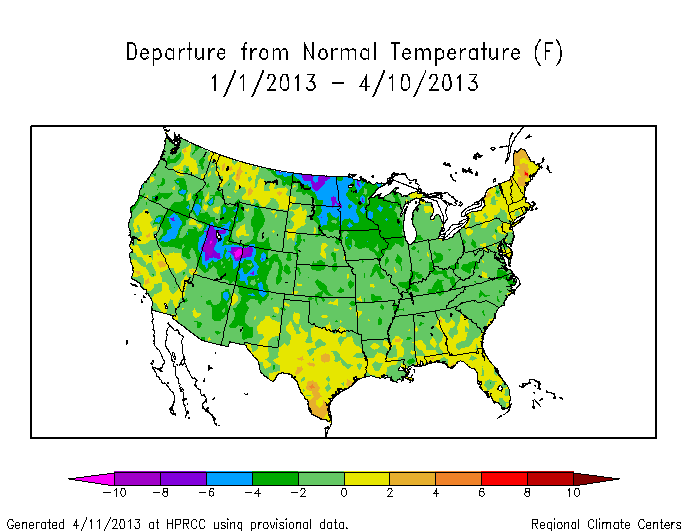
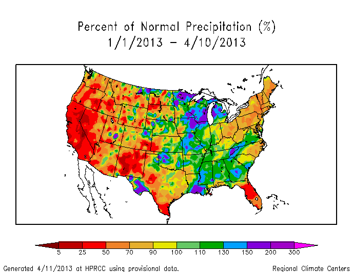
Climate departures from, say, a climate normal examine the change with respect to what we might expect given past knowledge. A great online resource with very up-to-date climate state is the daily-updated graphs of monthly temperature departure at the High Plains Regional Climate Center (HPRCC). You can easily create presentation-ready figures (properly citing HPRCC) such as temperature departure since first of the month, percent of normal precipitation since first of month, and the analogous figures for temperature departure and percent of normal precip since the first of the year. Here are examples of T and precip in 2013 (so far).

YearTDeptUS-2013-04

YearPNormUS-2013-04

By pressing a few buttons on the internet, you have access to a powerful and constantly evolving data set for the USA. You can evaluate where the USA is in terms of “Is the USA headed to another record warm year like 2012?”, “Has the drought subsided to any degree in the new calendar year?”. With some digging, you can get the numbers in the figures and embark on a more detailed analysis of trends and spatial patterns, but first-order analysis via the HPRCC figures is the natural place to start. For example, studying the figures above, we can quickly deduce that the temperatures in 2013 have been unremarkable compared to the climate normal period (1981-2010). In fact, I think we can safely conclude that through 10 April 2013, the temperature has been cooler than the climate normal period, or in terms of the colors on the graph, most of the figure is light green (a slight negative departure). This is a big shift from 2012, where March shattered records across much of the country and started off a long anomalously warm year in the USA. Precipitation trends for 2013 (so far) seem to suggest that the mountain west remains at less than 50% (red to dark red) of the climate normal period precipitation. The spatial map figures give you the additional power to watch not only the country, but parts of the country that might be more directly relevant to you.

Global warming introduces the increased probability of more warm years – this is very clear from data which I’ll post about soon. In the meantime, when you ask a question about the climate state, you can rest assured that they can be answered. What will 2013 bring us when the fire season starts in earnest? Or as the temperature time series evolves? Keep clicking on HPRCC to find out. Unlike sports seasons, the season for climate-relevant stats never ends.

*This is true in weather studies as well, but the motivation is different. Weather departures look at the magnitude of a departure to help evaluate the strength of the weather especially with regards to the pressure and temperature. Think of a hurricane. Most discussions of a hurricane talk about the central pressure – the air pressure in the eye of the storm. A low number usually indicates a more dramatic (negative) departure from “normal” pressure at sea level. This leads to a higher force moving the air from outside the hurricane towards the eye – air moves from high to low pressure. If you’re wondering, the spinning of a hurricane happens because the moving air is also affected by the coriolis effect from the rotating Earth.