global warming

Climate science movies

I held a screening of Thin Ice: The Inside Story Of Climate Science on Earth Day in April 2013, the day the film was released. The response from the students was good – they liked seeing Earth scientists working on complex data collection related to improving our collective understanding of the Earth system. thiniceBased on a written survey I asked many to fill out, I would say that the most general concern was that Thin Ice did not show enough data analysis – a great initial exploration into climate data is the National Academy of Sciences documentary on youtube called Climate Change: Lines of Evidence. I personally really appreciated the work of the Thin Ice film makers in showing not only how cohesive seemingly disparate problems in Earth sciences actually are, but also how enthusiastic Earth scientists are about their work. This enthusiasm, this love of their world and trying to understand it, is in my experience “the norm” amongst scientists studying some aspect of the Earth, whether that research is about the climate or climate change or weather or whatever (Earth sciences is a big topic). We love actively trying to solve these mysteries and understand how the physical world works. So I heartily recommend Thin Ice to anyone thinking about majoring in Earth Sciences or Meteorology or Geology or Geography. chasingiceYou may not work with ice cores or ocean-based research or even climate models, but you will have the chance to work with a group of highly dedicated people on problems that are interesting and sometimes poorly understood. Let your passion lead you!


Thin Ice the movie is available for mp4 download for only $10 through June 15 and you can watch from any device that plays mp4s. I will almost certainly screen Thin Ice in the Fall and Spring semesters of the upcoming academic year in my courses (Global Environmental Change and Applied Climatology). I am planning on buying another movie that visualizes change in a much different way called Chasing Ice. I haven’t watched this one yet, but I’ve heard very good things about the sweeping and powerful images of ice melting away before our eyes as the globe continues to warm.

Why is ice the theme of both movies? Well, actually Thin Ice is more about the scientists studying climate and my understanding of Chasing Ice is that it documents the ice as it is now with the implication that the ice will not be this way in even another generation. So, two ice-themed movies, but much different messages. Buy the mp4 of Thin Ice or watch for my screenings announcements. I’m 90% sure I’ll screen Chasing Ice in at least one of my classes as well. Visualizing global warming and seeing what scientists do (and LIKE to do!) is really important.
CO2 in the very merry month of May

The whole month has been an edge-of-your-seat wait-and-see when CO2 will stop hovering above and below 400 ppm and just stay above. Unlike Miguel Cabrera‘s triple crown of 2012 or the thoughts that he could repeat that feat in 2013 or even be the first since Ted Williams to hold a 400 batting average (can he do it – this evidence says yes), the increase in CO2 above 400 ppm is inevitable. Inevitability means you just need patience. Patience for me means more time to think about the numbers.

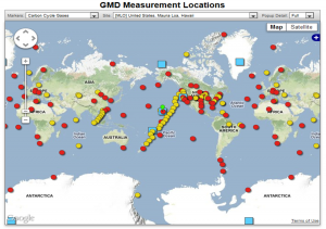
CO2 data are available from a number of sites

Sites around the world that are monitoring CO2 and other gases in the atmosphere.

Sites around the world that are monitoring CO2 and other gases in the atmosphere.

and there are differences in hemispheric CO2 concentrations that are completely expected due to emissions source location and atmospheric transport times, as discussed earlier. The Mauna Loa CO2 measurements are the ones I’ve been watching with more interest than this year’s baseball season and the daily-averaged CO2 concentrations are reported on the web and via twitter, among other places. Twitter is turning out some good and interesting data like this.

According to the twitter feed, daily-averaged CO2 exceeded 400 ppm on May 13 with CO2 of 400.16 ppm. By my own calculations using the daily tweets, weekly-averaged CO2 exceeded 400 ppm for the first time in the week ending May 19 (CO2 was 400.01 ppm). The next milestone is when the monthly-averaged CO2 exceeds 400 ppm, and then annually-averaged, and so on. We are approaching what should be the peak CO2 this calendar year as the growing season begins and CO2 is drawn down from plants breathing in CO2. Eventually, the Earth will be perpetually impacted by more than 400 ppm CO2 and even the seasonal drawdown in CO2 of 5-6 ppm from May to October every single year as plants in the biosphere convert CO2 into oxygen via photosynthesis will not overcome the long-term trend in CO2. The CO2 will remain in our atmosphere for 100s-1000s of years. The Earth will slowly re-equilibriate to this elevated CO2 through a myriad of processes that include ocean uptake, plant growth, chemical weathering, and finally increased surface and lower atmospheric (tropospheric) temperatures due to the absorptive power of CO2 in the infrared part of the electromagnetic spectrum. The impacts of increased CO2 and other atmospheric components that can force climate into a new state are the main reason climate science remains active. In a post that will be ready as soon as the data is available (June 2), I’ll show the weekly-averaged CO2 trend in the month of May based on the Keeling Curve twitter feed. In other words, I’ll show inevitability.

CO2 and climate sensitivity

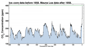
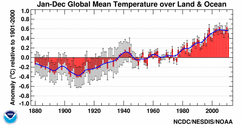
On Thursday, May 16, 2013, the official daily-averaged CO2 concentration in the atmosphere was reported by Scripps as (drumroll please)co2-2013-05-16Like I pointed out, 400 ppm is inevitable because CO2 increases by 2 ppm every year, but to actually see a value like that reported makes it more real. Now we await a value that is over 400 ppm for an entire week, and then for a month, and then it’s just a matter of time when we are in a world with 400 ppm of CO2, remembering how different this is than any time in Earth’s recent history as shown in the figure to the right (click to make larger).co2_800kRemember that CO2 in the atmosphere is a pretty simple physical perturbation on the Earth’s energy budget – more CO2 will result in an atmosphere that absorbs more of the infrared energy that the Earth emits to space to try and cool off. The energy that does not escape and is absorbed is then re-emitted towards the surface (and towards space). This forces the Earth to warm in response to try to bring the energy budget back into balance since balance is inevitably what everything in the universe seeks to achieve. This forcing of the Earth’s temperature has never been in doubt. The real question is how the Earth SYSTEM will respond to the extra energy or extra warmth. The SYSTEM is something I will start talking about here and it is certainly the most complicated aspect of climate science. Imagine the complexities associated with trying to understand how the atmosphere, ocean, land and plants, ice, and even humans and animals will all respond and how each affects the other! That is the heart of Earth system science and the heart of the very current discussion about climate sensitivity – a measure of how the system in total will respond to perturbations like more CO2 in the atmosphere. A very nice op-ed in the New York Times by Justin Gillis this week highlights the frank evaluation and debate about climate sensitivity occurring in the scientific community that has arisen from the apparent slowdown in the increase in globally averaged temperature (since about 2002 in the GISS time series or slightly more evident in the NCDC time series below)global-201101-201112The issue is getting a load of attention and, as Gillis wisely acknowledges, the analysis and studies in the peer-reviewed scientific literature will take a couple of years to “settle” on an answer. I agree. The public and policy makers and just about everyone wants to know the answer though so every publication or even statement about climate sensitivity will be intensely amplified. I’ve been reading about this issue myself, mostly as I prepare to bring the very current discussion into the classroom (here, here), but also because I am as concerned about the Earth as anyone. Here’s a final statement by Gillis that I also agree with.
Even if climate sensitivity turns out to be on the low end of the range, total emissions may wind up being so excessive as to drive the earth toward dangerous temperature increases. So if the recent science stands up to critical examination, it could indeed turn into a ray of hope — but only if it is then followed by a broad new push to get the combustion of fossil fuels under control.

Regardless of the climate sensitivity, changes to our lifestyles are inevitable. Will our society and will the USA be seen as forward-thinking or will we revert to the simplest and most destructive way to get energy?

Another week of CO2 from Scripps

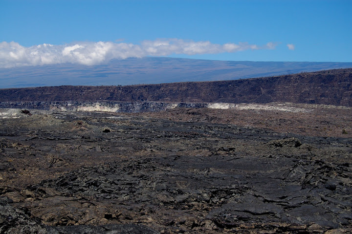
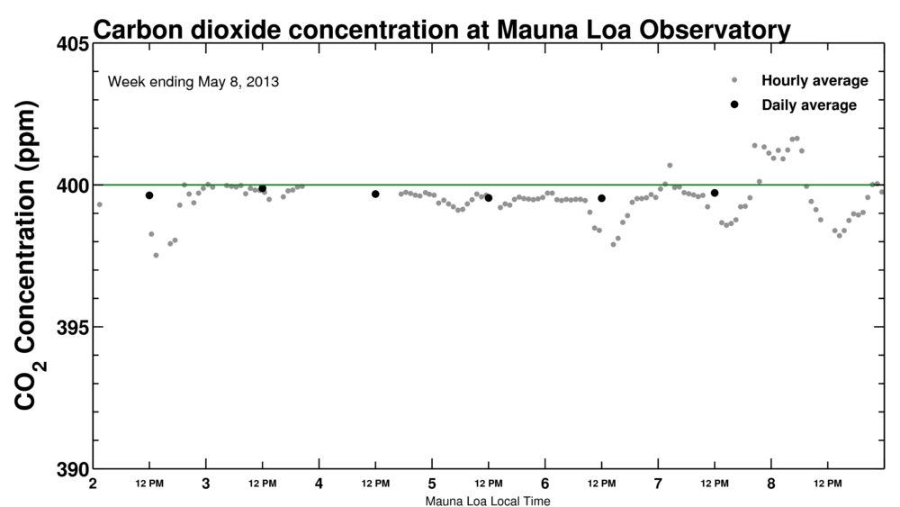
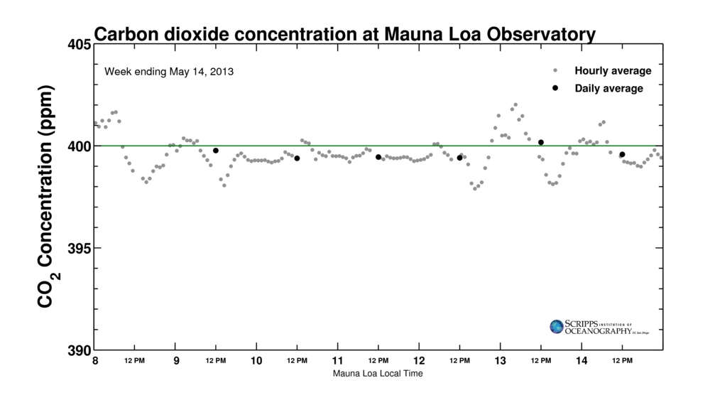
An update to my update from the original post. CO2 is rising 2 ppm/year and has been for about the last decade (see graph here). So the daily ups and downs and pretty miniscule. 2 ppm/year is 0.0055 ppm/day, or thought of yet another way – it’ll take about 180 days for CO2 to increase 1 ppm. While we await the inevitable, here’s an update with May 13 at least above 400 ppm, although the measurements are pretty variable for some reason.mlo_one_week-2013-05-14Variability in CO2 during the course of any one day can be for a number of reasons. One that scientists responsible for quality-control of the data have to account for is the simple fact that Mauna Loa is a gigantic shield volcano

Photo taken by me from the Kilauea Caldera in 2007.  Mauna Loa (13000 ft elevation) looms in the background under a shroud of clouds, but it's shocking how small that 13000 ft mountain looks.

Photo taken by me from the Kilauea Caldera in 2007. Mauna Loa (13000 ft elevation) looms in the background under a shroud of clouds, but it’s shocking how small that 13000 ft mountain looks.

Well, scientists are nothing if not rigorous and attentive, so here’s a nice post by a NOAA scientist talking about the volcanic CO2 pulses that occasionally disrupt the background CO2 measurements that Mauna Loa is best known for. I haven’t read the papers about the volcano relevant emissions, but the link at the bottom of the page gives the information needed to track down the publications via google scholar. That being said, it doesn’t look like the variability in the hourly values for May 13 CO2 was due to volcanic emissions.

CO2 hovering above and below 400 ppm

An update from the measurements being reported from Scripps that I discussed earlier. Here’s the screen shot when I checked the “box scores” for our favorite greenhouse gasco2-2013-05-07whew! I know if I patiently wait, the CO2 concentration will rise above 400 ppm in earnest since CO2 concentrations have been increasing by about 2 ppm/year
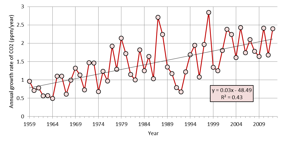
Global growth rate of atmospheric concentration of CO2

Global growth rate of atmospheric concentration of CO2 from 1959 to 2012 (data from NOAA ESRL in link below). 1959 is the start of in situ measurements. The best-fit line is overlaid for reference. You can see that the correlation coefficient is high. In this case, the R2 = 0.43 means that a line captures about 43% of the variance in the annual data. That, in turn, means that a line is a good approximation for predicting where we are going in the near-future.

for a long time with some indication of acceleration in the last few years as the NOAA ESRL CO2 data repository data indicates. Finally, note that hourly measurements of CO2 have already jumped over 401 ppm at times as shown in this figure from Scripps. 400 ppm is inevitable, but what this means for the world is something that science is trying to figure out.mlo_one_week-2013-05-07

Carbon dioxide concentrations are nearly 400 ppm

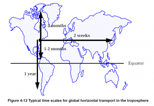
The latest reported value from 4th of May 2013 was 399.68 ppm. That’s as close to 400 ppm as we (our civilization and planet, that is) have gotten.The Earth The best place to see the rapidly updated CO2 concentrations is at the Scripps/UCSD website – the curve seen at the link is of course the famous Keeling curve, named after the scientist (Charles Keeling) who began the systematic monitoring of CO2 gas concentrations in our atmosphere back in the late 1950s. CO2 is measured at sites all around the world (choose a site from the map, then click on Carbon Cycle Gases, Time Series, Submit to see CO2), but the remote ocean sites like Mauna Loa, Hawaii provide the background concentration. This means that the concentration represents the average concentration around the world, as opposed to putting the instrument that measures CO2 concentration right next to a power plant or a fire or some other direct source of CO2. Once CO2 is emitted from a source, it mixes throughout the atmosphere fairly evenly because the molecule has a long (100-1000 year) chemical lifetime before it is drawn out of the atmosphere and into the oceans, forests, or rocks. This long life in the atmosphere means that CO2 accumulates in the atmosphere. The Northern Hemisphere has a slightly higher CO2 concentration than the Southern Hemisphere because there are more CO2 emission sources in the north (more human activity) and because mixing across the Northern and Southern Hemispheres is relatively slow – it takes about a year for a gas molecule to float across the equator, as shown in the figure to the right from Daniel Jacob’s atmospheric chemistry textbook. transport You can also see in the figure that it takes much less time to mix East-West and to the North for a molecule emitted in the Northern Hemisphere. Go to the link at NOAA Earth System Research Lab (ESRL) to see this mixing/emission effect play out. I chose to compare Mauna Loa in the remote Pacific and Crozet Island which is southeast of Africa in the even more remote southern ocean. Crozet Island is well behind Mauna Loa in data processing but we can compare July 2012 CO2 concentrations, which are about 396 ppm at Mauna Loa and 391 ppm at Crozet Island.
Getting back to the 400 ppm, we can expect this value to be drawn down as the biosphere – plants – breathe in the CO2 during the summer growth period. This happens every year, but our fossil fuel emissions are overwhelming that breathing cycle. Science always boils down to context, and in this part of the global warming problem, the context is simple. CO2 concentrations are much higher than anything ever seen in since human civilization emerged. Note the time scales on the graphs below are the past 300 years and past 800,000 years. As many times as I have seen different versions of these figures, I still am in utter shock at how much we’ve altered the chemical composition of our planet’s thin atmosphere. co2_800k_zoomco2_800k

North Carolina climate compared to the USA and globe

The first months of 2013 here in Charlotte have seemed unusually cool, but rather than relying on our gut feeling, let’s look at the numbers. Start by going to the NCDC website and mine out the data to find that in Charlotte, January was the 27th warmest in 118 years, February was the 40th coolest, and March was the 4th coldest in 118 years. Now a fair second question is how does Charlotte fit into the big picture? Namely, is Charlotte’s temperature ranking similar to that of the whole state of North Carolina, the USA, and even the world? With only a little bit of work, we can figure this out. The data below shows temperature anomaly compared to the 20th Century average as a +/- number, and the parenthetical numbers are the ranking in the overall temperature record (1 is hottest). USA has 119-120 years of data, while the global time series begins in 1880.

                  Charlotte*    North Carolina   USA**        Global Land   Global***
    April 2012    +1.7 (31)     +1.1 (39)        +3.7 (3)     +1.1 (6)      +0.6 (7) 
      May 2012    +2.9 (13)     +2.9 (11)        +3.3 (2)     ? (7)         +0.5 (10) 
     June 2012    -1.5 (93)     -1.5 (98)        +2.0 (12)    +0.9 (4)      +0.6 (7) 
     July 2012    +2.4 (8)      +3.2 (2)         +3.3 (1)     +0.8 (5)      +0.6 (7) 
   August 2012    -1.3 (97)     -0.4 (69)        +1.7 (13)    +0.8 (2)      +0.6 (8) 
September 2012    -1.6 (83)     -0.9 (72)        +1.4 (23)    +0.9 (4)      +0.5 (8) 
  October 2012    -1.5 (81)     -0.6 (65)        -0.3 (73)    +1.1 (2)      +0.6 (8) 
 November 2012    -3.6 (109)    -3.6 (108)       +2.0 (20)    +1.1 (6)      +0.7 (5) 
 December 2012    +5.1 (8)      +5.5 (8)         +3.3 (10)    +0.2 (49)     +0.4 (18)
  January 2013    +2.8 (27)     +3.5 (24)        +1.5 (42)    +0.9 (13)     +0.5 (9)
 February 2013    -2.0 (80)     -0.8 (70)        +0.9 (49)    +1.0 (11)     +0.6 (9)
    March 2013    -6.7 (116)    -5.9 (114)       -0.8 (77)    +1.1 (11)     +1.0 (10)

What’s remarkable is that at first glance, it seems like the rankings of Charlotte and NC are essentially on the opposite end of the spectrum of rankings compared to the global rankings in the last 12 months. There’s an easy way to quantitatively evaluate the relationship between sets of numbers and that is by using the statistical correlation coefficient, usually represented by the variable r. A positive r value means the numbers go up and down together, while a negative r means one set of numbers go up while the other goes down. When r is +1 or -1, that means the two sets of numbers are perfectly correlated and perfectly anti-correlated, respectively. Perfect correlation or anti-correlation never happens with data, unless you calculate the correlation of a dataset against itself which isn’t very interesting. That being said, r near +1 or -1 usually indicates that the two datasets being compared are statistically related. To quantify “usually” from the previous sentence and to contextualize the r value, a corresponding statistic that accompanies r is the p value. The p value is a way to quantify the statistical significance of the r value and depends. A p value less than 0.05 means there’s a 95% chance that a random set of numbers is not better related than the numbers you are testing. Thus when p is less than 0.05, you can be confident there is “statistically significant” relationship – remembering that correlation does not imply causation. This kind of analysis is done all the time in all fields of science, which speaks to the idea that math is the universal language. In the table below, r is the +/- number, p is the parenthetical number.

                NC              USA           Global Land    Global
    Charlotte   +0.97 (<0.05)   +0.52 (0.08)  -0.43 (0.16)   -0.43  (0.16)
           NC   -               +0.48 (0.11)  -0.39 (0.21)   -0.44  (0.16)
          USA   -               -             -0.10 (0.77)   +0.002 (0.99)
  Global Land   -               -             -              +0.92  (<0.05)

Now we’re getting somewhere. Over the last 12 months, Charlotte and NC temperatures are, as expected, significantly correlated (r = +0.97, p < 0.05). If Charlotte sets a cold or warm record, so does NC. Global land and ocean ("global" in the table) and global land are significantly correlated (+0.92, p < 0.05) as well. Not that shocking. What I didn't expect until I started comparing the trend in the rankings is that NC and Charlotte rankings are not significantly related to the USA or global temperature rankings. This is evident by the high p values in parenthesis in the 1st and 2nd rows. Surprisingly, NC and Charlotte are nearly significantly anti-correlated (negative r values, see above) with global rankings, something that might be worth looking into with more data. What’s perhaps even more surprising to me is that USA temperature rankings are essentially unrelated to the either of the global temperature rankings. This means that any given month in the USA tells you absolutely nothing about the global ranking for the same month – you might as well just guess. More data will tell the a more complete story here (and provide better stats), but over the last 12 months, there are some interesting possible relationships (Charlotte and NC similar to the USA, but opposite of the globe), and then occasions where the two datasets have no idea the other exists (USA and the globe). No wonder people get mixed up when looking at the news about global warming and then try to relate it to what’s going on in their backyard.

* NC Climate Division 5
** Contiguous USA
*** Combined land and ocean since 1880, as opposed to “global land” which is only land surfaces. Note May 2012 T anomaly wasn’t listed on NCDC site, but the ranking was. My stats analysis was based on the ranking, so the “missing” data point is not relevant.

Thin Ice film screening

I watched the soon-to-be-officially-released new film about climate science and climate scientists called Thin Ice today. I read about Thin Ice on the RealClimate blog, where the blog author (an Atmospheric Scientist who is interviewed in the film itself) posted that screenings of Thin Ice were being planned for Earth Day 2013 (22 April). Great idea! The film makers say

Join us on Earth Day, April 22nd, 2013 for the global launch of Thin Ice: The inside story of climate science. The film will be available for free online here or can be seen in person at various screenings around the world from April 22nd-23rd.

Since I teach a course about global warming in the Spring and Fall semester here at UNC Charlotte, I immediately thought that this would be a valuable multimedia way to incorporate more than just me talking about the world of climate science with my 12 students. Turns out the documentary-style film is really accessible. A geologist named Simon Lamb starts the movie by talking about his motivation – kind of like you would if you were writing a scientific paper intended for publication. Namely, Lamb poses the hypothesis that climate scientists are “peddling a lie” – a hypothesis that any person in the world could arrive at fairly easily given the way that climate science is discussed outside the scientific world at times. Lamb tests his hypothesis by talking with climate scientists and learning about what they do and, more importantly in my opinion, WHY. The answer to why isn’t stated explicitly, but I think it is the common thread linking the scientists working on understanding the amazing climate system. Certainly, the movie and the conclusions resonate with me. The Earth is an amazing place, and humans working for the greater good truly raise the collective level of optimism about the future.

If you want to sit in on the UNC Charlotte screening, I will show the movie from 11:00-12:15 on Monday April 22 (Earth Day). No admission. Send me an email if you plan to be there. I signed up for the screening via the Thin Ice website, so you can see the official screening annoucement here if you search Charlotte.

Resources for learning about the state of the climate

An atmospheric scientist likes to talk about the “state” of the atmosphere. A “meteorological state” usually means knowing the temperature, pressure, dewpoint temperature (moisture), and maybe the wind speed and whether there is precipitation. Climate state is similar but usually presented as a comparitive. I’ve talked about this before, but the essential calculation to understand in climate is the idea of a “departure” or an “anomaly”.*

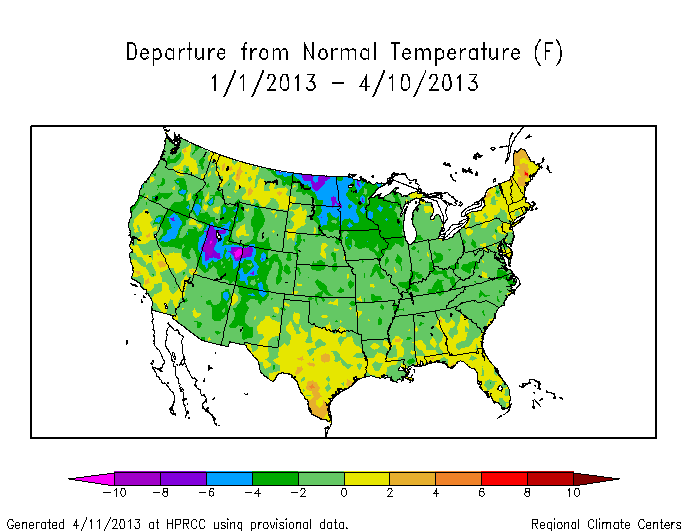
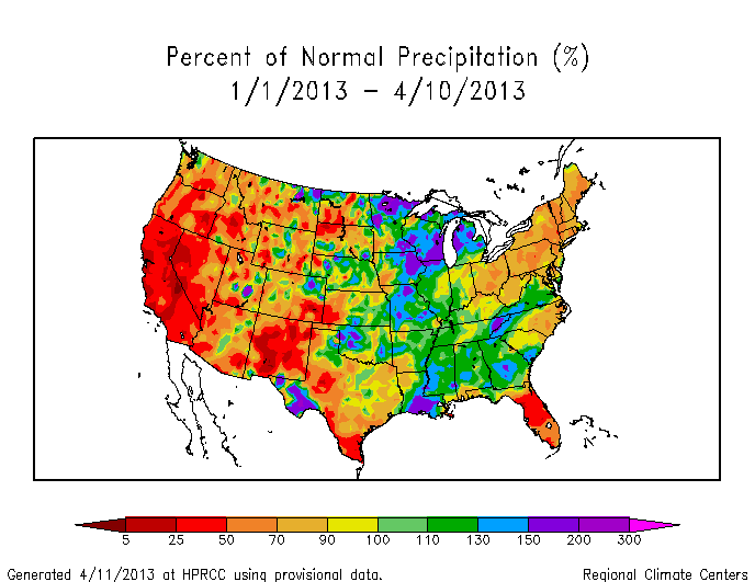
Climate departures from, say, a climate normal examine the change with respect to what we might expect given past knowledge. A great online resource with very up-to-date climate state is the daily-updated graphs of monthly temperature departure at the High Plains Regional Climate Center (HPRCC). You can easily create presentation-ready figures (properly citing HPRCC) such as temperature departure since first of the month, percent of normal precipitation since first of month, and the analogous figures for temperature departure and percent of normal precip since the first of the year. Here are examples of T and precip in 2013 (so far).

YearTDeptUS-2013-04

YearPNormUS-2013-04

By pressing a few buttons on the internet, you have access to a powerful and constantly evolving data set for the USA. You can evaluate where the USA is in terms of “Is the USA headed to another record warm year like 2012?”, “Has the drought subsided to any degree in the new calendar year?”. With some digging, you can get the numbers in the figures and embark on a more detailed analysis of trends and spatial patterns, but first-order analysis via the HPRCC figures is the natural place to start. For example, studying the figures above, we can quickly deduce that the temperatures in 2013 have been unremarkable compared to the climate normal period (1981-2010). In fact, I think we can safely conclude that through 10 April 2013, the temperature has been cooler than the climate normal period, or in terms of the colors on the graph, most of the figure is light green (a slight negative departure). This is a big shift from 2012, where March shattered records across much of the country and started off a long anomalously warm year in the USA. Precipitation trends for 2013 (so far) seem to suggest that the mountain west remains at less than 50% (red to dark red) of the climate normal period precipitation. The spatial map figures give you the additional power to watch not only the country, but parts of the country that might be more directly relevant to you.

Global warming introduces the increased probability of more warm years – this is very clear from data which I’ll post about soon. In the meantime, when you ask a question about the climate state, you can rest assured that they can be answered. What will 2013 bring us when the fire season starts in earnest? Or as the temperature time series evolves? Keep clicking on HPRCC to find out. Unlike sports seasons, the season for climate-relevant stats never ends.

*This is true in weather studies as well, but the motivation is different. Weather departures look at the magnitude of a departure to help evaluate the strength of the weather especially with regards to the pressure and temperature. Think of a hurricane. Most discussions of a hurricane talk about the central pressure – the air pressure in the eye of the storm. A low number usually indicates a more dramatic (negative) departure from “normal” pressure at sea level. This leads to a higher force moving the air from outside the hurricane towards the eye – air moves from high to low pressure. If you’re wondering, the spinning of a hurricane happens because the moving air is also affected by the coriolis effect from the rotating Earth.

Margaret Thatcher and global warming

Margaret Thatcher, prime minister of Great Britain from 1979-1990, passed away on 8 April 2013. These are her introductory words in a speech to the United Nations about the threat that global warming poses to world order, and that I talk about in more detail below

During his historic voyage through the south seas on the Beagle, Charles Darwin landed one November morning in 1835 on the shore of Western Tahiti. After breakfast he climbed a nearby hill to find advantage point to survey the surrounding Pacific. The sight seemed to him like “a framed engraving”, with blue sky, blue lagoon, and white breakers crashing against the encircling Coral Reef. As he looked out from that hillside, he began to form his theory of the evolution of coral; 154 years after Darwin’s visit to Tahiti we have added little to what he discovered then.

What if Charles Darwin had been able, not just to climb a foothill, but to soar through the heavens in one of the orbiting space shuttles? What would he have learned as he surveyed our planet from that altitude? From a moon’s eye view of that strange and beautiful anomaly in our solar system that is the earth? Of course, we have learned much detail about our environment as we have looked back at it from space, but nothing has made a more profound impact on us than these two facts.

First, as the British scientist Fred Hoyle wrote long before space travel was a reality, he said “once a photograph of the earth, taken from the outside is available … a new idea as powerful as any other in history will be let loose”. That powerful idea is the recognition of our shared inheritance on this planet. We know more clearly than ever[fo 1] before that we carry common burdens, face common problems, and must respond with common action.

And second, as we travel through space, as we pass one dead planet after another, we look back on our earth, a speck of life in an infinite void. It is life itself, incomparably precious, that distinguishes us from the other planets. It is life itself—human life, the innumerable species of our planet—that we wantonly destroy. It is life itself that we must battle to preserve.

In a previous posts about Barack Obama and Martin Luther King Jr, I highlighted some timely quotes related to the eventual costs of rapid technological development. Namely, global warming. This is a global, multi-faceted issue with no clear pathway even though essentially the problem has been understood for almost 200 years. Margaret Thatcher addressed the United Nations and although the transcript of her speech is available, the video I originally came across on Youtube is no longer available. I downloaded the video so I could show it in one of my classes, but I hesitate to re-distribute it since I don’t know the rules. It wasn’t exactly high-quality either. Anyway, here’s the link to the transcript of a beautiful speech by a powerful world figure. And here’s the punchline. She gave this speech in 1989. 1989. Clearly, the world is not responding to the science.

A framework [for addressing global warming and the impacts] is not enough. It will need to be filled out with specific undertakings, or protocols in diplomatic language, on the different aspects of climate change. These protocols must be binding and there must be effective regimes to supervise and monitor their application. Otherwise those nations which accept and abide by environmental agreements, thus adding to their industrial costs, will lose out competitively to those who do not. The negotiation of some of these protocols will undoubtedly be difficult. And no issue will be more contentious than the need to control emissions of carbon dioxide, the major contributor—apart from water vapour—to the greenhouse effect. We can’t just do nothing.

This speech by Margaret Thatcher was the precursor to the formation of the Intergovernmental Panel on Climate Change. The scientists and policy makers who led the writing of that report in 2005-2006 won the Nobel Peach Prize in 2007 along with Al Gore. PM Thatcher should feel quite a bit of pride in her country’s efforts to initiate the IPCC. The group of scientists who contribute changes with every report that is written and now the IPCC is collectively finishing their 5th Assessment Report. Since I am a proud US citizen, I will say that the US should be (really, should have been) the first to respond. We have consumed the biggest piece of the cheap carbon energy cake and are angrily hoarding as much of the rest as we can. I hope leadership from our President continues and that the efforts of so many in the USA and all around the world is not squandered. As Margaret Thatcher said, “We can’t just do nothing.”