north carolina

Forecasting the USA temperature and precipitation tendency for 2014

Where we are this calendar year

Currently, the USA as a whole and the Southeastern USA are both cooler than normal this year 2014-02-12-YearTDeptUS and precipitation is slightly below average for the Eastern USA, above average for Colorado-Wyoming-Idaho, and well below average for the Southwestern USA. 2014-02-12-YearPNormUS
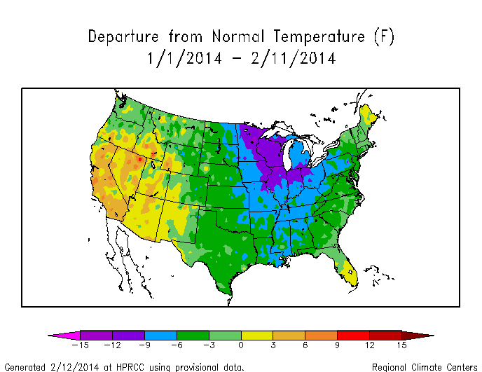
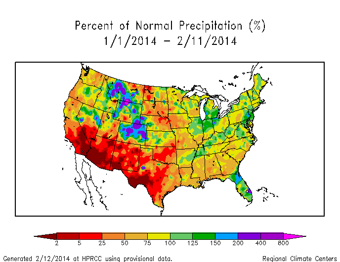
Where we are right now

Thinking about the upcoming year in weather while in the midst of a crippling snow/ice storm in the Carolinas (discussion via #NWSGSP, over 2,000 outages by end of 12 Feb 2014 mostly in Lancaster, Greenville, and Pickens Counties in SC, and Macon and Caswell Counties in NC*, flights cancelled, Rayleigh-Durham turning into a parking lot like Atlanta only two weeks ago, etc.) is the perfect time to test whether you can separate a trend from variability (teach me, dog walker).

*updated on 13 Feb 2014 midday is 36,400 outages; more than 14,000 in Mecklenburg, 4000 in Cabarrus, 2700 in Gaston, 1600 in Rowan, 1300 in Lincoln, and 1100 in Durham County, NC. About 5000 in Lancaster and 2900 in Chester County, SC. Wow. Second band of snow falling in North Mecklenburg dropped maybe another 6″ on the 5-6″ we had yesterday. Double wow. Snow and ice totals should be impressive after the analysis is complete.

Trend, variability, and perception

The temptation is that your opinion is tempered by what you are currently experiencing. The old and boring argument that “Hey, it’s cold. What’s up with global warming?” The short-story (pun intended) is that weather is always variable, and the #SEStorm snow and ice storm is no exception.

What is the trend? Globally, it’s simple. Temperature is increasing (NASA GISS, UK Met Office CRU, NOAA NCDC). For the USA, and states within the USA, it’s less simple. Variability in the weather tends to average out less and less over smaller and smaller spatial scales. What does this mean? The ups and downs we expect from weather like our February snow/ice storm and the preceding week with beautiful warm temperatures become less and less noticeable at larger spatial scales because while North Carolina might be down in temperature, somewhere else on Earth is certainly up on temperature. They average out unless there is an overriding trend, like the trend imposed by increases in greenhouse gases. That’s why the global temperature trend is so important. If something is making the entire Earth warm above what is considered a range of natural variability, then some very powerful mechanism is at work.

Where we might be this calendar year

Back to the question at hand though. Can science address near-term (say, over the next 3-12 months) temperature and precipitation? The answer is yes, and this prediction is studies using an analysis called seasonal forecasts. I was shocked by what is suggested for temperature for the rest of 2014 and slightly into the beginning of 2015. NOAA Climate Prediction Center (CPC) updates their seasonal forecasts about the middle of every month, and I put this animated version of their graphics together below. temperature-2014-01-16where, once you wrap your head around what I call the “geography” of the figure, you see that NOAA CPC is predicting whether the temperature over successively farther 3-month periods (Feb-Mar-Apr, Mar-Apr-May, etc.) will be above, at, or below the average temperature for 1981-2010 (the climate normal). Clearly, NOAA CPC analysis is suggesting that the USA is due to experience an above-average year for temperature. In particular, the Southwest and Alaska are pummeled by warmer-than-average temperatures until October (a hot summer in the Southwest is not pleasant, and hot summers in Alaska may be suggestive of a bad fire year). Furthermore, by about October-November, the forecast for the Southeastern USA is to be above average temperature even after the rest of the country goes to even chances for above or below-average temperature. That translates to a nice Halloween and Thanksgiving in the short-view, and yet another warm blip on the global warming trend in the long-view.*
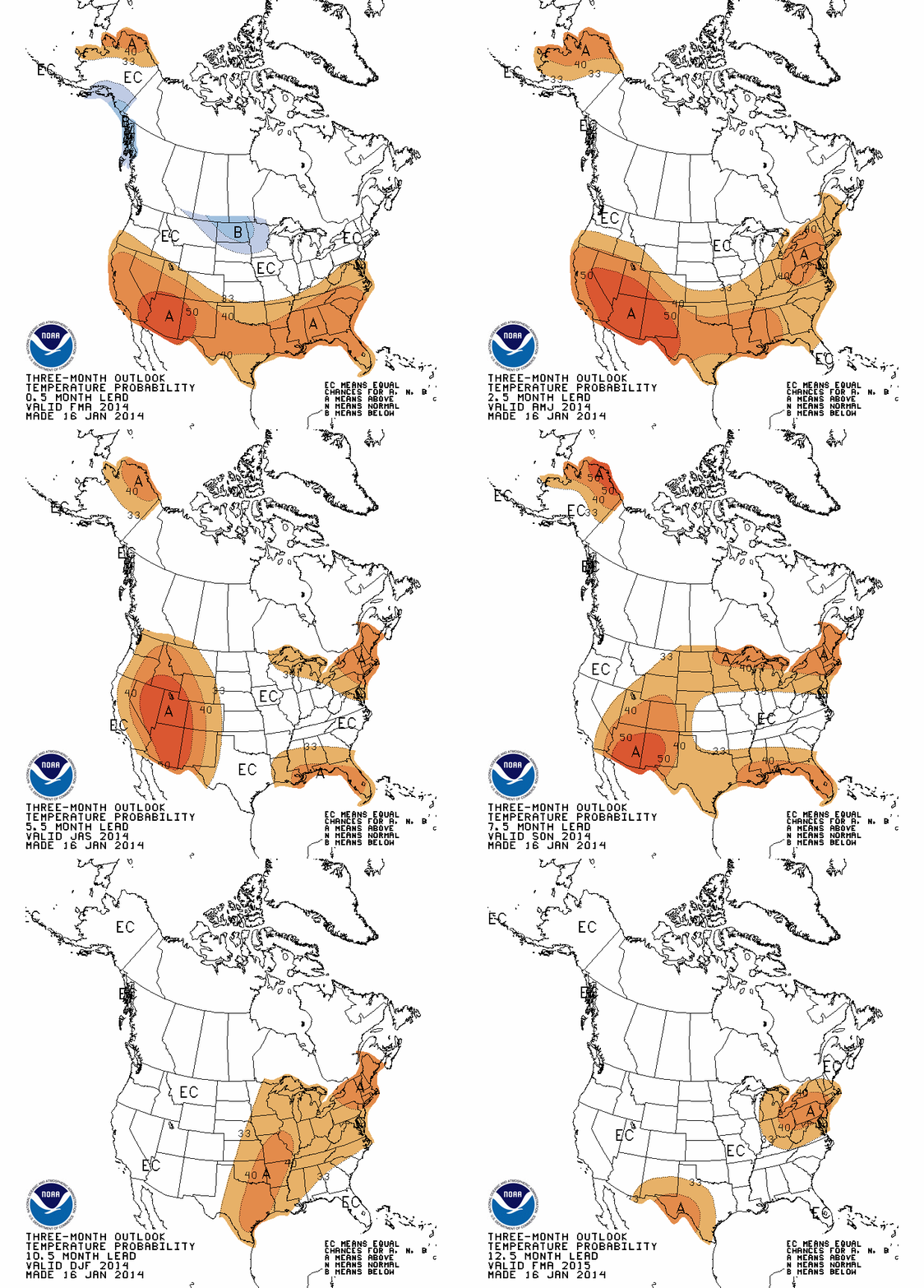
Precipitation seems to be less interesting in terms of climatological deviations, but the Southwest does seem to at least move away from below-normal, dry conditions that are plagueing California right now. precipitation-2014-01-16
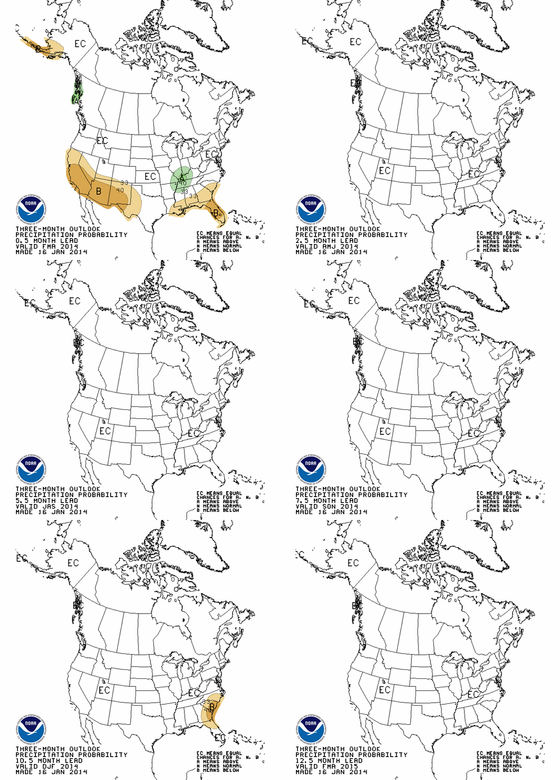
*I’ll revisit the seasonal forecasts again in a couple of weeks after NOAA CPC updates their analysis, and then also look at how well the forecasts capture reality at the end of the year using NOAA NCDC archived temperatures. This verification is mainly because I haven’t spent much time with these seasonal forecasts, but I am always seeking out new media for the classroom. A natural question about the NOAA CPC products is: Are they any good? We’ll see.

Summary

A lot to digest, and time will tell, but don’t let this cold early part of 2014 deceive you. Global warming is a major trend that is imposed on every weather system in the world. No single weather events is very likely attributable to global warming because of the complexity in parsing out all the causes and effects that modulate a weather system as it tracks through the USA (think of how tricky the forecast of ice vs snow was for this Feb 11-13 storm, and then try to say what it was that caused that specific location of the border between the two – hard!). But the average weather is slowly changing, and the average weather is climate. In the meantime, back to staring at the sleet that is falling and wondering when UNC Charlotte will open again for classes!

Climate in the Southeast in January 2014

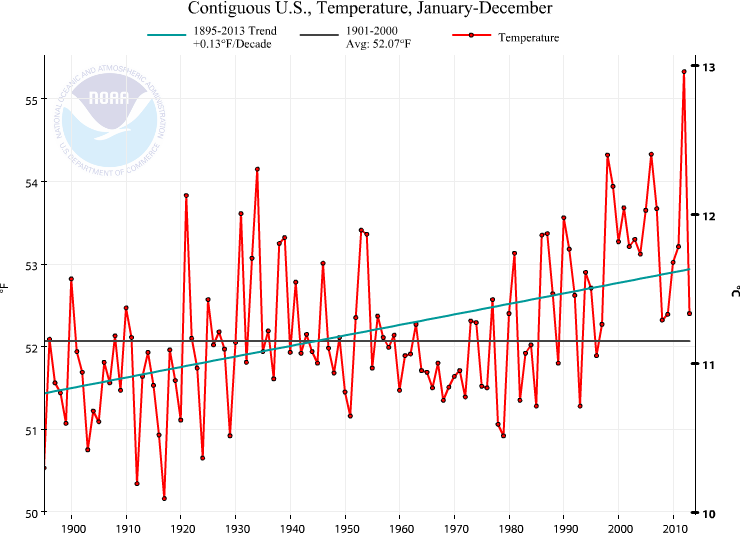
Scientists studying the Earth’s climate system are supported by an immense and rich array of data. Sometimes it seems like you only have to be comfortable working with all this information. Programming languages help (matlab, R, python, NCL, for example). But even more accessible are incredible web resources. The USA High Plains Regional Climate Center updates their climate and weather relevant maps on a daily basis. Here are some figures showing where the country and the southeast USA stands. From NCDC time series plotter, the contiguous USA (no Alaska and Hawaii) was the 37th warmest year in the last 119 years, as shown in the graph below.
contiguous-USA-2013-T
In itself, 2013 wasn’t unusual. In recent memory, 2008 and 2009 were really similar to 2013. However, compared to the fanfare around the hottest year on record for the USA in 2012, it does seem different. Who can remember ought-8 and ought-9, right?

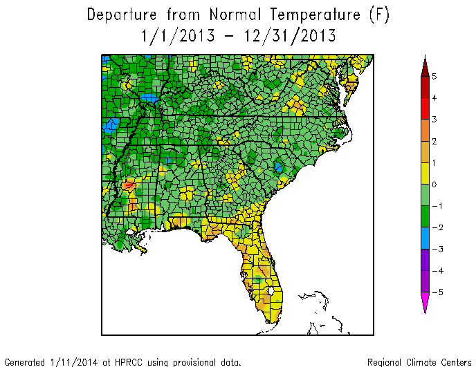
But even more to the point is what we feel where we live. Science and statistics are fine, but just like no one on Earth experiences the average global temperature, no one in the USA experiences the average USA temperature either! Let’s look at the Southeast. In 2013, drawing from the HPRCC link above for the figures below, the temperatures were cooler than average.
AnnDec13TDeptSERCC-2013-12-31
In the last 120 years, 2013 in the Southeast was about the 67th warmest. Most of the years in the past 120 years have been warmer! But this is really not that ususual. 4 of the last 10 years in the Southeast have been cooler than more than half the past 120 years. 10 years is a limited view, but I chose it because it’s a round number and because we remember the last 10 years. Going back to the USA, *none* of the last 10 years have been cooler than more than half of the past 120 years. Not really even close. You can verify this with NCDC data tools. What global warming? Well, that’s where perception matters. The Earth is warming, even if the Southeast seems to be avoiding the problem we’ve created with CO2 emissions.

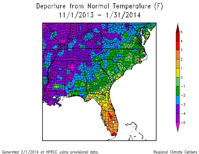
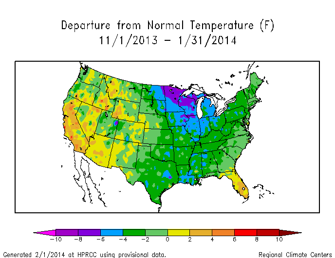
Looking to the more recent period, we can also glean a little bit about our winter months with a 3 month average (Nov-Dec-Jan) using HPRCC again
Last3mTDeptSERCC-2014-01-31
We see that except for Florida, the Southeast is largely cooler than average. Here HPRCC is comparing against the 1981-2010 average temperature (temperature anomaly). Appalachia and further to the west are in a deep recession of the warmth we expect when we think of global warming.

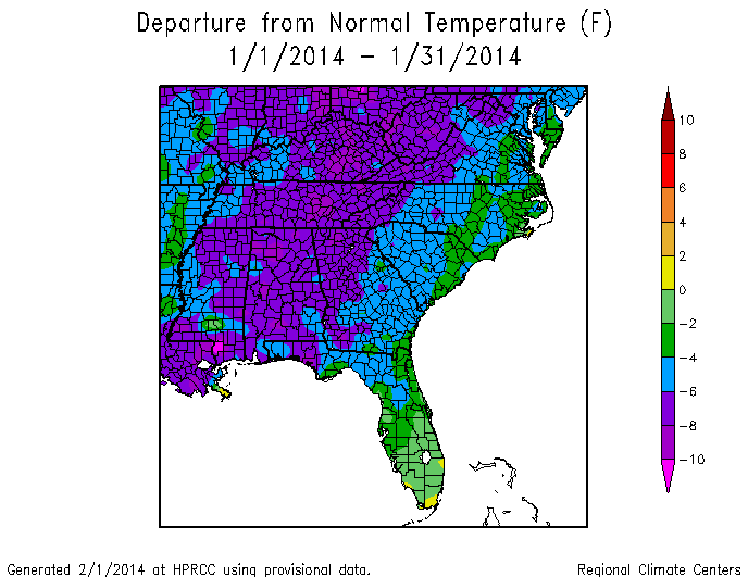
Finally, we can look at January 2014 using HPRCC tools.
Last1mTDeptSERCC-2014-01-31
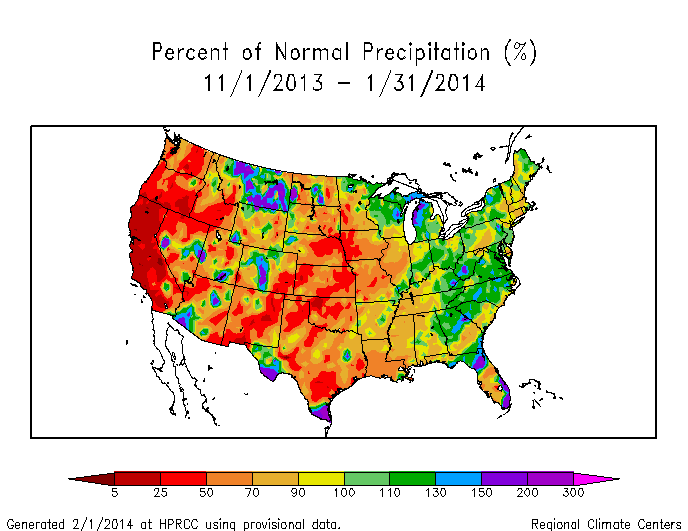
The Southeast is cold! Even poor Florida, which over the last 3 months is anomalously warm compared to the rest of the Southeast, is in a deep cold this past January. If we eyeball-average the data on the figure, we get a number of about 6-7 degrees F below the 1981-2010 average. Jeez. Where can we go for unseasonable warmth (retrospectively)? The West is certainly above average, and more importantly below average on precipitation, as the figures show below.
Last3mTDeptUS-2014-01-31
Last3mPNormUS-2014-01-31
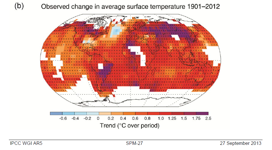
Be thankful the Southeast is so stubbornly refusing to budge on global warming… but I worry that as a result of this stubborness, our legislators will forget this is a problem. North Carolina will be affected even if we are a hold out for now. Think global whenever you think of climate. Or, if you want, think of Bob Marley (one love, one heart). This figure from the recent IPCC report (WGIAR5-SPM_Approved27Sep2013) shows that there are only a couple of non-red areas on Earth (ie. they are not following the warming trend). The Southeast is one of them! But that is one scorched Earth otherwise.
ipcc-ar5-wg1-spm-fig1

Charlotte Citizens Hearing on EPA Proposal to Regulate Carbon Emissions

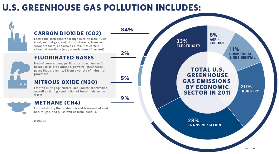
Real conversations about how we can act on climate change (#ActOnClimate) seem to be happening right now. Environment North Carolina published their tabulated emissions from state power plants, and even highlighted North Carolina’s role in this.ghg-largeTo offer public support for the EPA proposal to limit carbon emissions from any new power plant, Clean Air Carolina and NC Conservation Network are hosting a Citizens’ Hearing in downtown Charlotte on Tuesday October 15 from 6-7:30pm (more info below). Charlotte Observer noted the event, and the general public is invited to participate. I will attend and offer brief remarks about the climate science behind the EPA proposal. Please join us and support the proposal to FINALLY regulate some of the emissions from any new power plants. This discussion will set the stage for the presumably upcoming/inevitable proposal to regulate emissions from existing power plants the EPA should have ready next year. From the Clean Air Carolina post:

Last week, the Environmental Protection Agency (EPA) announced its first steps under President Obama’s Climate Action Plan to reduce carbon pollution from power plants. The EPA will soon hold hearings in various cities at which the public can comment.

For decades, public participation has become a regular and important part of how new laws are carried out. As an alternative to attending an official EPA hearing, communities across the country will hold “Citizens’ Hearings” and all comments will be recorded and sent to the agency as official public record. Clean Air Carolina and NC Conservation Network are hosting the Charlotte Citizens’ Hearing on Tuesday, October 15 to allow area residents the opportunity to provide oral testimony on the new rule.

Charlotte Citizens’ Hearing
October 15, 2013 – 6:00 p.m. – 7:30 p.m.
Caldwell Presbyterian Memorial Church
1609 East 5th Street
Charlotte, NC 28204
RSVP today and let us know you’re coming!

Cleaning up power plant pollution will result in better air quality, healthier communities and a major reduction in climate changing pollution. Just today, the world’s top climate experts have announced an upper limit on carbon emissions that they warn we cannot pass if we are to avoid the most dangerous effects of a warming planet. Join us for the Charlotte Citizens’ Hearing to show your support for strong carbon rules on new and existing power plants! See below for Citizens’ Hearings scheduled in other NC cities.

Tracking and targetting emissions from power plants

Speaking as a part of a press release about power plant carbon emissions in NC.

Speaking as a part of a press release about power plant carbon emissions in NC.

As my students probably know by now, I think an important point when discussing or even thinking about how to deal with the combination of our hunger for energy and global warming is to remember the scales of the problem. There are two important scales to consider in every discussion of global warming: time and space. The adjectival forms would be “temporal” and “spatial”. The super-cool adjective, which I probably overuse, is “spatiotemporal”. Spatiotemporal analysis is critical to understanding global warming and what it means in any single location on Earth. The temporal scale is highlighted over and over again right now because of the global warming “pause”, which as any analysis or background research should reveal, is nothing more than a pause and that plenty of research is underway and done that helps to understand yet another small surprise in the complex Earth system. One part of the problem of climate change that is not surprising is what is the cause. Carbon emissions from fossil fuel burning are the main culprit, so the prescription is simple: Stop burning fossil fuels. Hah! This comes back to our hunger for the energy stored deep in the Earth, so the answer is definitely not as simple as the prescription.

Me talking about the state of climate science with Graham Givens of Environment NC, Ronald Ross, local resident and Vice President of Stewart Creek Environmental Association, and reporters!

Me talking about the state of climate science with Graham Givens of Environment NC, Ronald Ross, local resident and Vice President of Stewart Creek Environmental Association, and reporters!

I provided some scientific feedback to an effort by Environment North Carolina a few weeks ago that I neglected to highlight on my research webpage (but I did on twitter), and I will expand on this a little now. Environment NC released a report of carbon emissions from power plants across the USA. Power plants (coal, natural gas) are required to track and report these emissions, so sometimes groups just need to put forth the effort in assembling these numbers into a coherent piece of writing, which is what Environment NC did. They found that 3 of the top 50 most serious carbon emitters were in the state of NC – they are all coal plants of course. Coal is still being burned even though Natural Gas is used more and more. The key findings, as Environment NC stated on their written press release, are:

  • The Marshall plant, near Lake Norman, emitted 10.1 million metric tons of pollution in 2011, the equivalent of 2.09 million cars.
  • Three of the most polluting power plants in the country are in North Carolina: Belews, Roxboro, and Marshall.
  • Belews Creek Power plant near Winston-Salem was the state’s biggest global warming polluter and 16th overall, emitting 13.8 million metric tons of carbon pollution, the equivalent of 2.9 million cars.
  • North Carolina’s power plants are the 12th most polluting in the country, producing as much carbon each year as 15 million cars.
  • North Carolina’s power plants are its single largest source of carbon pollution – responsible for 51% of the carbon pollution in the state.
  • The press release was at their news site, and they arranged a live release for media. I went to Frazier Park near the heart of the Queen City early in Septemeber to speak about the science, essentially relying on the discussion in IPCC AR4, which is what I discuss in my classes too. I spoke from the position of scientific evidence. The press release at Frazier Park made its way through state and city news outlets, and I thought the reporters did a great job with the write-ups. Here are some links:

    Charlotte Business Journal

    WSOC-TV in Charlotte

    NC Public News Service

    Charlotte Observer

    I think on the eve of the release of the first part of the IPCC Fifth Assessment Report, it’s important to remember that the solution to the problem of global warming, or at least the best way to mitigate the problems, begins at a local level. We have to remember that the carbon emissions in our backyard – which Environment NC highlighted – affect the entire world. CO2 lasts 100-1000 years in the atmosphere so CO2 from North Carolina will be absorbing infrared radiation for a long, long time. Maybe I’ll write an op-ed for the Observer.

    Ramping up for teaching with NOAA NCDC

    Summer is a time of dedicated research for me. Finished one project, waiting for peer reviews on that manuscript, tinkering with twitter, planning out research conference travel in the next school year, and working on a grant proposal to NSF. The season of the classroom is nearly here though, so I’m slowly re-allocating my hours to teaching. A great early-career workshop for university and college faculty that I attended the last week of July helped me get into gear with teaching again. I need a workshop like that every summer!

    Another way I start to think about teaching is to begin to browse through the data that I want to bring into the classroom. One site I haven’t visited in months, but that I prolifically visit throughout past school years, is the NOAA NCDC time series plotter. I had the pleasure of visiting the numbers again tonight and remain very impressed by NCDC outreach and transparency efforts. The new addition to the time-series plotter (which you can use to produce climate-relevant analysis at different spatial and temporal scales) is a slightly more friendly user-interface, and a few features that I think most stats people will really appreciate. Yes, it’s not a super fancy analysis package, but the statistical analysis you can do just via the webpage now includes two new options. One is the option to display the anomaly against a different base period rather than always using the 20th Century average. In other words, you can choose a base period of 1951-1980 like NASA GISS tends to use or you can play around and see what the effect of a different base period is. The other new option is a display of a trend line for any period. The first thing you can do with this is see how temperature (for example) trends in the early part of the century compare to the trends in the latter part of the century. Or you can mimic the cherry picking that climate data is sometimes a victim to and choose very specific start and end points to produce a trend that amplifies an argument you are making (“look, it’s getting colder!” or “look, it heating up super fast”). one exception to all this great online analysis is that it only applies at the “super” level for data in the contiguous USA. someday, i’ll ask NCDC scientists why this can’t be done for Alaska and Hawaii, and why the global analysis tools are more limited. either way, an exciting development in my virtual friendship with NOAA NCDC.

    May 2013 climate in North Carolina and the world

    With global warming and all of the impacts, it’s very important to constantly consider the question of time and space scales. May 2013 is a good example for those of us living in the Southeastern USA or North Carolina. Namely, North Carolina’s normal-to-cool spring is not at all indicative of how the global temperature is evolving. Let’s see how we can quickly use NOAA NCDC graphs to figure this out.

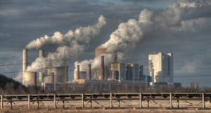
    Global warming refers to the increase in average temperature of the entire Earth. The last part – the entire Earth – is the spatial scale. And that’s a huge spatial scale! When a scientist talks about global warming or that global warming has been detected, you have to step back and say WOW. What on Earth could warm an entire planet? coal_fired_power_plantOver long time scales, of course there are a number of possible reasons (changes in the Sun, Earth’s orbital shape/proximity around the Sun, plate techtonics), but these take so long, they aren’t relevant to the concept of global warming. Even my statement that What on Earth could warm an entire planet? should be more precise and say something like What on Earth could warm an entire planet over a relatively short time period? The simplest, if somewhat incomplete, answer is the combination of greenhouse gases and aerosols emitted into the atmosphere from human activities. Period.
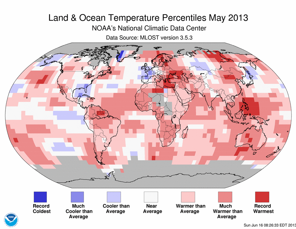
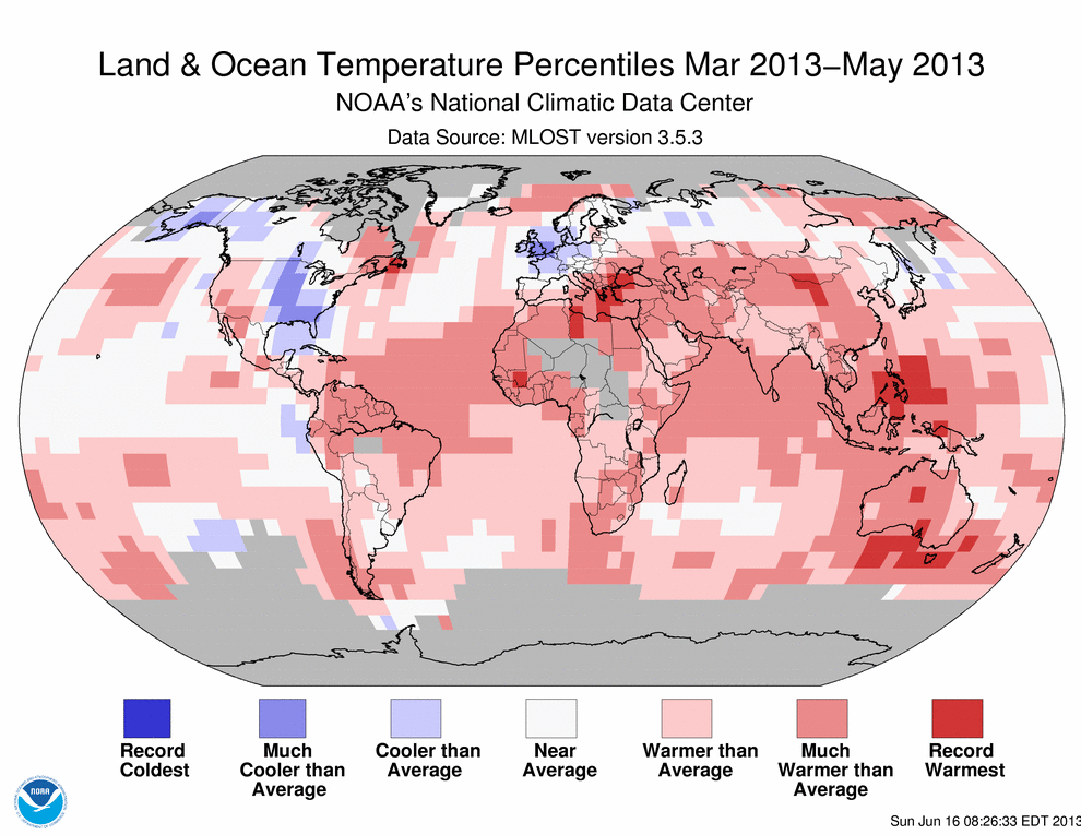
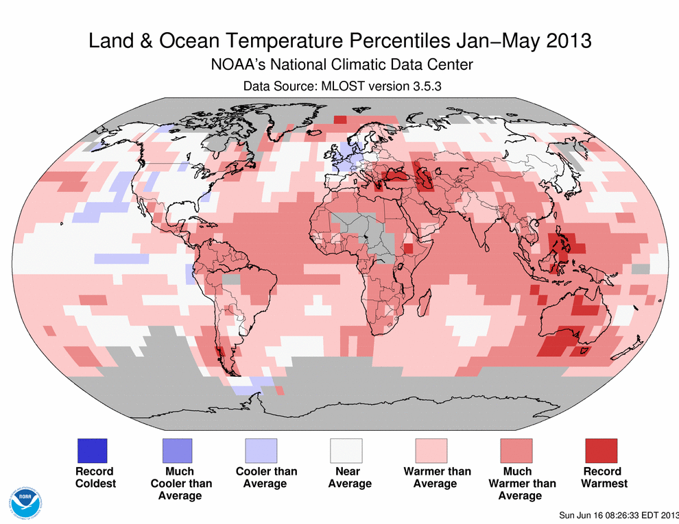
    May 2013 analysis of global temperatures are trickling out. NOAA NCDC as always has a wonderfully complete report of climate news for May and for all previous months. My favorite part is the plethora of hyperlinks. NOAA NCDC should really be commended for their public outreach! Here is one of the figures from that webpage201305where you can see how different the Southeast USA is from the world in May 2013 – the world is shades of red, while the Southeast USA is shades of blue (cooler than normal). We’ve had a very pleasant spring in North Carolina. Pull back on the temporal (time) scale to see the March-April-May seasonal average201303-201305 and you can see that the cool spring extends well beyond May in terms of the anomaly. By this, I mean that the blues become deeper when you consider a three month period (March-April-May) and that implies without any quantitative work that March-April were more cooler-than-average. Pull back slightly further to the year-to-date rankings201301-201305and here you see that the Southeastern USA and in fact most of the USA and even Alaska have been right at the climatological normal (which for NCDC is the average temperature from 1981-2010). The short story is that North Carolina below average temperatures for the period from January to May, March to May or just plain old May are not indicative of global temperatures. The real question is why?

    North Carolina climate compared to the USA and globe

    The first months of 2013 here in Charlotte have seemed unusually cool, but rather than relying on our gut feeling, let’s look at the numbers. Start by going to the NCDC website and mine out the data to find that in Charlotte, January was the 27th warmest in 118 years, February was the 40th coolest, and March was the 4th coldest in 118 years. Now a fair second question is how does Charlotte fit into the big picture? Namely, is Charlotte’s temperature ranking similar to that of the whole state of North Carolina, the USA, and even the world? With only a little bit of work, we can figure this out. The data below shows temperature anomaly compared to the 20th Century average as a +/- number, and the parenthetical numbers are the ranking in the overall temperature record (1 is hottest). USA has 119-120 years of data, while the global time series begins in 1880.

                      Charlotte*    North Carolina   USA**        Global Land   Global***
        April 2012    +1.7 (31)     +1.1 (39)        +3.7 (3)     +1.1 (6)      +0.6 (7) 
          May 2012    +2.9 (13)     +2.9 (11)        +3.3 (2)     ? (7)         +0.5 (10) 
         June 2012    -1.5 (93)     -1.5 (98)        +2.0 (12)    +0.9 (4)      +0.6 (7) 
         July 2012    +2.4 (8)      +3.2 (2)         +3.3 (1)     +0.8 (5)      +0.6 (7) 
       August 2012    -1.3 (97)     -0.4 (69)        +1.7 (13)    +0.8 (2)      +0.6 (8) 
    September 2012    -1.6 (83)     -0.9 (72)        +1.4 (23)    +0.9 (4)      +0.5 (8) 
      October 2012    -1.5 (81)     -0.6 (65)        -0.3 (73)    +1.1 (2)      +0.6 (8) 
     November 2012    -3.6 (109)    -3.6 (108)       +2.0 (20)    +1.1 (6)      +0.7 (5) 
     December 2012    +5.1 (8)      +5.5 (8)         +3.3 (10)    +0.2 (49)     +0.4 (18)
      January 2013    +2.8 (27)     +3.5 (24)        +1.5 (42)    +0.9 (13)     +0.5 (9)
     February 2013    -2.0 (80)     -0.8 (70)        +0.9 (49)    +1.0 (11)     +0.6 (9)
        March 2013    -6.7 (116)    -5.9 (114)       -0.8 (77)    +1.1 (11)     +1.0 (10)
    

    What’s remarkable is that at first glance, it seems like the rankings of Charlotte and NC are essentially on the opposite end of the spectrum of rankings compared to the global rankings in the last 12 months. There’s an easy way to quantitatively evaluate the relationship between sets of numbers and that is by using the statistical correlation coefficient, usually represented by the variable r. A positive r value means the numbers go up and down together, while a negative r means one set of numbers go up while the other goes down. When r is +1 or -1, that means the two sets of numbers are perfectly correlated and perfectly anti-correlated, respectively. Perfect correlation or anti-correlation never happens with data, unless you calculate the correlation of a dataset against itself which isn’t very interesting. That being said, r near +1 or -1 usually indicates that the two datasets being compared are statistically related. To quantify “usually” from the previous sentence and to contextualize the r value, a corresponding statistic that accompanies r is the p value. The p value is a way to quantify the statistical significance of the r value and depends. A p value less than 0.05 means there’s a 95% chance that a random set of numbers is not better related than the numbers you are testing. Thus when p is less than 0.05, you can be confident there is “statistically significant” relationship – remembering that correlation does not imply causation. This kind of analysis is done all the time in all fields of science, which speaks to the idea that math is the universal language. In the table below, r is the +/- number, p is the parenthetical number.

                    NC              USA           Global Land    Global
        Charlotte   +0.97 (<0.05)   +0.52 (0.08)  -0.43 (0.16)   -0.43  (0.16)
               NC   -               +0.48 (0.11)  -0.39 (0.21)   -0.44  (0.16)
              USA   -               -             -0.10 (0.77)   +0.002 (0.99)
      Global Land   -               -             -              +0.92  (<0.05)
    

    Now we’re getting somewhere. Over the last 12 months, Charlotte and NC temperatures are, as expected, significantly correlated (r = +0.97, p < 0.05). If Charlotte sets a cold or warm record, so does NC. Global land and ocean ("global" in the table) and global land are significantly correlated (+0.92, p < 0.05) as well. Not that shocking. What I didn't expect until I started comparing the trend in the rankings is that NC and Charlotte rankings are not significantly related to the USA or global temperature rankings. This is evident by the high p values in parenthesis in the 1st and 2nd rows. Surprisingly, NC and Charlotte are nearly significantly anti-correlated (negative r values, see above) with global rankings, something that might be worth looking into with more data. What’s perhaps even more surprising to me is that USA temperature rankings are essentially unrelated to the either of the global temperature rankings. This means that any given month in the USA tells you absolutely nothing about the global ranking for the same month – you might as well just guess. More data will tell the a more complete story here (and provide better stats), but over the last 12 months, there are some interesting possible relationships (Charlotte and NC similar to the USA, but opposite of the globe), and then occasions where the two datasets have no idea the other exists (USA and the globe). No wonder people get mixed up when looking at the news about global warming and then try to relate it to what’s going on in their backyard.

    * NC Climate Division 5
    ** Contiguous USA
    *** Combined land and ocean since 1880, as opposed to “global land” which is only land surfaces. Note May 2012 T anomaly wasn’t listed on NCDC site, but the ranking was. My stats analysis was based on the ranking, so the “missing” data point is not relevant.

    2012 Temperatures in North Carolina and USA

    The big news, if you’re paying attention the inexorable increase in temperatures, is that the biggest contributor to fossil fuel carbon (the USA) is experiencing the hottest year in 118 years. We have one month remaining this year, but the record will be set unless the USA suddenly experiences the coldest December in 118 years (it won’t – we’re well on our way to a warmer than average December and there’s a weak-moderate El Nino in place right now too which tends to result in more mild winters for at least part of the USA). Certainly many locations in the contiguous USA will be cold, but it’s not the cold that matters though. It’s the comparison of the current temperature to an average of past temperatures that really highlights relative warmth or cold. Mining what has quickly become my favorite climate data source, at least for the USA, i went to the NCDC website and pulled down the data to look at how temperatures of our home state compare to those of our home country. Here’s what I got:

                 North Carolina   NC Climate Division 5*  Contiguous USA
      January    +2.9 (92)        +3.1 (94)               +5.8 (115)
     February    +2.7 (88)        +2.3 (83)               +3.9 (104)
        March    +8.7 (117)       +9.8 (117)              +8.8 (118)
        April    +1.1 (80)        +1.7 (88)               +3.7 (116)
          May    +2.9 (108)       +2.9 (106)              +3.3 (117)
         June    -1.5 (21)        -1.5 (26)               +2.1 (107)
         July    +3.2 (117)       +2.4 (111)              +3.3 (118)
       August    -0.4 (50)        -1.3 (22)               +1.7 (106)
    September    -0.9 (47)        -1.6 (36)               +1.4 (96)
      October    -0.6 (54)        -1.5 (38)               -0.3 (46)
     November    -3.6 (11)        -3.6 (10)               +2.0 (99)
     December    TBD (TBD)        TBD (TBD)               TBD (TBD)
    

    *includes Charlotte and Mecklenburg County

    The numbers with the + and – are the anomaly (departure) of that month’s temperature from the 20th Century average for that month. The numbers in parentheses are how the particular month for the particular region ranks (118 is hottest, 1 is coldest following NCDC protocol). The regions are NC, a smaller part of NC that includes CharMeck, and the USA minus Hawaii and Alaska. So, if you’re from North Carolina and can’t wait to have the dinnertime conversation with your friend/relative about how global warming is a joke/hoax/conspiracy, here is what you do. Pull up that table and you can heartily agree that, yes, North Carolina has been cooler than average, particularly since August. CharMeck (middle column essentially) has pretty much been the same, maybe even cooler. But then there’s the USA. The USA had below average temperatures in October, but the warmth has otherwise been shockingly constant. March and July 2012 were both the hottest in the 118 year record. On January 1, it’ll be clear that the USA has been warmer than it has been in over a century. North Carolina has finished cooler than average, but as I pointed out before, it was the warmth in the beginning of the calendar year that set the stage. And GLOBAL warming has never been about the warming or cooling of a particular US State – it is the response of an entire planet to the energy imbalance imposed on it by human activities. The data is mounting up though and the temperature trends of regions like the USA are slowly creeping out of the noise of the day-to-day variability.

    Cool in North Carolina, but not the USA

    Between all the various climate excitement in the news – like record-low Arctic sea ice – temperature measurements continue to be collected. A really great webpage to actually examine the temperature data is at the NOAA National Climatic Data Center. The NCDC data shows that in 2012

               North Carolina   NC Climate Division 5*  Contiguous USA
         July  80.5 (+3.2)      81.1 (+2.4)             77.2 (+3.3)
       August  75.7 (-0.4)      76.1 (-1.3)             74.6 (+1.7)
    September  69.8 (-0.9)      70.3 (-1.6)**           67.0 (+1.4)
    

    *includes Charlotte and Mecklenburg County
    **corrected after an NCDC website glitch which originally had values of 74.1 (-1.5)

    where the bigger number under each header is the avereage temperature for the particular month in degrees Fahrenheit, while the number in the parentheses is the departure (or anomaly) of the month to the average temperature for that month for the 20th century (1900-1999). North Carolina, like most of the USA, had a really warm July 2012 and the country experienced the warmest July in the 118 years of records. On the other hand, August and September temperatures in North Carolina this year were about a half degree to nearly a full degree less than the 20th century average temperatures. These much cooler-than-average temperatures were even more pronounced in southern North Carolina, which I show above as NC Climate Division 5. This climate division includes Charlotte and Mecklenburg County.

    This is a great example of how even when the local temperature for a particular month is below or above average, this may not be true when you examine other parts of the country, or in the case of Charlotte, other parts of the state. This same analogy is true when comparing regional (like USA) to global temperature trends. The summary is that even though NC had a cooler than average Aug-Sep, the USA on the whole still experienced a warmer than average August and September to pile on to the warmest July on record.