It’s been cool in North Carolina and in Charlotte in August and September 2012, as I talked about on one of my posts. In that post, I said that if you really want to know whether the temperatures you are experiencing are representative of the bigger picture, you can “zoom out” from the city level (or Climate Division) to the state level and even to the country level. This is easy with the NCDC website which archives USA climate data. Another way to think about the temperatures in a particular month (like September 2012) is to zoom out in time. In other words, take a longer time average to see whether the temperature averaged over the last few months or even the whole year are at all like the temperature you are experiencing in the here and now. (we’re still talking about monthly temperature, not the weather).
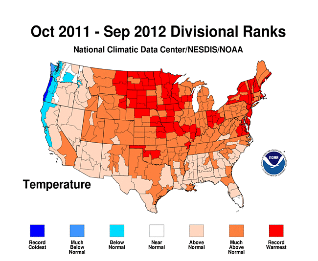
Using figures that you can get at NCDC, I made the animation above. The figure shows the temperature averaged over progressively fewer months (starting with 12 months up to Sep 2012 and going down to just Sep 2012). I think the data in the figure shows that the temperatures departures over the last year (Oct 2011 to Sep 2012) in North Carolina were dominated by unusually large warm anomalies back in the winter months, from about Oct 2011 to Mar 2012. Starting in May 2012, the temperature anomalies in NC were below average, but these below-average temperatures we’ve been experiencing are swamped by the above-average temperatures from the what we did experience (but may have forgotten). When you look at the trend in the country as a whole, and focus on the Oct 2011 to Sep 2012 image when it pops up, you can see that most of the country is very warm compared to average.