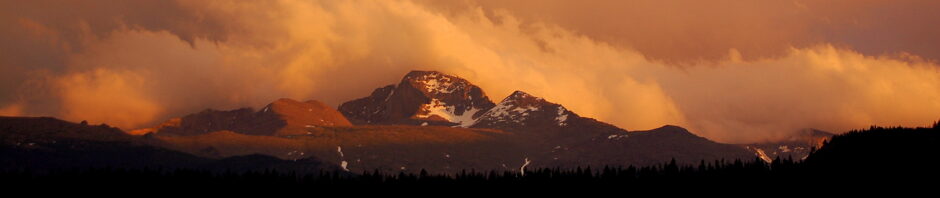
There is a treasure trove of information and misinformation about global warming on the mighty internet. I try to sift through these as I prepare for effective ways to empower students or at least generate discussion. Here are a couple of new-ish resources that visualize the NASA GIStemp gridded temperature anomaly data set, which are described in great detail on that website but also in the peer-reviewed science literature. The New Scientist (UK popular science magazine) created this webapp to allow anyone to point and click on a location to see how the temperature has changed since about 1890. Here’s a snippet of the Southeast USA anomaly averaged from 1893-1912 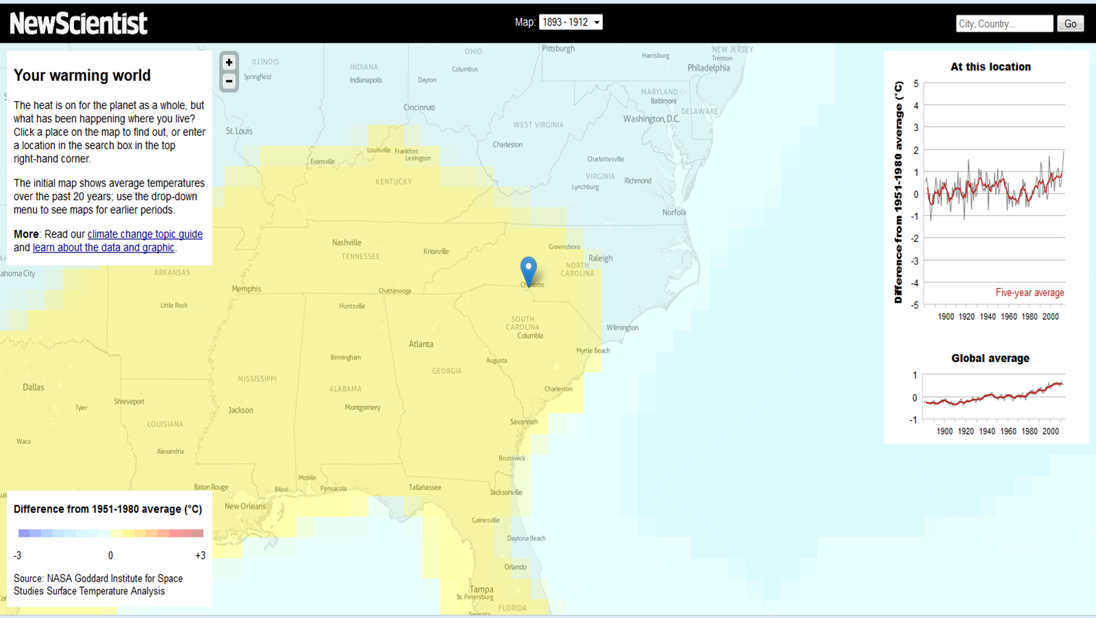 and then from 1993-2012
 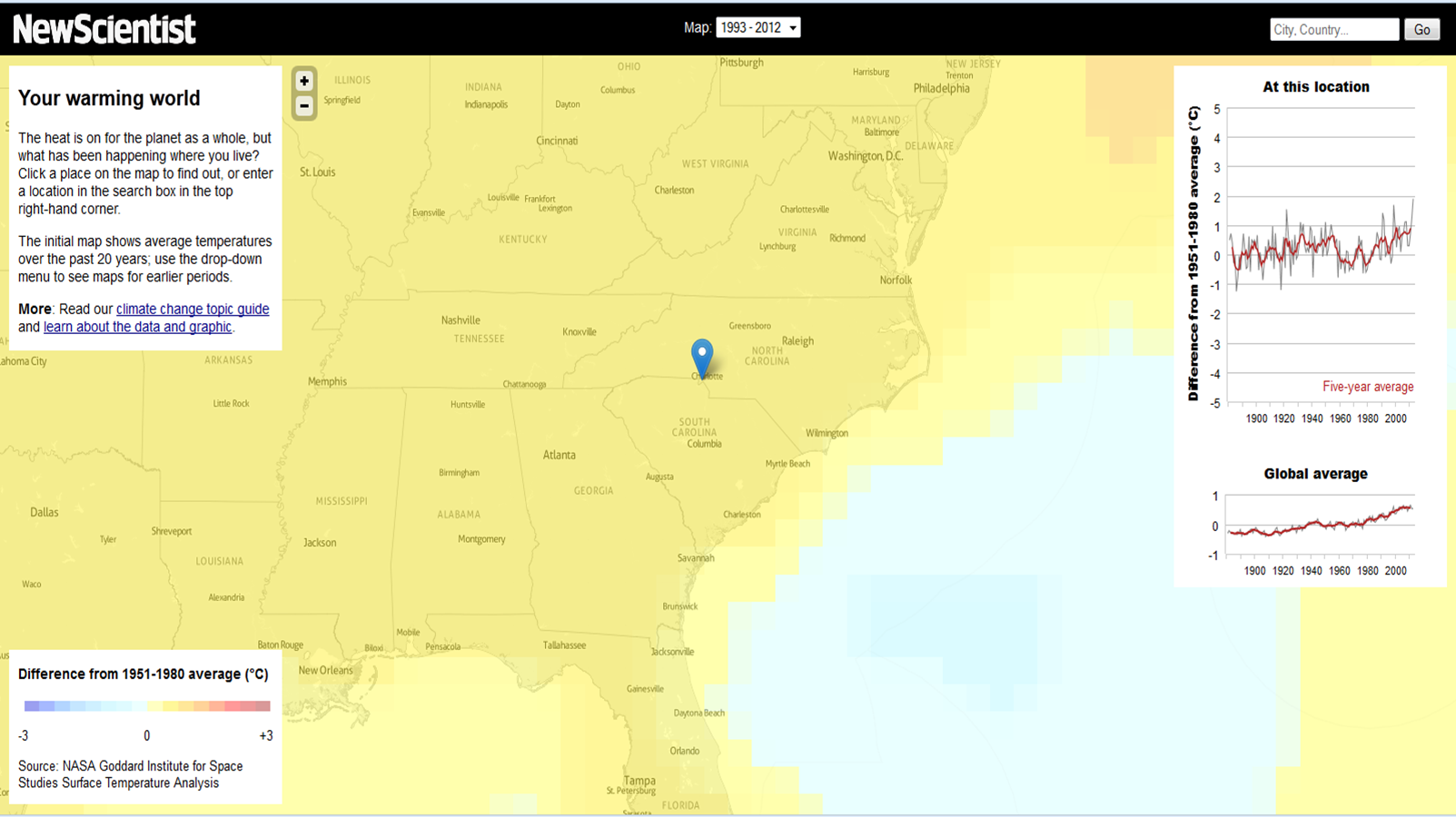 The global warming trend is presented on the right side, while the temperature trend for the specific location is right above it. What’s really nice is the pop-up window that the app opens when you hover over that location-specific temperature trend. You can see the data that’s plotted! Admittedly, it’s pretty easy to get from NASA GISS as indicated via the links on the webapp itself, but still, it’s a great effort by the New Scientist to make sure any person who wants to can reproduce the analysis. And, most importantly, the app itself is a really accessible way to “see” global warming. Other temperature data sets (HadCRU, NOAA NCDC, and a couple of others) have trends that are very similar to NASA GISS – if I find a link showing this comparison, I will post it.
Contact Me
Brian Magi
brian dot magi at charlotte dot edu
Email is the best way to contact me. My office is McEniry 232, and my mailing address is below.
Geography and Earth Sciences
UNC Charlotte
McEniry 331
9201 University City Blvd
Charlotte, NC 28223-0001Meta


