An atmospheric scientist likes to talk about the “state” of the atmosphere. A “meteorological state” usually means knowing the temperature, pressure, dewpoint temperature (moisture), and maybe the wind speed and whether there is precipitation. Climate state is similar but usually presented as a comparitive. I’ve talked about this before, but the essential calculation to understand in climate is the idea of a “departure” or an “anomaly”.*
Climate departures from, say, a climate normal examine the change with respect to what we might expect given past knowledge. A great online resource with very up-to-date climate state is the daily-updated graphs of monthly temperature departure at the High Plains Regional Climate Center (HPRCC). You can easily create presentation-ready figures (properly citing HPRCC) such as temperature departure since first of the month, percent of normal precipitation since first of month, and the analogous figures for temperature departure and percent of normal precip since the first of the year. Here are examples of T and precip in 2013 (so far).
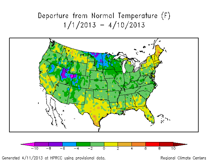
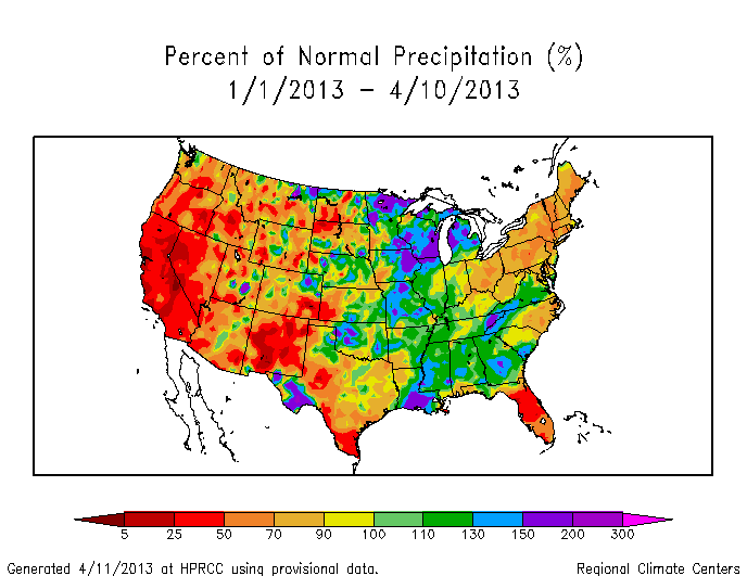
By pressing a few buttons on the internet, you have access to a powerful and constantly evolving data set for the USA. You can evaluate where the USA is in terms of “Is the USA headed to another record warm year like 2012?”, “Has the drought subsided to any degree in the new calendar year?”. With some digging, you can get the numbers in the figures and embark on a more detailed analysis of trends and spatial patterns, but first-order analysis via the HPRCC figures is the natural place to start. For example, studying the figures above, we can quickly deduce that the temperatures in 2013 have been unremarkable compared to the climate normal period (1981-2010). In fact, I think we can safely conclude that through 10 April 2013, the temperature has been cooler than the climate normal period, or in terms of the colors on the graph, most of the figure is light green (a slight negative departure). This is a big shift from 2012, where March shattered records across much of the country and started off a long anomalously warm year in the USA. Precipitation trends for 2013 (so far) seem to suggest that the mountain west remains at less than 50% (red to dark red) of the climate normal period precipitation. The spatial map figures give you the additional power to watch not only the country, but parts of the country that might be more directly relevant to you.
Global warming introduces the increased probability of more warm years – this is very clear from data which I’ll post about soon. In the meantime, when you ask a question about the climate state, you can rest assured that they can be answered. What will 2013 bring us when the fire season starts in earnest? Or as the temperature time series evolves? Keep clicking on HPRCC to find out. Unlike sports seasons, the season for climate-relevant stats never ends.