
Time series are profilic in climate science. This is a dataset that shows the how a measurement changes over some period of time. The best known in our world is the global warming time series displayed as the globally-averaged surface temperature trend, which is compiled from thermometer measurements. A few research groups worldwide maintain this analysis (NASA GISS, UK Met Office, NOAA NCDC). Since CO2 is in the news, and since there is variability from one measurement location to another, it is useful to see how the best-known station in Mauna Loa, Hawaii (source of the data shown in the Keeling curve graph). Once you navigate the shifting axes (y-axis on the right and left, and the time series begin at different points in the past) and digest the information visualized here, the graph below is very useful in quickly understanding variability in CO2 concentration from the northernmost latitudes to the southernmost, noting the latitude is listed under the three-letter station identifier but that the graph is arranged north to south.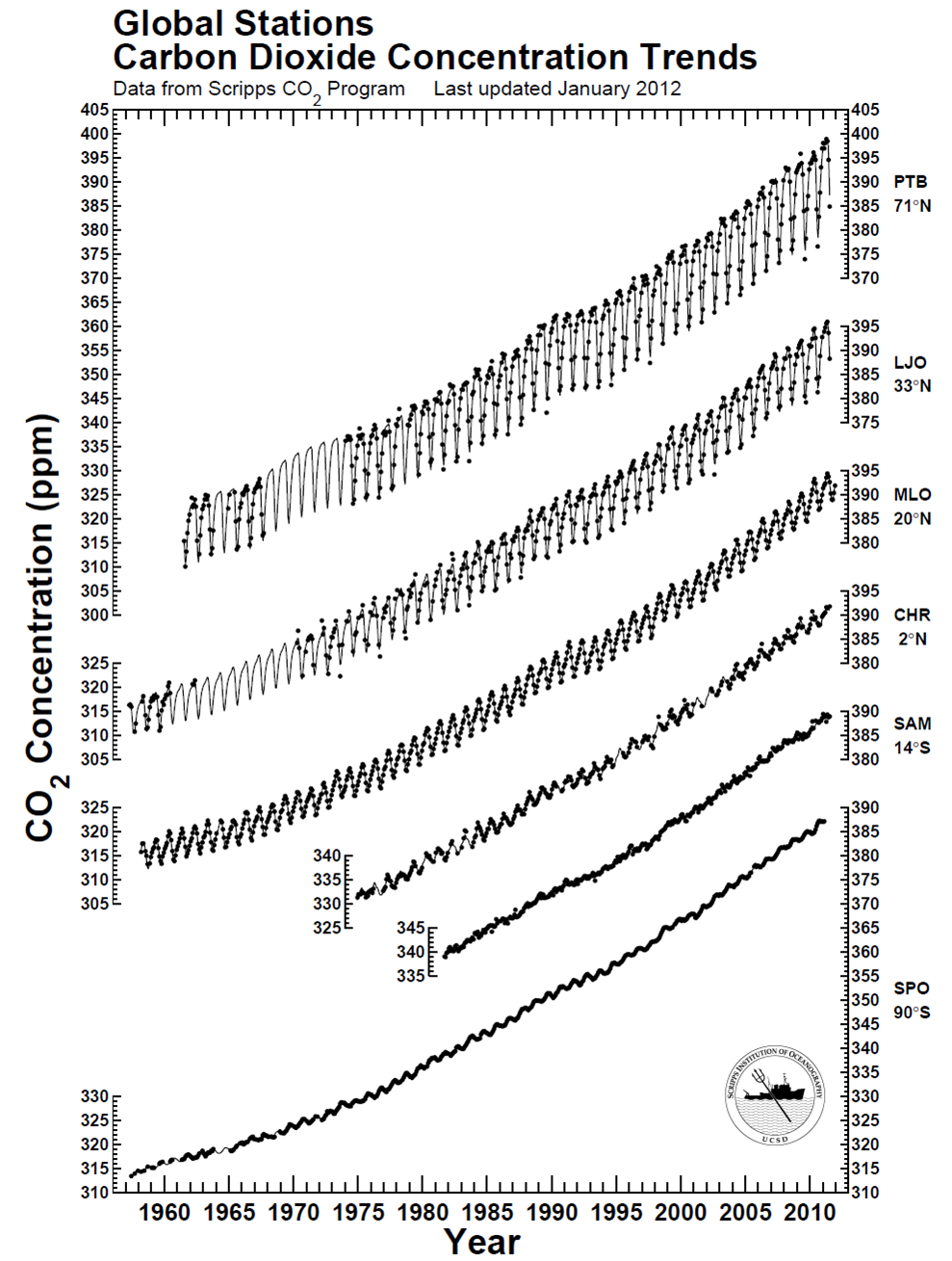 There is clearly a bias toward higher CO2 in the northern hemisphere compared to the southern hemisphere – CO2 is about 10-12 ppm higher near the north pole. This piece of information – this data – reflects the higher abundance of sources of CO2 in the northern hemisphere and the relatively slow transport times required for air to move across the equator (like a slow drip compared to the winds we feel every day in the USA). The graph also effectively conveys another dimension of information: Regardless of the specific location of CO2 measurement, the long-term trend is essentially the same worldwide, indicating that CO2 continues to accumulate in the atmosphere worldwide at about the same pace. The trend could relatively easily be quantified, but sometimes qualitative analysis is enough. From the webpage where I found the figure, the station identifiers are PTB = Point Barrow, LJO = La Jolla, MLO = Mauna Loa Observatory, CHR = Christmas Island, SAM = Samoa, and SPO = South Pole. You can also find some commonality in the stations at NOAA’s website. All in all, a great data visualization that can be done entirely in black-and-white!
Contact Me
Brian Magi
brian dot magi at charlotte dot edu
Email is the best way to contact me. My office is McEniry 232, and my mailing address is below.
Geography and Earth Sciences
UNC Charlotte
McEniry 331
9201 University City Blvd
Charlotte, NC 28223-0001Meta


