Earth System Observer

Analysis and observations about the science of our complex planet

Global carbon emissions increased in 2012

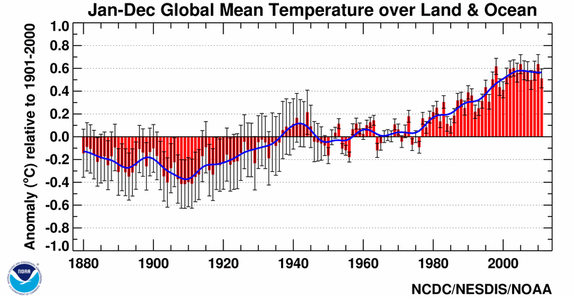
Unlike the somewhat misleadingly rosy picture painted by President Obama about (USA) carbon emissions in his Inaugural Address and his State of the Union speech in 2013, the global carbon emissions are what matter. So if the USA continues to mine coal and ship it elsewhere, it is not an improvement except for the USA emissions portfolio. It’s like a gambler who doesn’t count losses at casinos other than the one he or she is sitting at. The International Energy Agency released a report stating that global carbon emissions are up 1.4%.bluemarble.eastI haven’t read the IEA report, but I came across the press release via the excellent energy/economy reporting they are doing. Then I heard the same WA Post reporter on the Diane Rehm show this morning (available for mp3 download via ITunes, for example). Then I read about the IEA article on Climate Central. Whew!

The Diane Rehm show had a good panel, with a requisite global warming “skeptic” (whatever that means!). That skeptic role was played by an analyst from The Heritage Foundation*. The other roles on the panel were the Post journalist, an analyst at the Environmental Defense Fund**, and a research scientist from Rutger’s University***. I would say that Diane Rehm handled the panel well, and I think that the Heritage Foundation representative overplayed his hand to the point where his comments were generally made irrelevant. In other words, he spoke too much and too glibly (is that a word) and made points that undermined his real argument that adaptation may be the most likely pathway (which is actually kind of interesting). The other panelist laid into the sillier points that the skeptic made and shut him down. Rehm left it that way.

Shutting down those punchline-style quips (memes) is really how the discussion should be every time. The Earth is warming. CO2 and other greenhouse gas concentrations continues to rise. The conversation should be about how it is our civilization needs to adapt and change. This is what the IEA discusses. Mitigation of carbon emissions is a huge discussion in the science journals. The IEA report is highlighting that we as a civilization are heading towards a major point in our hunger for fossil fuel based energy. This hunger has been targetted by scientist since the 1980s and arguably since the late 1800s! Think about solutions and strategies when you are thinking of how you want to make an impact on your community or your country or even the world. Think about our Earth and our future. The world needs you.

*The Heritage Foundation webpage states: Founded in 1973, The Heritage Foundation is a research and educational institution—a think tank—whose mission is to formulate and promote conservative public policies based on the principles of free enterprise, limited government, individual freedom, traditional American values, and a strong national defense.

**The Environmental Defense Fund webpage states: We are passionate, pragmatic environmental advocates who believe in prosperity and stewardship. Grounded in science, we forge partnerships and harness the power of market incentives.

***Dr. Jennifer Francis is deeply involved in improving our understanding of how the Arctic affects the USA – see google scholar or video of her talking about her work

Bring on double-blind peer review

My peer-reviewed publication record isn’t long yet, but I have participated in the anonymous peer-review process in a number of different scientific journals. I’ve read some great science that I thought was ready to be published only to see it rejected at the editor level of the journal. I’ve read grant proposals (how scientists fund their research but also how they gain recognition well beyond their immediate sphere of colleagues) that I would recommend and support, but that are rejected. I’ve read other manuscripts that I reject repeatedly to the point that I tell the editor asking me to review the article yet again that I simply will not read that article anymore. Science is built on recognizing incremental progress towards a solution, and more rarely on that great leap forward. Underneath it all, however, is the peer-review process.

Peer-review is the gateway to publications in technical journals, acceptance into conferences and workshops, and earning money to conduct research through grant proposals from funding agencies like NSF and NASA (among others). All professors hired to do research face these basic metrics when their professional activities are reviewed. Did they publish? Were they awarded a grant? Did they attend conferences? Other than organizing travel around teaching (and family), the last one is the easiest professional activity to participate in. I have never been rejected from a conference, for example. Conferences also carry the least weight when professional activities are reviewed.

So it comes back to publications and grants – two activities that are strongly dependent on peer-review. When I began reviewing articles submitted for publication as a graduate student, I couldn’t believe that the process of review was anonymous only from the reviewer side. Right away, I thought the review should be anonymous from both sides – the reviewer should not know who the authors (usually there are multiple) are and the author(s) should not know who reviewed the paper. Imagine a 4th year PhD student receiving a paper to review from a prominent journal that is co-authored by a scientist who has 100+ publications (a large number in climate and related sciences – usually meaningful in the sense that this person has done some serious work. Check out James Hansen’s peer-reviewed publication list) What kind of bias does the reputation/track-record of that author introduce into the review process for that poor graduate student? The same issue of a heavy hitter can play out the other way too. Imagine that prominent scientist is reviewing the second paper you’ve ever published and they’ve never heard your name or anything about your research. They might (might!) more easily dismiss your work than they would of a fellow heavy-hitter. The question of bias is hard to answer quantitatively. All that being said, I have had some great informal interactions with reviewers of my papers who voluntarily disclosed their identity. And even without knowing the reviewer’s name, their comments have almost always helped to improve my paper in some way. Still, bias is a nasty beast and scientists are human. That link goes to a paper published last year that concludes

The dearth of women within academic science reflects a significant wasted opportunity to benefit from the capabilities of our best potential scientists, whether male or female. Although women have begun to enter some science fields in greater numbers, their mere increased presence is not evidence of the absence of bias. Rather, some women may persist in academic science despite the damaging effects of unintended gender bias on the part of faculty. Similarly, it is not yet possible to conclude that the preferences for other fields and lifestyle choices that lead many women to leave academic science (even after obtaining advanced degrees) are not themselves influenced by experiences of bias, at least to some degree. To the extent that faculty gender bias impedes women’s full participation in science, it may undercut not only academic meritocracy, but also the expansion of the scientific workforce needed for the next decade’s advancement of national competitiveness.

Maybe the tone of that conclusion is reflected in this “letter” to Harvard University published recently in the Washington Post. I’m not convinced that the letter is really effective, but the point I took from it was that bias has consequences that may not be evident right away. Clearly, bias (intended, but more likely unintended as the PNAS article concludes) is, as I said before, a nasty beast.

Getting back to peer review and how it’s susceptible to bias, the simplest solution is that both sides remain anonymous and this is known as a double-blind peer-review. Finally, the journal Nature, which has a long history and is internationally-recognized and is so large it is now a publishing group with a number of disciplinary publications, has decided to include the option for double-blind peer-review in the journals Nature Geosciences and Nature Climate Change. This move is in my mind really important and I hope it is successful. Nature Geosciences published this editorial. The key point in this editorial is

In a reader survey last year (Nature Geosci. 5, 585; 2012), three-quarters of respondents were supportive of double-blind peer review, with only 16% unconvinced. Interestingly, those who might benefit did not preferentially support a double-blind process: the ratios of males to females, established scientists to young researchers, and people from western countries to scientists elsewhere in the world, were all very similar (down to a per cent or so) between supporters of double-blind peer review and the entire group of respondents.

Towards the future we go!

CO2 trends from around the world

Time series are profilic in climate science. This is a dataset that shows the how a measurement changes over some period of time. The best known in our world is the global warming time series displayed as the globally-averaged surface temperature trend, which is compiled from thermometer measurements. A few research groups worldwide maintain this analysis (NASA GISS, UK Met Office, NOAA NCDC). Since CO2 is in the news, and since there is variability from one measurement location to another, it is useful to see how the best-known station in Mauna Loa, Hawaii (source of the data shown in the Keeling curve graph). Once you navigate the shifting axes (y-axis on the right and left, and the time series begin at different points in the past) and digest the information visualized here, the graph below is very useful in quickly understanding variability in CO2 concentration from the northernmost latitudes to the southernmost, noting the latitude is listed under the three-letter station identifier but that the graph is arranged north to south.co2-globaltrends
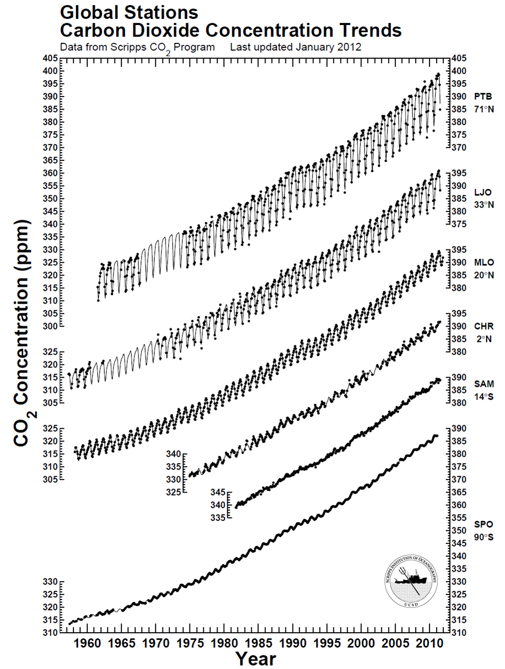
There is clearly a bias toward higher CO2 in the northern hemisphere compared to the southern hemisphere – CO2 is about 10-12 ppm higher near the north pole. This piece of information – this data – reflects the higher abundance of sources of CO2 in the northern hemisphere and the relatively slow transport times required for air to move across the equator (like a slow drip compared to the winds we feel every day in the USA). The graph also effectively conveys another dimension of information: Regardless of the specific location of CO2 measurement, the long-term trend is essentially the same worldwide, indicating that CO2 continues to accumulate in the atmosphere worldwide at about the same pace. The trend could relatively easily be quantified, but sometimes qualitative analysis is enough. From the webpage where I found the figure, the station identifiers are PTB = Point Barrow, LJO = La Jolla, MLO = Mauna Loa Observatory, CHR = Christmas Island, SAM = Samoa, and SPO = South Pole. You can also find some commonality in the stations at NOAA’s website. All in all, a great data visualization that can be done entirely in black-and-white!

CO2 time line for May 2013

The month of May is officially over, and perhaps the Earth is about to take a big breath in and begin to draw down CO2 from its year 2013 peak. The last tweets by @Keeling_curve showed a relatively (emphasis on relatively!) sharp decrease from May 29 to May 30 with CO2 falling from 400.33 ppm to 398.41 ppm, and then May 31 had variability that was too high as tweeted here. Funny side note was that for whatever reason, this “data too variable” drew the attention of one well-known (but not well-respected) blog, to which @Keeling_curve replied “see here“. Geez, you’d think seasoned bloggers would click a couple of web links before tweeting a question like that. The values of CO2 should start their annual decrease from the peak value in the Northern Hemisphere as the plant life in temperate and polar zones comes to life, but in the mean time, we’re living in the age of a 400 ppm CO2 world, which is very unusual in recent geological history, as discussed here and shown here. Here’s the time line of CO2 concentrations for this historic May 2013co2-2013-05
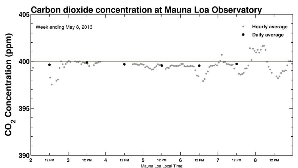
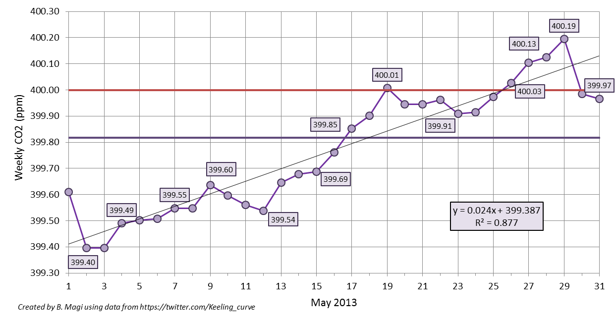
which shows the weekly-averaged CO2 from the daily-averaged values posted on Twitter (ok, tweeted). The straight horizontal purple line is the monthly-averaged CO2 of 399.82 ppm (wow!), and the straight red line is the mystical 400 ppm CO2. I calculated the weekly-average as the value of the previous 7 days up. For example, May 15 weekly-average is the average of values from May 9 through May 15. The weekly-average ideally is 7 data points, but occasionally a daily-averaged value is not tweeted due to high variability in the data. From the figure you can see that we reached our first weekly-averaged CO2 concentration greater than 400 ppm on May 19. I actually thought that would be it for the year, but from May 24 to May 29, daily values were again well over 400 ppm. This brought the number of weekly-averaged values greater than 400 ppm up to 5. Roughly, about 33% of the days in May 2013 had CO2 greater than 400 ppm. The decline should begin soon with the annual minimum in September-October reaching values of about 394-395 ppm, noting that the annual minimum for 2013 will probably be very close to the maximum from only 2 years ago. Below is the data shown in the graph above. An impressive May, and one that will be recorded in the history books.

                       carbon dioxide (ppm)
year    month   day     daily   weekly
2013	5	1	*	399.61
2013	5	2	399.29	399.40
2013	5	3	*	399.40
2013	5	4	399.68	399.49
2013	5	5	399.54	399.50
2013	5	6	399.52	399.51
2013	5	7	399.71	399.55
2013	5	8	*	399.55
2013	5	9	399.73	399.64
2013	5	10	399.4	399.60
2013	5	11	399.46	399.56
2013	5	12	399.41	399.54
2013	5	13	400.16	399.65
2013	5	14	399.91	399.68
2013	5	15	399.74	399.69
2013	5	16	400.25	399.76
2013	5	17	400.04	399.85
2013	5	18	399.8	399.90
2013	5	19	400.15	400.01
2013	5	20	399.73	399.95
2013	5	21	399.91	399.95
2013	5	22	399.85	399.96
2013	5	23	399.88	399.91
2013	5	24	400.09	399.92
2013	5	25	400.2	399.97
2013	5	26	400.53	400.03
2013	5	27	400.27	400.10
2013	5	28	400.06	400.13
2013	5	29	400.33	400.19
2013	5	30	398.41	399.98
2013	5	31	*	399.97

*data was too variable over the course of the day. no value was reported on twitter.

Climate science movies

I held a screening of Thin Ice: The Inside Story Of Climate Science on Earth Day in April 2013, the day the film was released. The response from the students was good – they liked seeing Earth scientists working on complex data collection related to improving our collective understanding of the Earth system. thiniceBased on a written survey I asked many to fill out, I would say that the most general concern was that Thin Ice did not show enough data analysis – a great initial exploration into climate data is the National Academy of Sciences documentary on youtube called Climate Change: Lines of Evidence. I personally really appreciated the work of the Thin Ice film makers in showing not only how cohesive seemingly disparate problems in Earth sciences actually are, but also how enthusiastic Earth scientists are about their work. This enthusiasm, this love of their world and trying to understand it, is in my experience “the norm” amongst scientists studying some aspect of the Earth, whether that research is about the climate or climate change or weather or whatever (Earth sciences is a big topic). We love actively trying to solve these mysteries and understand how the physical world works. So I heartily recommend Thin Ice to anyone thinking about majoring in Earth Sciences or Meteorology or Geology or Geography. chasingiceYou may not work with ice cores or ocean-based research or even climate models, but you will have the chance to work with a group of highly dedicated people on problems that are interesting and sometimes poorly understood. Let your passion lead you!

Thin Ice the movie is available for mp4 download for only $10 through June 15 and you can watch from any device that plays mp4s. I will almost certainly screen Thin Ice in the Fall and Spring semesters of the upcoming academic year in my courses (Global Environmental Change and Applied Climatology). I am planning on buying another movie that visualizes change in a much different way called Chasing Ice. I haven’t watched this one yet, but I’ve heard very good things about the sweeping and powerful images of ice melting away before our eyes as the globe continues to warm.

Why is ice the theme of both movies? Well, actually Thin Ice is more about the scientists studying climate and my understanding of Chasing Ice is that it documents the ice as it is now with the implication that the ice will not be this way in even another generation. So, two ice-themed movies, but much different messages. Buy the mp4 of Thin Ice or watch for my screenings announcements. I’m 90% sure I’ll screen Chasing Ice in at least one of my classes as well. Visualizing global warming and seeing what scientists do (and LIKE to do!) is really important.

CO2 in the very merry month of May

The whole month has been an edge-of-your-seat wait-and-see when CO2 will stop hovering above and below 400 ppm and just stay above. Unlike Miguel Cabrera‘s triple crown of 2012 or the thoughts that he could repeat that feat in 2013 or even be the first since Ted Williams to hold a 400 batting average (can he do it – this evidence says yes), the increase in CO2 above 400 ppm is inevitable. Inevitability means you just need patience. Patience for me means more time to think about the numbers.

CO2 data are available from a number of sites

Sites around the world that are monitoring CO2 and other gases in the atmosphere.

Sites around the world that are monitoring CO2 and other gases in the atmosphere.

and there are differences in hemispheric CO2 concentrations that are completely expected due to emissions source location and atmospheric transport times, as discussed earlier. The Mauna Loa CO2 measurements are the ones I’ve been watching with more interest than this year’s baseball season and the daily-averaged CO2 concentrations are reported on the web and via twitter, among other places. Twitter is turning out some good and interesting data like this.

According to the twitter feed, daily-averaged CO2 exceeded 400 ppm on May 13 with CO2 of 400.16 ppm. By my own calculations using the daily tweets, weekly-averaged CO2 exceeded 400 ppm for the first time in the week ending May 19 (CO2 was 400.01 ppm). The next milestone is when the monthly-averaged CO2 exceeds 400 ppm, and then annually-averaged, and so on. We are approaching what should be the peak CO2 this calendar year as the growing season begins and CO2 is drawn down from plants breathing in CO2. Eventually, the Earth will be perpetually impacted by more than 400 ppm CO2 and even the seasonal drawdown in CO2 of 5-6 ppm from May to October every single year as plants in the biosphere convert CO2 into oxygen via photosynthesis will not overcome the long-term trend in CO2. The CO2 will remain in our atmosphere for 100s-1000s of years. The Earth will slowly re-equilibriate to this elevated CO2 through a myriad of processes that include ocean uptake, plant growth, chemical weathering, and finally increased surface and lower atmospheric (tropospheric) temperatures due to the absorptive power of CO2 in the infrared part of the electromagnetic spectrum. The impacts of increased CO2 and other atmospheric components that can force climate into a new state are the main reason climate science remains active. In a post that will be ready as soon as the data is available (June 2), I’ll show the weekly-averaged CO2 trend in the month of May based on the Keeling Curve twitter feed. In other words, I’ll show inevitability.

CO2 and climate sensitivity

On Thursday, May 16, 2013, the official daily-averaged CO2 concentration in the atmosphere was reported by Scripps as (drumroll please)co2-2013-05-16Like I pointed out, 400 ppm is inevitable because CO2 increases by 2 ppm every year, but to actually see a value like that reported makes it more real. Now we await a value that is over 400 ppm for an entire week, and then for a month, and then it’s just a matter of time when we are in a world with 400 ppm of CO2, remembering how different this is than any time in Earth’s recent history as shown in the figure to the right (click to make larger).co2_800kRemember that CO2 in the atmosphere is a pretty simple physical perturbation on the Earth’s energy budget – more CO2 will result in an atmosphere that absorbs more of the infrared energy that the Earth emits to space to try and cool off. The energy that does not escape and is absorbed is then re-emitted towards the surface (and towards space). This forces the Earth to warm in response to try to bring the energy budget back into balance since balance is inevitably what everything in the universe seeks to achieve. This forcing of the Earth’s temperature has never been in doubt. The real question is how the Earth SYSTEM will respond to the extra energy or extra warmth. The SYSTEM is something I will start talking about here and it is certainly the most complicated aspect of climate science. Imagine the complexities associated with trying to understand how the atmosphere, ocean, land and plants, ice, and even humans and animals will all respond and how each affects the other! That is the heart of Earth system science and the heart of the very current discussion about climate sensitivity – a measure of how the system in total will respond to perturbations like more CO2 in the atmosphere. A very nice op-ed in the New York Times by Justin Gillis this week highlights the frank evaluation and debate about climate sensitivity occurring in the scientific community that has arisen from the apparent slowdown in the increase in globally averaged temperature (since about 2002 in the GISS time series or slightly more evident in the NCDC time series below)global-201101-201112The issue is getting a load of attention and, as Gillis wisely acknowledges, the analysis and studies in the peer-reviewed scientific literature will take a couple of years to “settle” on an answer. I agree. The public and policy makers and just about everyone wants to know the answer though so every publication or even statement about climate sensitivity will be intensely amplified. I’ve been reading about this issue myself, mostly as I prepare to bring the very current discussion into the classroom (here, here), but also because I am as concerned about the Earth as anyone. Here’s a final statement by Gillis that I also agree with.

Even if climate sensitivity turns out to be on the low end of the range, total emissions may wind up being so excessive as to drive the earth toward dangerous temperature increases. So if the recent science stands up to critical examination, it could indeed turn into a ray of hope — but only if it is then followed by a broad new push to get the combustion of fossil fuels under control.

Regardless of the climate sensitivity, changes to our lifestyles are inevitable. Will our society and will the USA be seen as forward-thinking or will we revert to the simplest and most destructive way to get energy?

Cold spring and signs of summer

A great description of some of the unusual recent temperature swings in the north central part of the USA by Minnesota State Climatologist office with the original link here:

A taste of summer air surged into Minnesota on May 14th, sending the mercury soaring into the 80s and 90s across a good part of the state. A few locations even cracking 100 degrees. Notable exceptions were locations near ice covered lakes in northern Minnesota and near Lake Superior. At 2pm May 14th, the air temperature was 102 degrees at St. James and 44 degrees at Grand Marais. This kind of temperature range happens occasionally in the spring. One of the more dramatic episodes in recent years was May 19, 2009 when there was a difference of 66 degrees from Grand Marias to Granite Falls. The warmest temperatures found from a National Weather Service Cooperative site was 103 degrees from Sherburne 3 WSW in Martin County and Winnebago in Faribault County. Amboy also had reading of 102 degrees. Extremely dry air was in place as well, with desert-like relative humidity readings in the single digits at St. James. At 2pm while it was 102 degrees at St. James, the dew point temperature was only 28 degrees, creating a relative humidity of seven percent. Very low relative humidity readings happen on occasion. On April 28, 2004 the relative humidity dipped to just 2% at Pipestone. The lowest relative humidity reading ever recorded in the Twin Cities is 10% measured at 5pm April 22, 1953. The statewide hottest maximum temperature for the entire month of May is 112 degrees measured at Maple Plain in Hennepin County on May 31,1934. The Twin Cities had a high temperature of 98 degrees on May 14. This broke the old record high of 95 degrees that was set in 1932. This is also the hottest temperature recorded so early in the season for the Twin Cities. Ironically, despite how cool it has been this spring, 2013 had its first 90 plus degree day in the Twin Cities four days earlier than 2012, which hit 93 on May 18.

That last line is a pretty interesting weather tidbit, noting that the salient graphs from NCDC are below201304201302-201304 North Dakota had its coldest April in 119 years! Yow. Most of the central part of the country was colder than average, but by comparing the April 2013 to the multimonth average February-April 2013 plot, you can see signs of the transition out of spring to summer as well as parts of the country which had an above-average warm month (California, mid-Atlantic, Nevada, Arizona). More about this later – but these “extremes” are exactly the kind of weather we can expect as the Arctic warms or stays warmer than usual due to less sea ice. N_stddev_timeseries-2013-05The Sun will eventually win this battle and the mid-latitudes (southern USA) will inevitably heat up this year (at least I think so!). Here’s the temperature departure for the last week from HPRCC which clearly shows relatively warm temperatures creeping from the Pacific Northwest into the heretofore frozen Great Plains. 7dTDeptUS-2013-05-16 
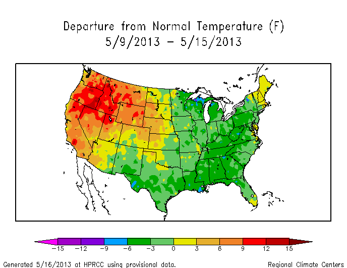
Summer is coming. Will Summer 2013 be like Summer 2012? Another question for another day.

Another week of CO2 from Scripps

An update to my update from the original post. CO2 is rising 2 ppm/year and has been for about the last decade (see graph here). So the daily ups and downs and pretty miniscule. 2 ppm/year is 0.0055 ppm/day, or thought of yet another way – it’ll take about 180 days for CO2 to increase 1 ppm. While we await the inevitable, here’s an update with May 13 at least above 400 ppm, although the measurements are pretty variable for some reason.mlo_one_week-2013-05-14Variability in CO2 during the course of any one day can be for a number of reasons. One that scientists responsible for quality-control of the data have to account for is the simple fact that Mauna Loa is a gigantic shield volcano

Photo taken by me from the Kilauea Caldera in 2007.  Mauna Loa (13000 ft elevation) looms in the background under a shroud of clouds, but it's shocking how small that 13000 ft mountain looks.

Photo taken by me from the Kilauea Caldera in 2007. Mauna Loa (13000 ft elevation) looms in the background under a shroud of clouds, but it’s shocking how small that 13000 ft mountain looks.

Well, scientists are nothing if not rigorous and attentive, so here’s a nice post by a NOAA scientist talking about the volcanic CO2 pulses that occasionally disrupt the background CO2 measurements that Mauna Loa is best known for. I haven’t read the papers about the volcano relevant emissions, but the link at the bottom of the page gives the information needed to track down the publications via google scholar. That being said, it doesn’t look like the variability in the hourly values for May 13 CO2 was due to volcanic emissions.

CO2 hovering above and below 400 ppm

An update from the measurements being reported from Scripps that I discussed earlier. Here’s the screen shot when I checked the “box scores” for our favorite greenhouse gasco2-2013-05-07
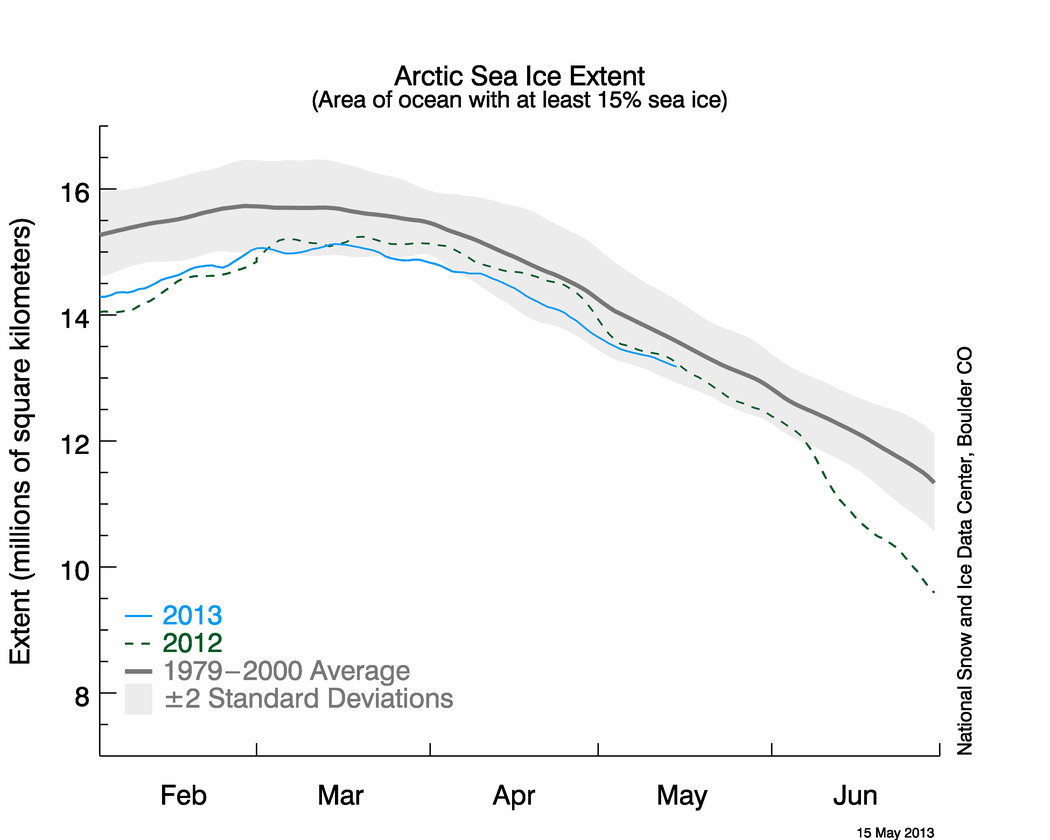
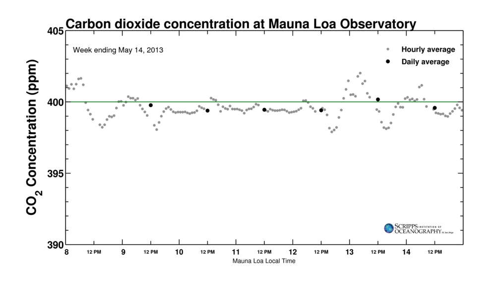
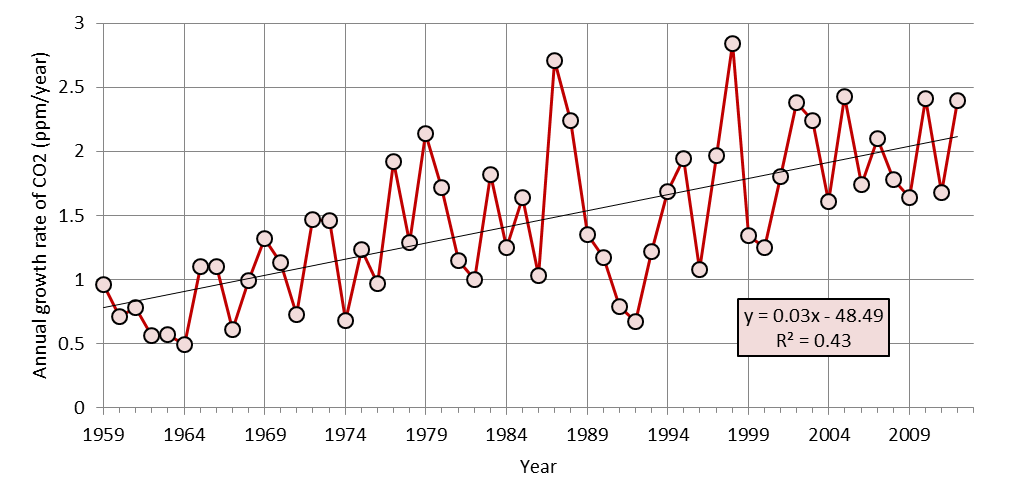
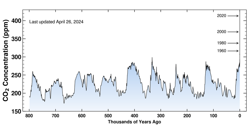
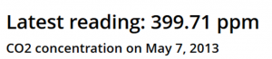
whew! I know if I patiently wait, the CO2 concentration will rise above 400 ppm in earnest since CO2 concentrations have been increasing by about 2 ppm/year

Global growth rate of atmospheric concentration of CO2

Global growth rate of atmospheric concentration of CO2 from 1959 to 2012 (data from NOAA ESRL in link below). 1959 is the start of in situ measurements. The best-fit line is overlaid for reference. You can see that the correlation coefficient is high. In this case, the R2 = 0.43 means that a line captures about 43% of the variance in the annual data. That, in turn, means that a line is a good approximation for predicting where we are going in the near-future.

for a long time with some indication of acceleration in the last few years as the NOAA ESRL CO2 data repository data indicates. Finally, note that hourly measurements of CO2 have already jumped over 401 ppm at times as shown in this figure from Scripps. 400 ppm is inevitable, but what this means for the world is something that science is trying to figure out.mlo_one_week-2013-05-07