I’m excited to be hosting an American Geophysical Union (AGU) session in December 2017 and excited about only having to fly to New Orleans instead of San Francisco. This is the first time in many many years that AGU has not been in San Fran. My session co-conveners are Sam Rabin (Germany), Fang Li (Beijing), and Guido van der Werf (Netherlands). Alex Schaefer (my PhD student) will certainly be out there, and I hope our session hosts a diverse set of oral and poster presentations that allow us all to collectively explore the many different scales of how to study fire patterns on our planet, and what it all means in the context of the on-going human-driven climate change. The session viewer link for AGU is at https://agu.confex.com/agu/fm17/preliminaryview.cgi/Session26024 and here are the details:
Session Title: Quantifying drivers of global and regional fire patterns using data and models
Session ID#: 26024
Session Description: Fire is a critical component of Earth system dynamics and the carbon cycle. However, since climate and human driving factors vary considerably over time and space, capturing observed patterns using simulations remains a major challenge. These challenges also result in important uncertainties in predicting future fire activity, understanding past fire activity, and quantifying the role of fire in the Earth system. Paleorecords offer a diverse source of global/regional fire data on decadal to millennial timescales. The present day has extensive satellite records and increasingly detailed observations. Fire model are informed by present day records, but offer a way to test fundamental hypotheses well beyond the present. This session seeks presentations that aim to quantify the role of humans and climate in driving patterns of fire at multiple spatiotemporal scales. The goal of our session is to foster interdisciplinary discussions of how data can inform models, and models can inform data.
Primary Convener: Brian Indrek Magi, University of North Carolina at Charlotte, Charlotte, NC, United States
Conveners: Sam S Rabin, Karlsruhe Institute of Technology, Karlsruhe, Germany, Fang Li, Inst. of Atmospheric Physics, Beijing, China and Guido van der Werf, Organization Not Listed, Washington, DC, United States
Cross-Listed: A – Atmospheric Sciences, GC – Global Environmental Change, NH – Natural Hazards
Index Terms: 0414 Biogeochemical cycles, processes, and modeling [BIOGEOSCIENCES], 0434 Data sets [BIOGEOSCIENCES], 0466 Modeling [BIOGEOSCIENCES], 1630 Impacts of global change [GLOBAL CHANGE]
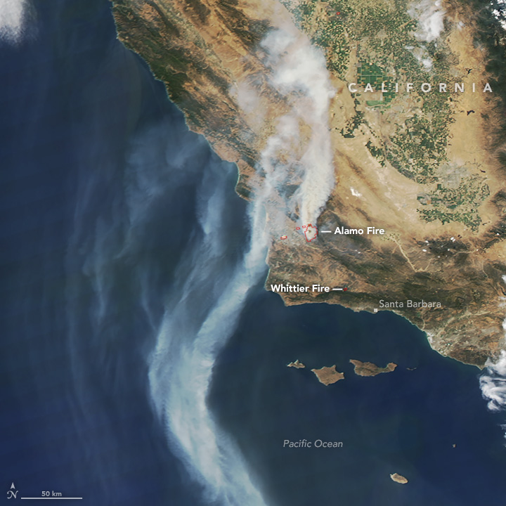
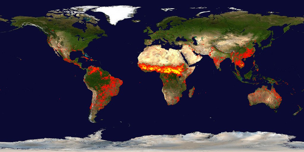
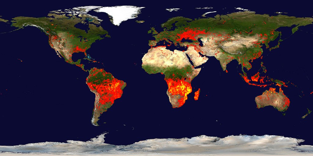
Fires in California during Summer 2017
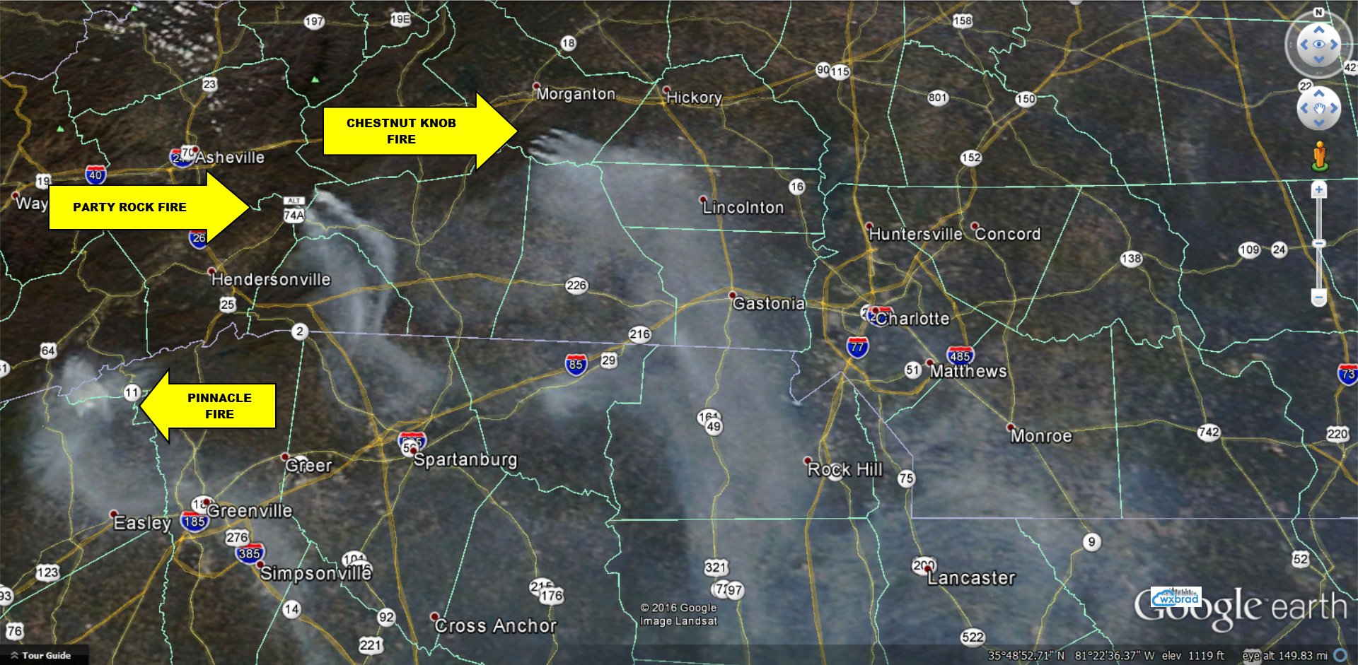
 So I applied our
 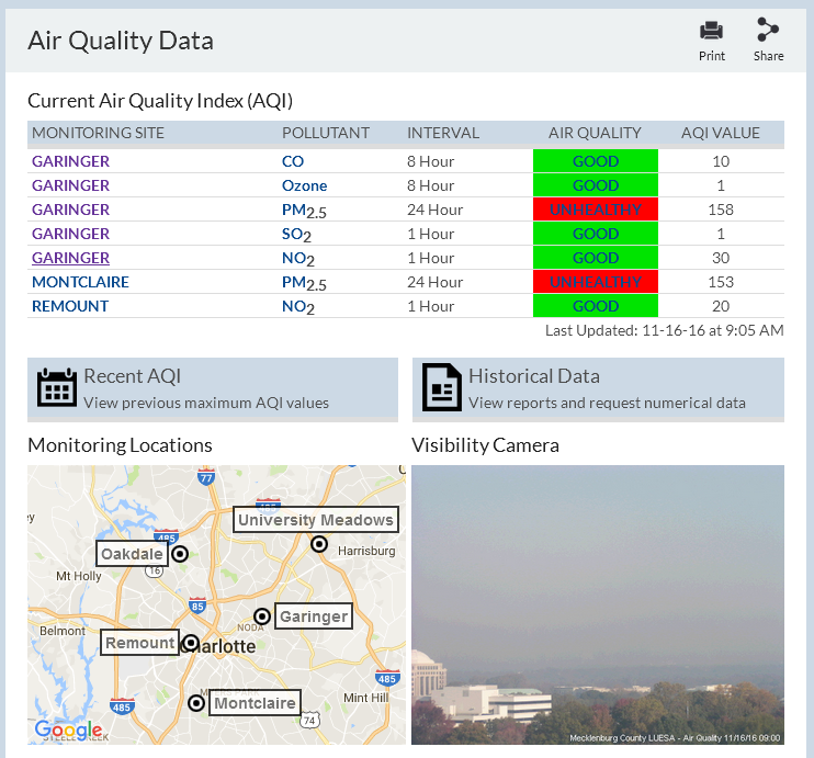 This morning, Charlotte/Mecklenburg was in Code Red air quality, which is an unusually high value of AQI that we have not experienced in the last five years at least (thankfully!). Our AQI was 158 this morning from
 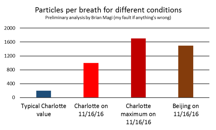 Bottom line, for much of the day we were breathing more than 10 times as many particles in every breath than usual. This is like a semi-typical day in Beijing where 50% of the days have AQI greater than 169
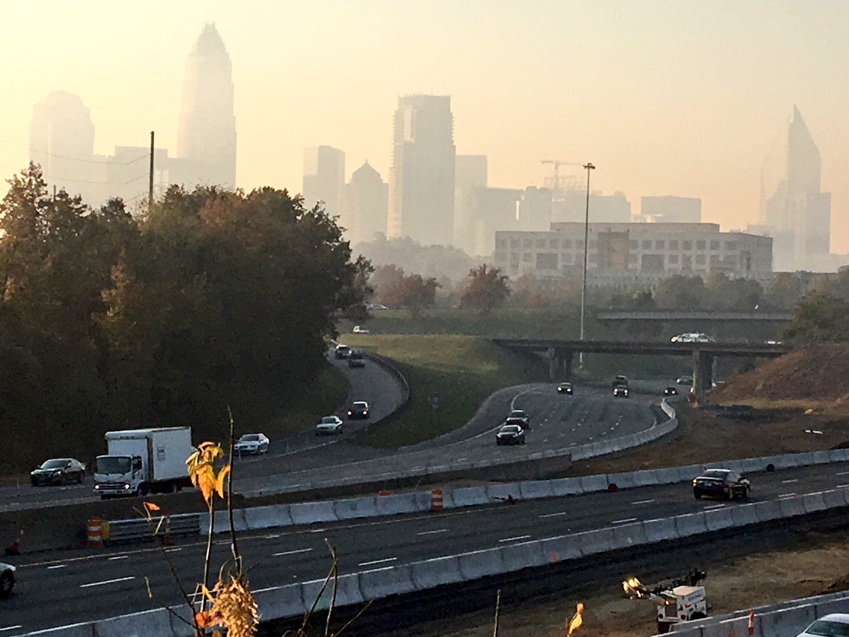


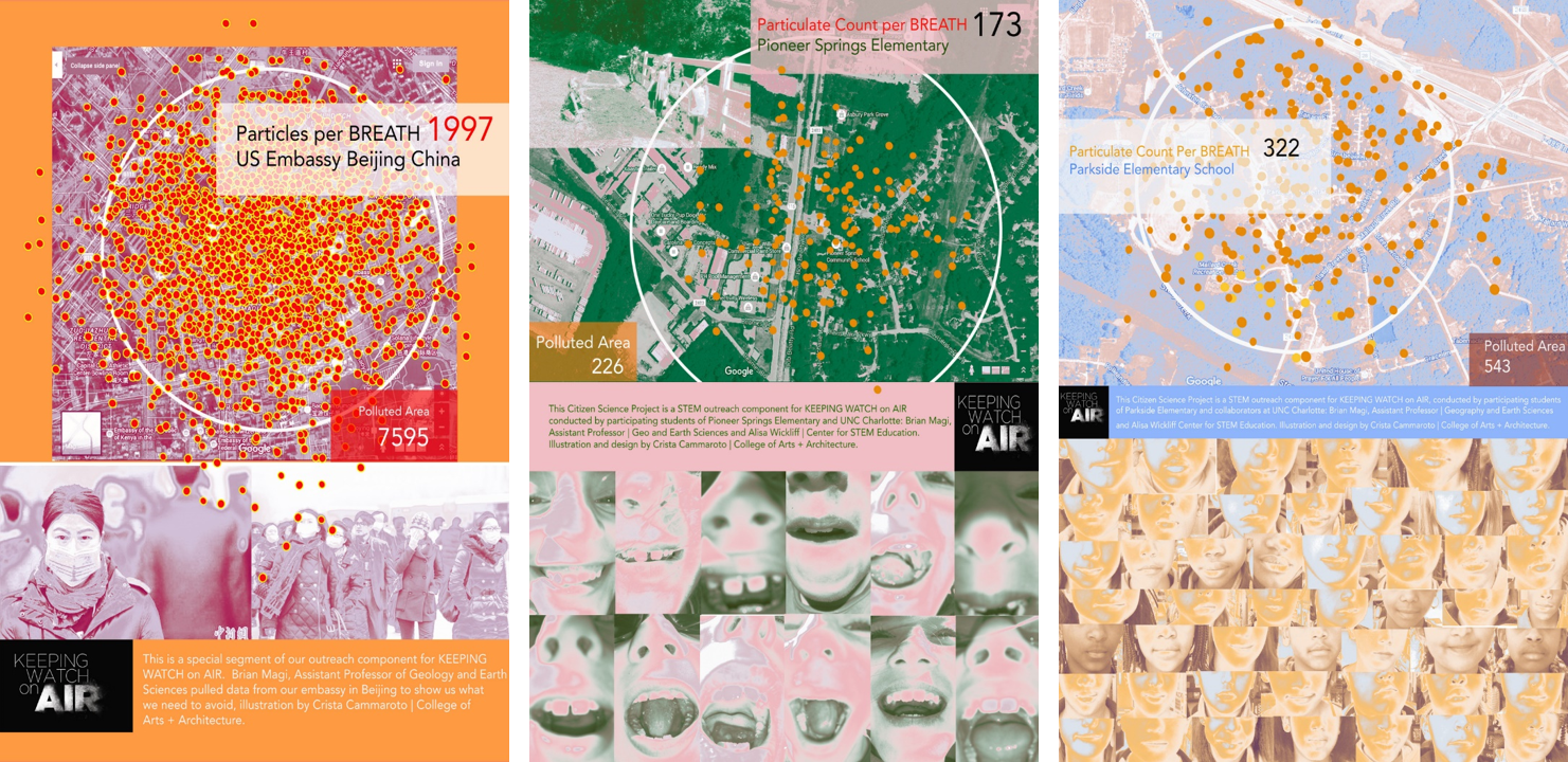
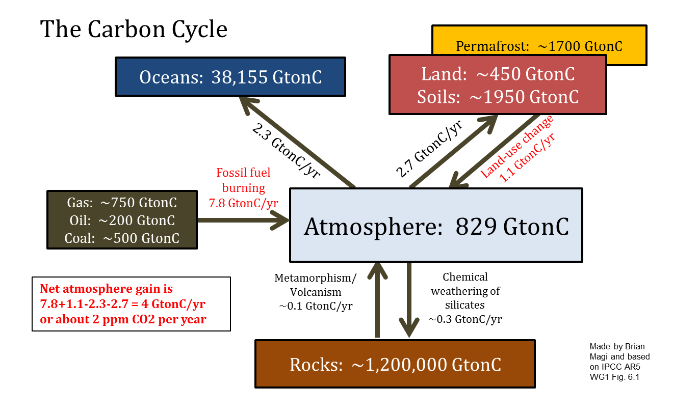 The reason that CO2 goes up and down
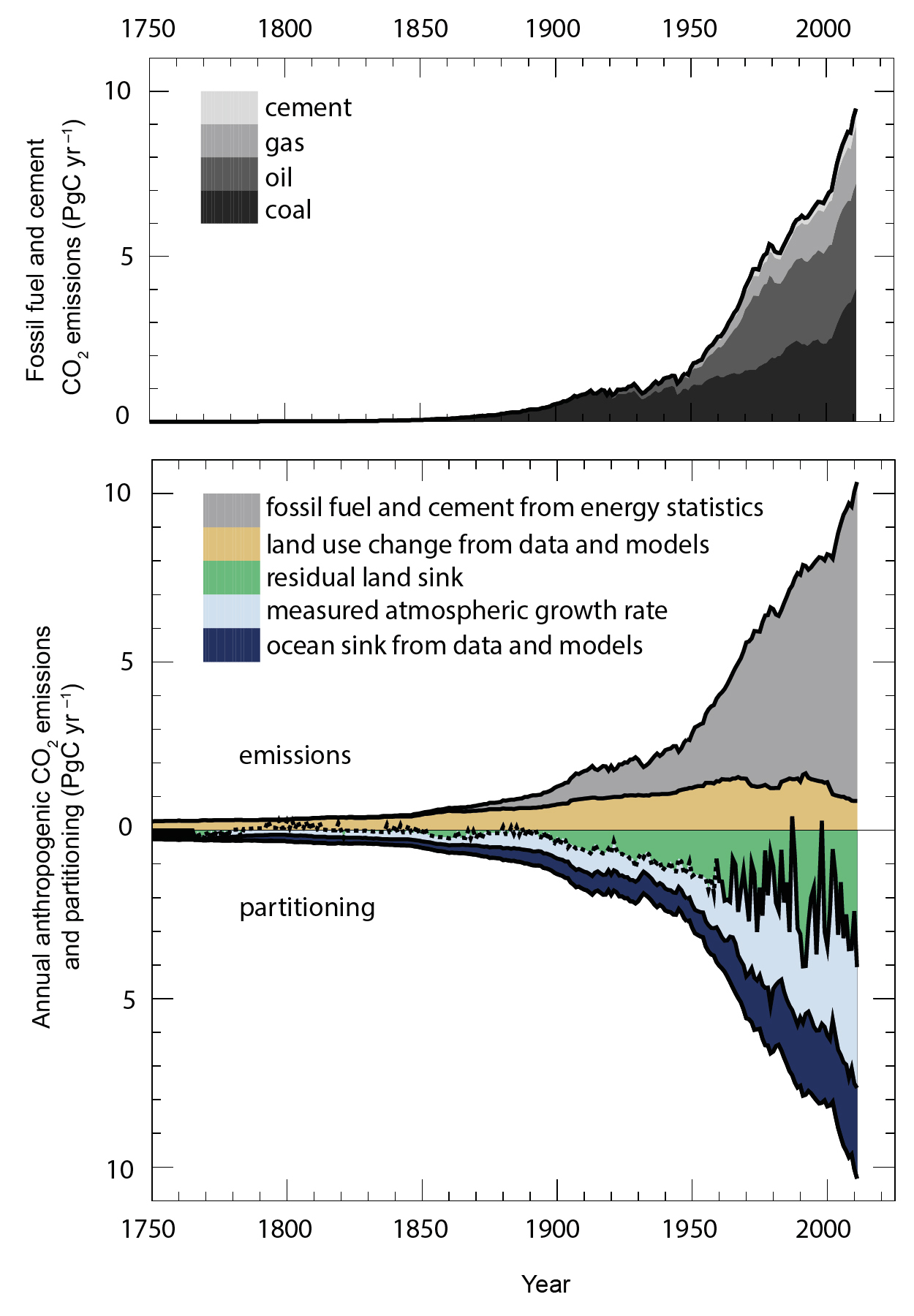


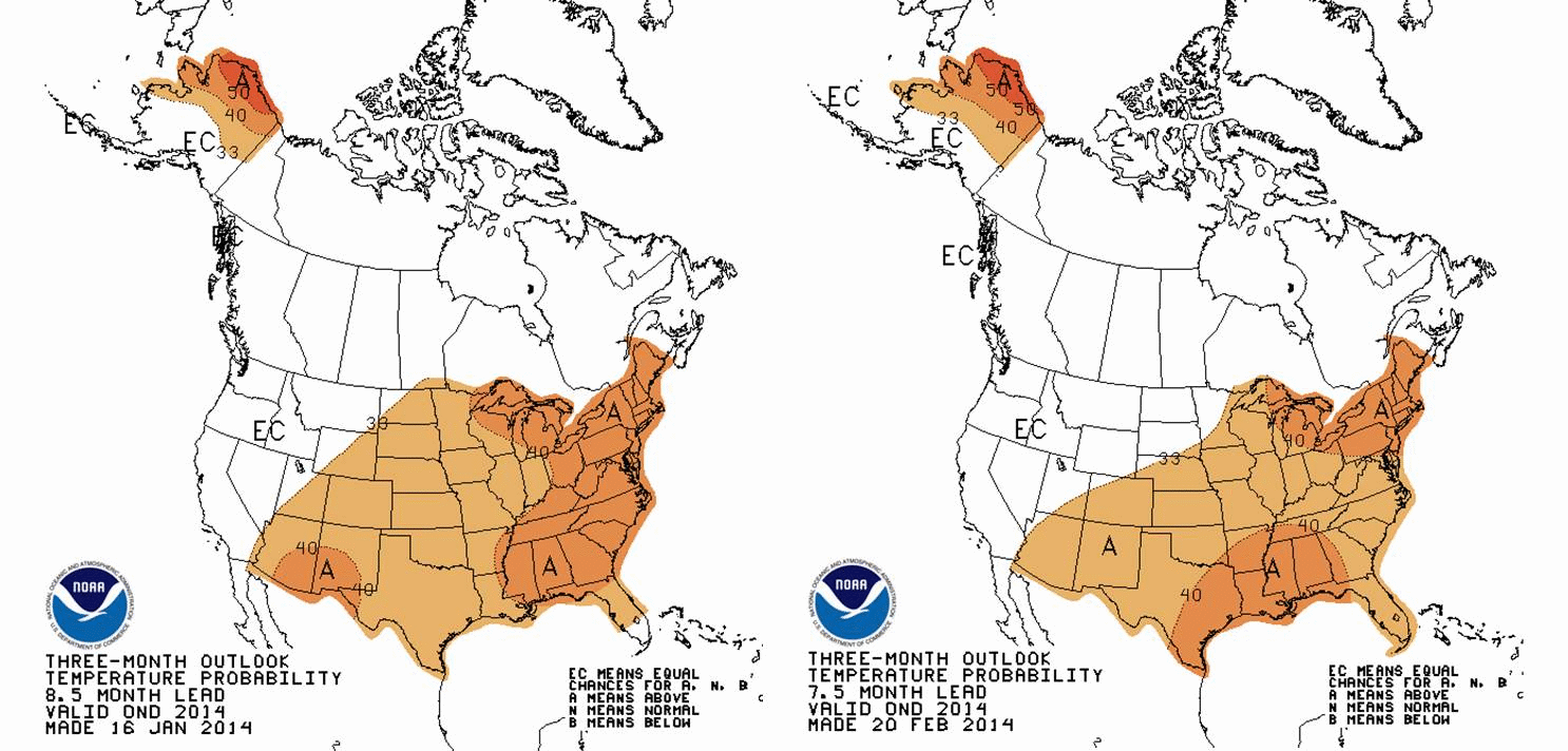
 Watch the figures carefully. All the animations start with a forecast for 3-month averaged T and PCP for March-April-May (MAM). Then, they step forward to April-May-June (AMJ)The CPC data product seems intended to provide an idea of whether T and PCP will be above or below average for the USA (including Alaska). In a previous discussion,
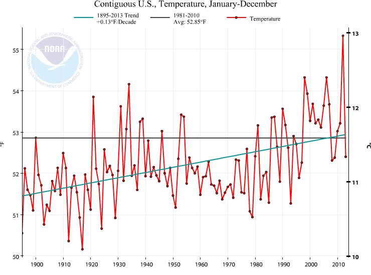
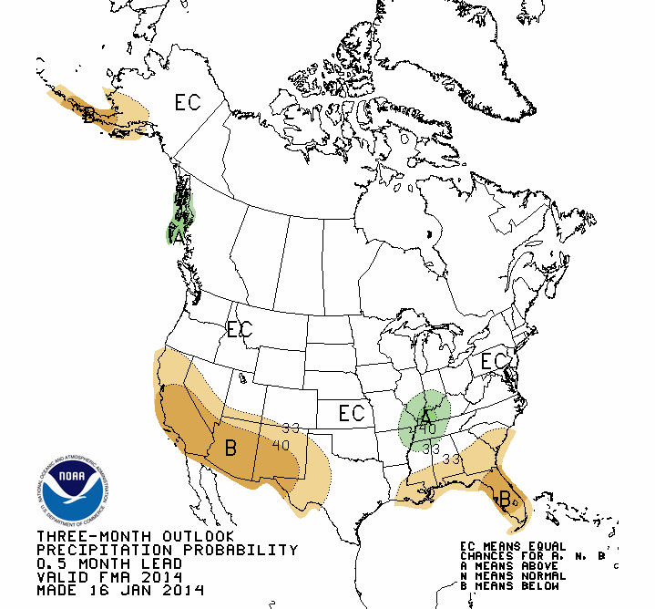
 The precipitation is not the story, in my mind. The story is that we should expect a warmer than 1981-2010 year. The average of 1981-2010, without doing any math, is clearly warmer than most of the years this past century. Quickly eyeballing this number says that 82 of the 100 years in the last century are colder than the 1981-2010 average. This is really important in terms of perception of the significance of a warmer than “average” year. 1981-2010 is not a very good choice for the “average”. Gonna be a warm year according to CPC. Nowhere is there a robust and spatially significant feature suggesting below average temperatures, by the way.
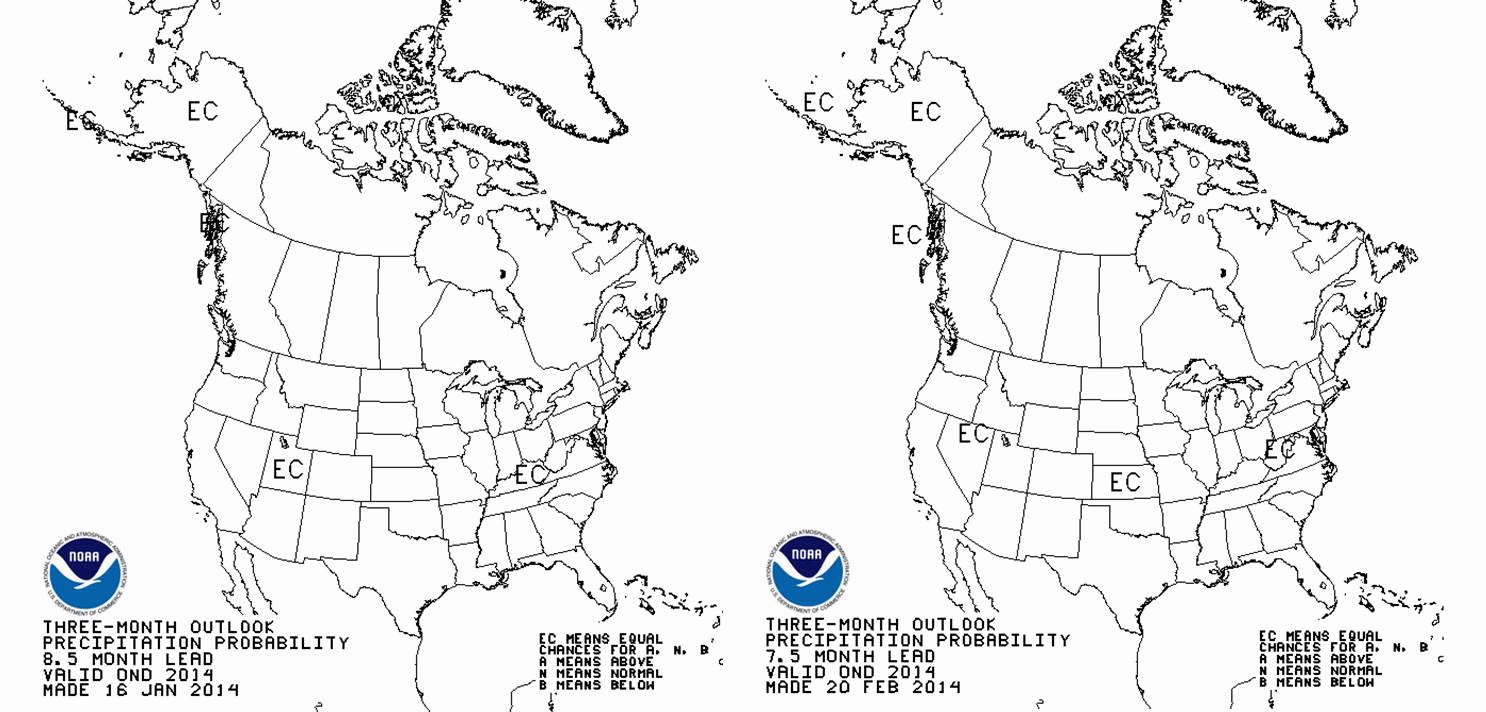
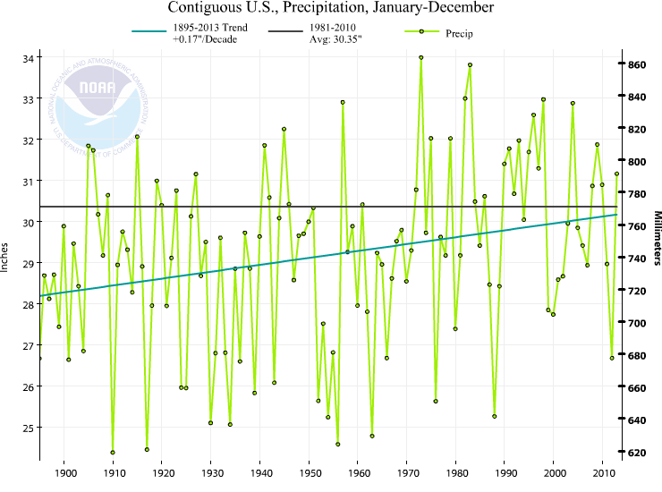
 and precipitation is slightly below average for the Eastern USA, above average for Colorado-Wyoming-Idaho, and well below average for the Southwestern USA.
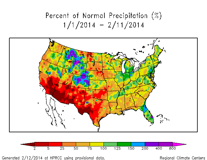
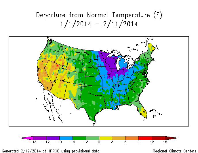
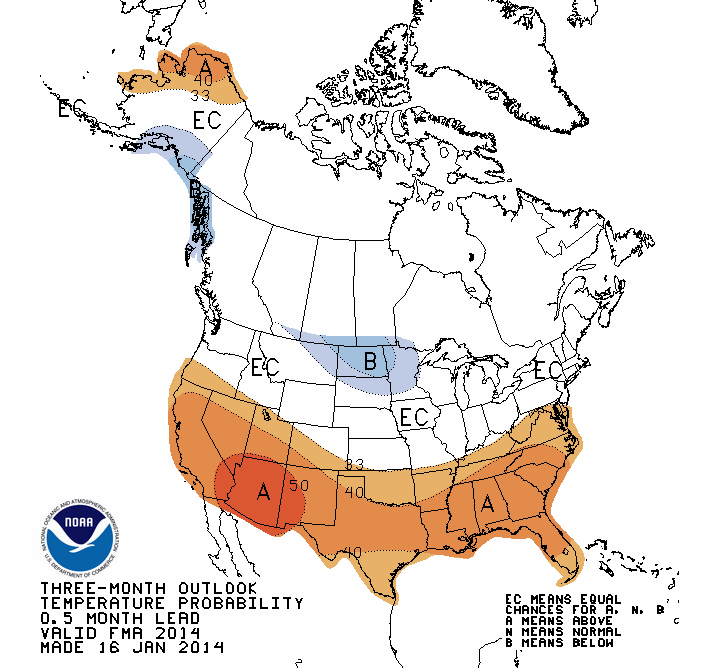 where, once you wrap your head around what I call the “geography” of the figure, you see that NOAA CPC is predicting whether the temperature over successively farther 3-month periods (Feb-Mar-Apr, Mar-Apr-May, etc.) will be above, at, or below the average temperature for 1981-2010 (