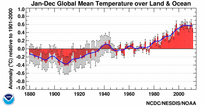
 As real as global warming (figure above from NOAA NCDC) is, and as much as we expect that the science has done enough, one US lawmaker recently said
I am for global action on climate change. I am a proud supporter and very anxious for the U.S. to participate globally. But I think if you look at the current makeup of the U.S. Senate, it’s very difficult.
This is a quote from Senator Ben Cardin (D-Md.) that I drew from a recent article that I’ll get to below. As I close off discussions with 28 undergraduate students of Earth Sciences, Geology, Meteorology, and Economics this semester in my Global Environmental Change course, the questions that permeate their responses to readings* we went over in class are
1. WHAT CAN WE DO?
2. WHY AREN’T WE DOING ANYTHING?
I bring a lot of current discussion into the classroom – more than the previous iteration of my course and I await my course reviews and student comments to better understand which materials resonated and which did not. In the meantime, my answer to the driving questions for the future of our state and country is simple: VOTE. Vote for the legislators that work on issues that you think benefit the global community.
The simplicity in my answer is partly because I don’t have a better answer, but partly because this is where the science stands. Namely, science has arrived at robust conclusions based on decades of intense research by communities of experts, most recently evidenced by the full report of the IPCC. Earth scientists keep working on issues because we are interested in what makes the physical world tick, and just like any community of professionals, the majority of us work on science that is relevant. The most relevant Earth science is climate science. I think it is safe to say that most Earth scientists want to see some actual climate action rather than the empty words that most that most of the action statements by politicians have amounted to so far. A widely-cited scientific paper about a way to visualize and break down carbon mitigation strategies into manageable parts said that the choice is simple: Act or delay.
If we want action, we cannot rely solely on science and engineering – we need policy makers. Policy makers are elected by people. So if my students want to help, vote. If citizens in general want to help, then vote. An interesting report by Lisa Friedman at Energy and Environment News included quotes from US lawmakers about the upcoming 2015 Paris climate meeting that many were hoping would be much farther along after this year’s Poland climate meeting. I’ll include several below:
It will be difficult to get a treaty passed in 2015 in the U.S. Senate as it is presently constituted
———————————–> Sen. Ed Markey (D-Mass.)
Keep our eyes on the prize of creating an ambitious, effective and durable agreement. Insisting that only one way can work, such as an agreement that is internationally binding in all respects, could put that prize out of reach.
———————————–> U.S. Special Envoy for Climate Change Todd Stern
[A binding agreement is] not going to go anywhere. It’s dead on arrival… [EPA limits on CO2 emissions from future power plants are] hurting our economy on a daily basis.
———————————–> Sen. John Barrasso (R-Wyo.)
There is a lot of difference of opinion among very educated people on the science [of global warming]. [On whether a binding agreement would pass the Senate: ] I kind of doubt it. There is still a legitimate question of science, and you can’t brush that away.
———————————–> Sen. Orrin Hatch (R-Utah)
I think this [a global climate treaty] is an issue that can flip very quickly. [An EPA regulation, for example, would] put a lot of costs on polluters and cause them to rethink the wisdom of an economywide carbon fee. If we can organize the armies on our side, it’s a rout. We just haven’t bothered to organize them. [The fact that climate is back in the political discussion and may be in 2014 means] that adds up to 2015 being a pretty good year.
———————————–> Sen. Sheldon Whitehouse (D-R.I.)
This problem is global, not just related to any one country or only one region. We need an international effort, and I think there’s growing support for that in the United States.
———————————–> Rep. Henry Waxman (D-Calif.)
We need to set a good example to the rest of the world. That way, when we call on China and India and other big emitters, we can say not only ‘Do as I say,’ but ‘Do as I do.’
———————————–> Sen. Tom Carper (D-Del.)
Increasingly, the U.S. is being viewed as a leader. Especially if the administration takes action on coal-fired power plants, I think it will be very hard, then, for China and India to say the U.S. is not acting.
———————————–> Sen. Ed Markey (D-Mass.)
[Action might require] some kind of catastrophe… I think [global warming and subsequent impacts are] real, and I think that we should continue to explore our options to reduce the effects of it. [He has not liked] anything I’ve seen lately [about how the UN climate process has influenced US lawmakers.] [Still, he conceded,] I don’t think talking hurts. It probably helps.
———————————–> Sen. John McCain (R-Ariz.)
Are pathways opening up? Has Obama been able to set up his position strongly enough to promote policies that are in line with the science? Well, it comes back to the simple solution: Vote for what you believe. I would argue that your political party – socially or economically – is not the relevant part of a vote that supports climate change policy.
As Professor Andrew Dessler argues in his book, and as many other climate and climate policy scientists argue, the decision to move away from energy sources with high carbon emissions is completely reversible – if the climate science summarized in the IPCC reports is entirely wrong or even partly wrong about carbon cycle science,
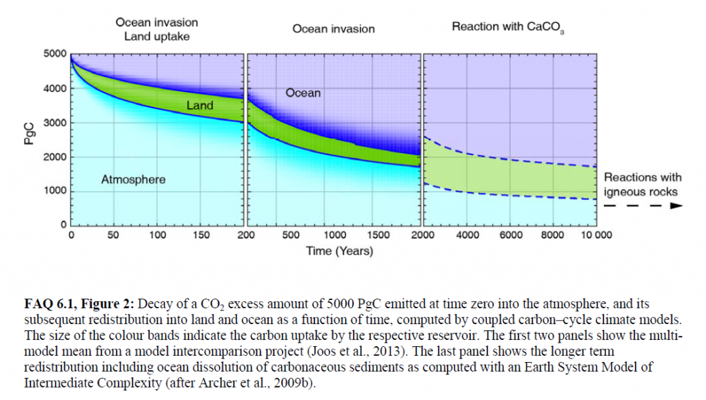
Figure 2 from Chapter 6 (Carbon and Other Biogeochemical Cycles) FAQ 6.1 of IPCC AR5 Working Group 1. Shows that some fraction of a 5000 GtC pulse of carbon emissions – on scale with a pulse from burning all fossil fuel reserves – would affect the atmosphere for 1,000s to 100,000s of years. Roughly 40% of the pulse would remain in the atmosphere even after 2000 years.
we can always go back to burning the least expensive energy sources without regard to the environment. But if climate science is even close to right, then we are facing irreversible changes (see the figure above) to the carbon cycle that will affect the Earth for centuries, millenia, and even further.
As I told my students, the questions that we face are civilization scale (echoing Rep. Waxman’s quote above). Human civilization emerged as a presence on Earth somewhere between 20,000 and 200,000 years ago. I’m no archaeologist, so that number isn’t particularly important. The point is that dinosaurs managed to survive for 165 million years on Earth and evolve into the Cretaceous Period species that we know and love (tyrannosaurus rex, triceratops, etc.). It sure would be nice to think that our advanced technology means we can learn to live in harmony with the planet longer than the dinosaurs! Considering that the dinosaurs were finally offed by a meteorite, I’d say we have a lot to prove still.


 The reason that CO2 goes up and down
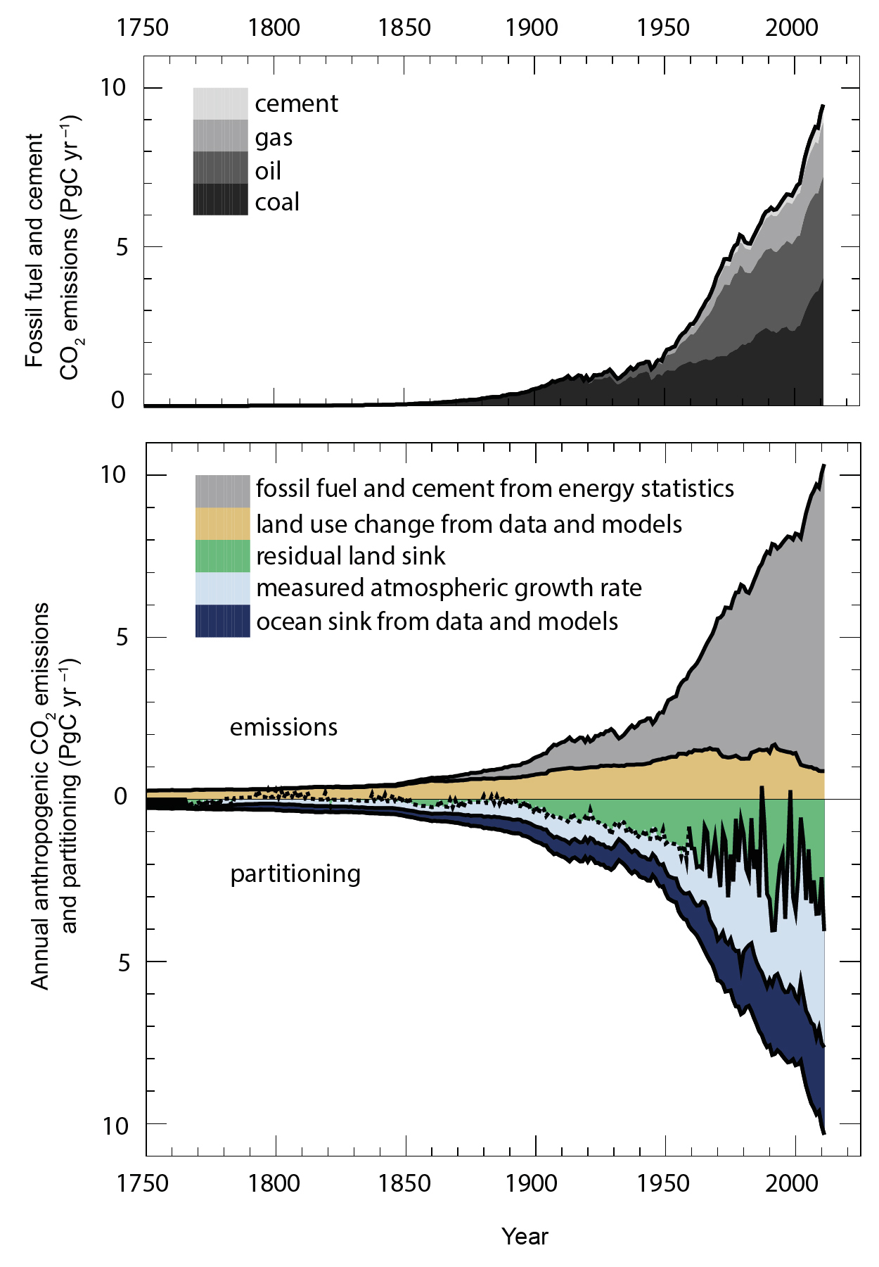
 Over long time scales, of course there are a number of possible reasons (changes in the Sun, Earth’s orbital shape/proximity around the Sun, plate techtonics), but these take so long, they aren’t relevant to the concept of global warming. Even my statement that What on Earth could warm an entire planet? should be more precise and say something like What on Earth could warm an entire planet over a relatively short time period? The simplest, if somewhat incomplete, answer is the combination of greenhouse gases and aerosols emitted into the atmosphere from human activities. Period.
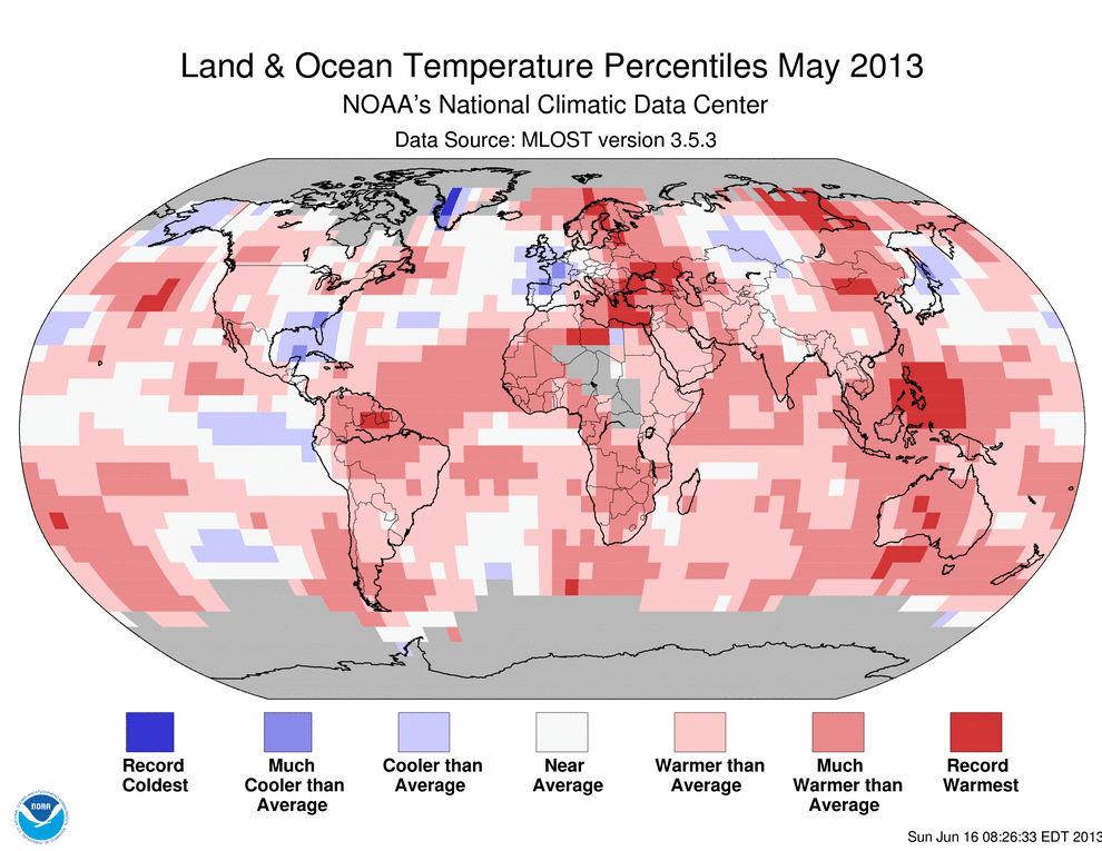
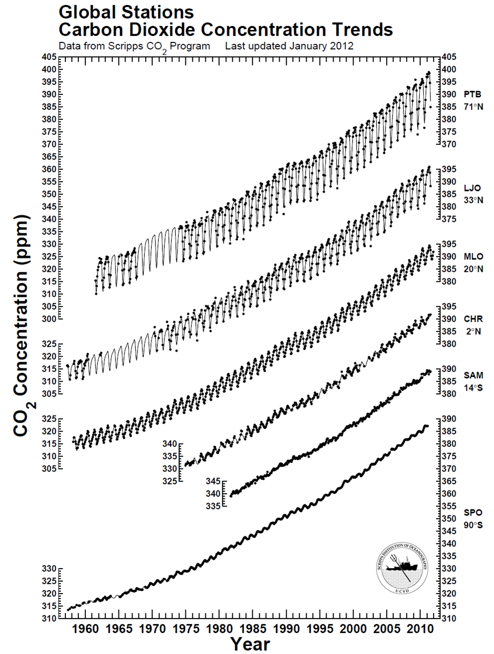 There is clearly a bias toward higher CO2 in the northern hemisphere compared to the southern hemisphere – CO2 is about 10-12 ppm higher near the north pole. This piece of information – this data – reflects the higher abundance of sources of CO2 in the northern hemisphere and the relatively slow
 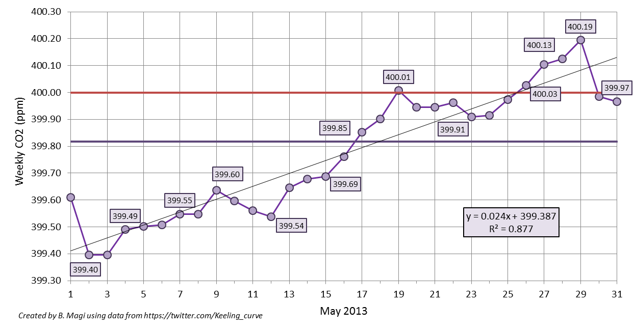 which shows the weekly-averaged CO2 from the daily-averaged values posted on Twitter (ok, tweeted). The straight horizontal purple line is the monthly-averaged CO2 of 399.82 ppm (wow!), and the straight red line is the mystical 400 ppm CO2. I calculated the weekly-average as the value of the previous 7 days up. For example, May 15 weekly-average is the average of values from May 9 through May 15. The weekly-average ideally is 7 data points, but