NOAA

Robust features in the 2014 USA forecast

Building on a previous discussion about a seasonal forecast product from NOAA Climate Prediction Center (CPC), I am still really curious about how robust the features in the seasonal weather patterns in the USA are. “Weather” in this case is referring to temperature and precipitation (T and PCP), and features refer to 3-month boxcar averages of T and PCP anomalies compared to the corresponding 3-month climatologies. So this is not the normal day-to-day weather or even the recent weather. Here are some new figures, which I explore below in terms of features that seem to be “robust” and features that seems to be “ephemeral”.

First, temperature in two plots:

comparisons-2014-3-start

Then, precipitation in two plots:

comparisons-precipitation-2014-3-start
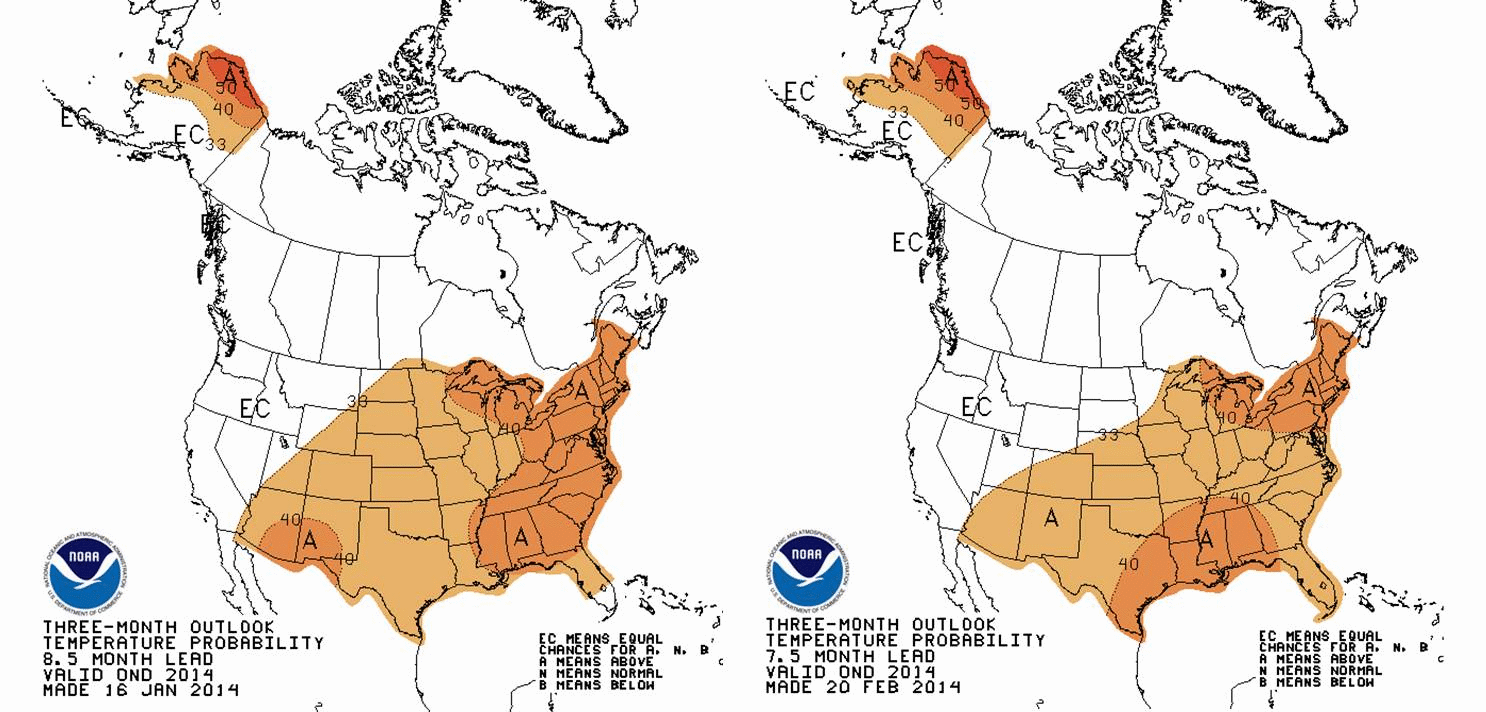
Watch the figures carefully. All the animations start with a forecast for 3-month averaged T and PCP for March-April-May (MAM). Then, they step forward to April-May-June (AMJ)The CPC data product seems intended to provide an idea of whether T and PCP will be above or below average for the USA (including Alaska). In a previous discussion, I looked at CPC outlooks for 2014 and early 2015, and their figures and analysis were produced using actual mid-January 2014 conditions.

New data

Now another month of data is in and CPC has updated their seasonal forecast to begin with mid-February 2014 conditions. A natural expectation is that the seasonal forecast would be better earlier in the overall forecast period. In other words, as the animation above progresses, the confidence in the forecast should decrease with time. Sometimes, however, larger patterns of atmospheric variability that emerge somewhere else in the world can exert some level of control on weather patterns (T and PCP) in the USA. El Nino-Southern Oscillation (ENSO, or sometimes just “El Nino”) is the best known example.

There could be all sorts of speculative lines of thinking in terms of causes, so for now, I’ll focus on the features that seem to hold up after another month of data. I’ll call these robust, and point out one overall theme that is worth watching as winter releases its grip on much of the USA.

Robust Features

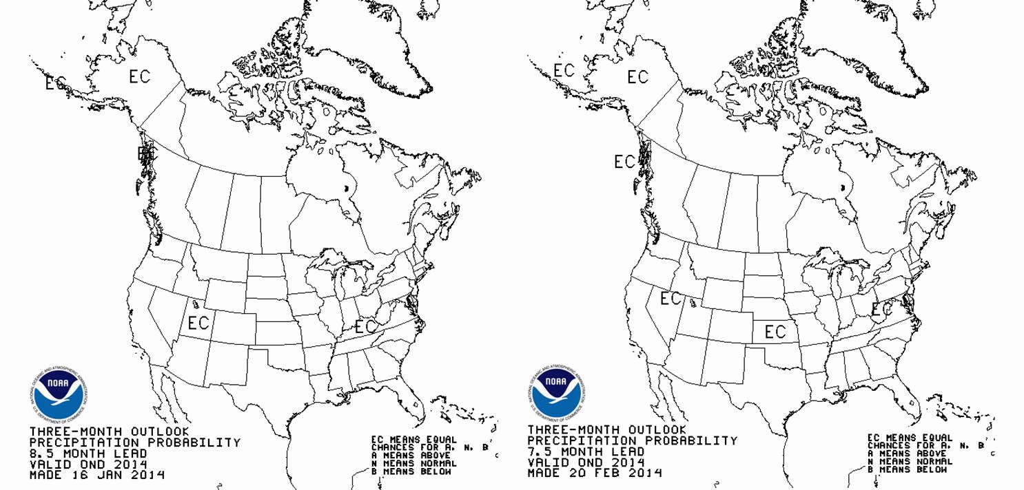
The Southwestern USA and often the Western USA in general is facing what will likely be a warmer than average year until about October. I think this is a pretty safe prediction. There is almost no evolution after more data was considered, except perhaps that the Pacific Coast tends towards higher probability of above average warmth. Upper Alaska is also holding up to the earlier forecast of warmth, especially in the northernmnost reaches. Both these regions are well known as fire prone under unusual warmth. Uh-oh. By November-December, the above average warmth shifts to the mid-Atlantic and the Southeast USA. The Northeast USA drifts towards unusual warmth starting in the summertime, maybe July, and ending about, oh, early next calendar year. For precipitation, much of the USA seems to be a normal water year. The problem is that in the near term, California remains dryer than average. Other features in a featureless prediction are that the deep South is dry in the spring, while the Ohio River Valley is wetter than average. Northern Florida and the coastal SE USA tend towards dry late in the calendar year.*

Summary and What the AVERAGE Year Looks Like

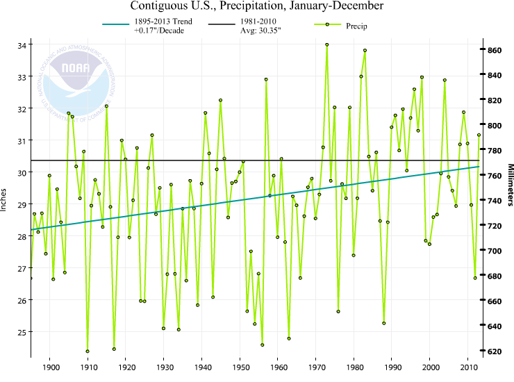
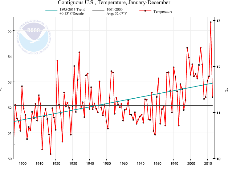
Overall, the story remains clear: The USA should experience another warmer than average year. Warmer than average is a relative term. Remember that NOAA (and CPC) define the normal temperature and precipitation amounts by the 1981-2010 30 year average. This is a particularly irritating 30 year timeframe mainly because climate is clearly warming most rapidly during the 1970 to present day period. It is what it is, but sometimes the simpler message is lost. The CPC forecast is for a year that is warmer than the 1981-2010 average. So what is the 1981-2010 average?? This is what the 1895-2013 temperature and precipitation trends for the contiguous USA (no Alaska) from NOAA NCDC with the baseline average 1981-2010 average temperature overlaid.contiguousUSA-1895-2013-annual-TcontiguousUSA-1895-2013-annual-P
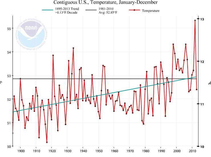
The precipitation is not the story, in my mind. The story is that we should expect a warmer than 1981-2010 year. The average of 1981-2010, without doing any math, is clearly warmer than most of the years this past century. Quickly eyeballing this number says that 82 of the 100 years in the last century are colder than the 1981-2010 average. This is really important in terms of perception of the significance of a warmer than “average” year. 1981-2010 is not a very good choice for the “average”. Gonna be a warm year according to CPC. Nowhere is there a robust and spatially significant feature suggesting below average temperatures, by the way.

*There are a few features that are not that robust, by my admittedly weak definition. For example, it’s not that clear whether the NE USA or the NW USA will tend warmer than average in the early summer. And precipitation has about the same number of features that are robust as not robust.

Forecasting the USA temperature and precipitation tendency for 2014

Where we are this calendar year

Currently, the USA as a whole and the Southeastern USA are both cooler than normal this year 2014-02-12-YearTDeptUS and precipitation is slightly below average for the Eastern USA, above average for Colorado-Wyoming-Idaho, and well below average for the Southwestern USA. 2014-02-12-YearPNormUS

Where we are right now

Thinking about the upcoming year in weather while in the midst of a crippling snow/ice storm in the Carolinas (discussion via #NWSGSP, over 2,000 outages by end of 12 Feb 2014 mostly in Lancaster, Greenville, and Pickens Counties in SC, and Macon and Caswell Counties in NC*, flights cancelled, Rayleigh-Durham turning into a parking lot like Atlanta only two weeks ago, etc.) is the perfect time to test whether you can separate a trend from variability (teach me, dog walker).

*updated on 13 Feb 2014 midday is 36,400 outages; more than 14,000 in Mecklenburg, 4000 in Cabarrus, 2700 in Gaston, 1600 in Rowan, 1300 in Lincoln, and 1100 in Durham County, NC. About 5000 in Lancaster and 2900 in Chester County, SC. Wow. Second band of snow falling in North Mecklenburg dropped maybe another 6″ on the 5-6″ we had yesterday. Double wow. Snow and ice totals should be impressive after the analysis is complete.

Trend, variability, and perception

The temptation is that your opinion is tempered by what you are currently experiencing. The old and boring argument that “Hey, it’s cold. What’s up with global warming?” The short-story (pun intended) is that weather is always variable, and the #SEStorm snow and ice storm is no exception.

What is the trend? Globally, it’s simple. Temperature is increasing (NASA GISS, UK Met Office CRU, NOAA NCDC). For the USA, and states within the USA, it’s less simple. Variability in the weather tends to average out less and less over smaller and smaller spatial scales. What does this mean? The ups and downs we expect from weather like our February snow/ice storm and the preceding week with beautiful warm temperatures become less and less noticeable at larger spatial scales because while North Carolina might be down in temperature, somewhere else on Earth is certainly up on temperature. They average out unless there is an overriding trend, like the trend imposed by increases in greenhouse gases. That’s why the global temperature trend is so important. If something is making the entire Earth warm above what is considered a range of natural variability, then some very powerful mechanism is at work.

Where we might be this calendar year

Back to the question at hand though. Can science address near-term (say, over the next 3-12 months) temperature and precipitation? The answer is yes, and this prediction is studies using an analysis called seasonal forecasts. I was shocked by what is suggested for temperature for the rest of 2014 and slightly into the beginning of 2015. NOAA Climate Prediction Center (CPC) updates their seasonal forecasts about the middle of every month, and I put this animated version of their graphics together below. temperature-2014-01-16
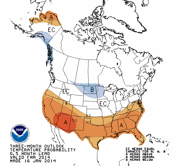
where, once you wrap your head around what I call the “geography” of the figure, you see that NOAA CPC is predicting whether the temperature over successively farther 3-month periods (Feb-Mar-Apr, Mar-Apr-May, etc.) will be above, at, or below the average temperature for 1981-2010 (the climate normal). Clearly, NOAA CPC analysis is suggesting that the USA is due to experience an above-average year for temperature. In particular, the Southwest and Alaska are pummeled by warmer-than-average temperatures until October (a hot summer in the Southwest is not pleasant, and hot summers in Alaska may be suggestive of a bad fire year). Furthermore, by about October-November, the forecast for the Southeastern USA is to be above average temperature even after the rest of the country goes to even chances for above or below-average temperature. That translates to a nice Halloween and Thanksgiving in the short-view, and yet another warm blip on the global warming trend in the long-view.*

Precipitation seems to be less interesting in terms of climatological deviations, but the Southwest does seem to at least move away from below-normal, dry conditions that are plagueing California right now. precipitation-2014-01-16

*I’ll revisit the seasonal forecasts again in a couple of weeks after NOAA CPC updates their analysis, and then also look at how well the forecasts capture reality at the end of the year using NOAA NCDC archived temperatures. This verification is mainly because I haven’t spent much time with these seasonal forecasts, but I am always seeking out new media for the classroom. A natural question about the NOAA CPC products is: Are they any good? We’ll see.

Summary

A lot to digest, and time will tell, but don’t let this cold early part of 2014 deceive you. Global warming is a major trend that is imposed on every weather system in the world. No single weather events is very likely attributable to global warming because of the complexity in parsing out all the causes and effects that modulate a weather system as it tracks through the USA (think of how tricky the forecast of ice vs snow was for this Feb 11-13 storm, and then try to say what it was that caused that specific location of the border between the two – hard!). But the average weather is slowly changing, and the average weather is climate. In the meantime, back to staring at the sleet that is falling and wondering when UNC Charlotte will open again for classes!

Climate in the Southeast in January 2014

Scientists studying the Earth’s climate system are supported by an immense and rich array of data. Sometimes it seems like you only have to be comfortable working with all this information. Programming languages help (matlab, R, python, NCL, for example). But even more accessible are incredible web resources. The USA High Plains Regional Climate Center updates their climate and weather relevant maps on a daily basis. Here are some figures showing where the country and the southeast USA stands. From NCDC time series plotter, the contiguous USA (no Alaska and Hawaii) was the 37th warmest year in the last 119 years, as shown in the graph below.
contiguous-USA-2013-T
In itself, 2013 wasn’t unusual. In recent memory, 2008 and 2009 were really similar to 2013. However, compared to the fanfare around the hottest year on record for the USA in 2012, it does seem different. Who can remember ought-8 and ought-9, right?

But even more to the point is what we feel where we live. Science and statistics are fine, but just like no one on Earth experiences the average global temperature, no one in the USA experiences the average USA temperature either! Let’s look at the Southeast. In 2013, drawing from the HPRCC link above for the figures below, the temperatures were cooler than average.
AnnDec13TDeptSERCC-2013-12-31
In the last 120 years, 2013 in the Southeast was about the 67th warmest. Most of the years in the past 120 years have been warmer! But this is really not that ususual. 4 of the last 10 years in the Southeast have been cooler than more than half the past 120 years. 10 years is a limited view, but I chose it because it’s a round number and because we remember the last 10 years. Going back to the USA, *none* of the last 10 years have been cooler than more than half of the past 120 years. Not really even close. You can verify this with NCDC data tools. What global warming? Well, that’s where perception matters. The Earth is warming, even if the Southeast seems to be avoiding the problem we’ve created with CO2 emissions.

Looking to the more recent period, we can also glean a little bit about our winter months with a 3 month average (Nov-Dec-Jan) using HPRCC again
Last3mTDeptSERCC-2014-01-31
We see that except for Florida, the Southeast is largely cooler than average. Here HPRCC is comparing against the 1981-2010 average temperature (temperature anomaly). Appalachia and further to the west are in a deep recession of the warmth we expect when we think of global warming.

Finally, we can look at January 2014 using HPRCC tools.
Last1mTDeptSERCC-2014-01-31
The Southeast is cold! Even poor Florida, which over the last 3 months is anomalously warm compared to the rest of the Southeast, is in a deep cold this past January. If we eyeball-average the data on the figure, we get a number of about 6-7 degrees F below the 1981-2010 average. Jeez. Where can we go for unseasonable warmth (retrospectively)? The West is certainly above average, and more importantly below average on precipitation, as the figures show below.
Last3mTDeptUS-2014-01-31
Last3mPNormUS-2014-01-31
Be thankful the Southeast is so stubbornly refusing to budge on global warming… but I worry that as a result of this stubborness, our legislators will forget this is a problem. North Carolina will be affected even if we are a hold out for now. Think global whenever you think of climate. Or, if you want, think of Bob Marley (one love, one heart). This figure from the recent IPCC report (WGIAR5-SPM_Approved27Sep2013) shows that there are only a couple of non-red areas on Earth (ie. they are not following the warming trend). The Southeast is one of them! But that is one scorched Earth otherwise.
ipcc-ar5-wg1-spm-fig1

Ramping up for teaching with NOAA NCDC

Summer is a time of dedicated research for me. Finished one project, waiting for peer reviews on that manuscript, tinkering with twitter, planning out research conference travel in the next school year, and working on a grant proposal to NSF. The season of the classroom is nearly here though, so I’m slowly re-allocating my hours to teaching. A great early-career workshop for university and college faculty that I attended the last week of July helped me get into gear with teaching again. I need a workshop like that every summer!

Another way I start to think about teaching is to begin to browse through the data that I want to bring into the classroom. One site I haven’t visited in months, but that I prolifically visit throughout past school years, is the NOAA NCDC time series plotter. I had the pleasure of visiting the numbers again tonight and remain very impressed by NCDC outreach and transparency efforts. The new addition to the time-series plotter (which you can use to produce climate-relevant analysis at different spatial and temporal scales) is a slightly more friendly user-interface, and a few features that I think most stats people will really appreciate. Yes, it’s not a super fancy analysis package, but the statistical analysis you can do just via the webpage now includes two new options. One is the option to display the anomaly against a different base period rather than always using the 20th Century average. In other words, you can choose a base period of 1951-1980 like NASA GISS tends to use or you can play around and see what the effect of a different base period is. The other new option is a display of a trend line for any period. The first thing you can do with this is see how temperature (for example) trends in the early part of the century compare to the trends in the latter part of the century. Or you can mimic the cherry picking that climate data is sometimes a victim to and choose very specific start and end points to produce a trend that amplifies an argument you are making (“look, it’s getting colder!” or “look, it heating up super fast”). one exception to all this great online analysis is that it only applies at the “super” level for data in the contiguous USA. someday, i’ll ask NCDC scientists why this can’t be done for Alaska and Hawaii, and why the global analysis tools are more limited. either way, an exciting development in my virtual friendship with NOAA NCDC.

May 2013 climate in North Carolina and the world

With global warming and all of the impacts, it’s very important to constantly consider the question of time and space scales. May 2013 is a good example for those of us living in the Southeastern USA or North Carolina. Namely, North Carolina’s normal-to-cool spring is not at all indicative of how the global temperature is evolving. Let’s see how we can quickly use NOAA NCDC graphs to figure this out.

Global warming refers to the increase in average temperature of the entire Earth. The last part – the entire Earth – is the spatial scale. And that’s a huge spatial scale! When a scientist talks about global warming or that global warming has been detected, you have to step back and say WOW. What on Earth could warm an entire planet? coal_fired_power_plant
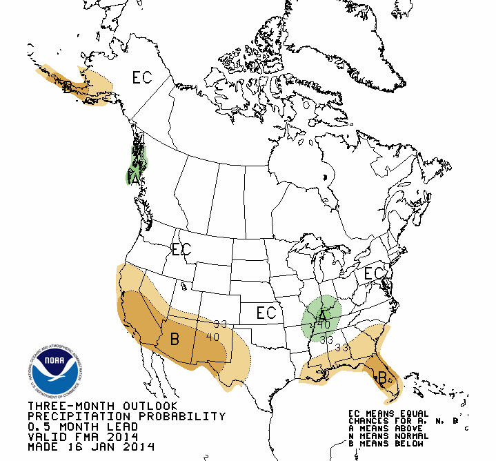
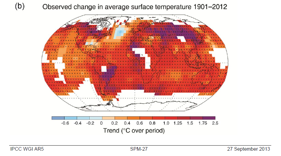
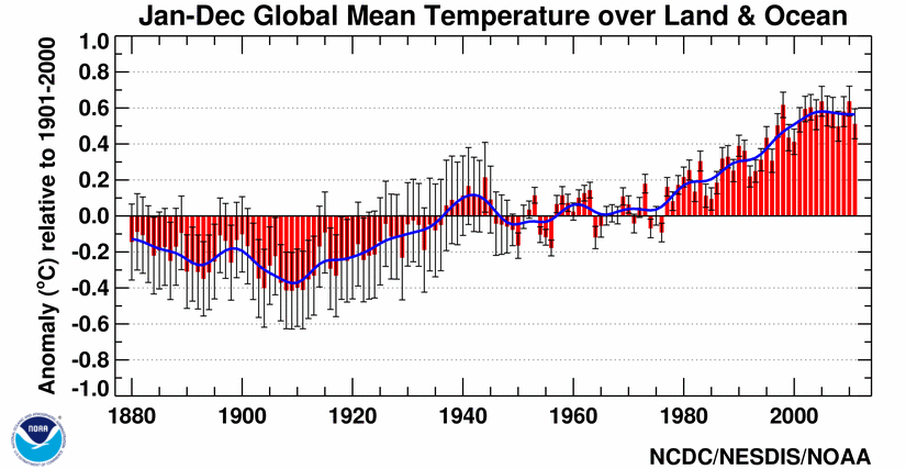
Over long time scales, of course there are a number of possible reasons (changes in the Sun, Earth’s orbital shape/proximity around the Sun, plate techtonics), but these take so long, they aren’t relevant to the concept of global warming. Even my statement that What on Earth could warm an entire planet? should be more precise and say something like What on Earth could warm an entire planet over a relatively short time period? The simplest, if somewhat incomplete, answer is the combination of greenhouse gases and aerosols emitted into the atmosphere from human activities. Period.

May 2013 analysis of global temperatures are trickling out. NOAA NCDC as always has a wonderfully complete report of climate news for May and for all previous months. My favorite part is the plethora of hyperlinks. NOAA NCDC should really be commended for their public outreach! Here is one of the figures from that webpage201305where you can see how different the Southeast USA is from the world in May 2013 – the world is shades of red, while the Southeast USA is shades of blue (cooler than normal). We’ve had a very pleasant spring in North Carolina. Pull back on the temporal (time) scale to see the March-April-May seasonal average201303-201305 and you can see that the cool spring extends well beyond May in terms of the anomaly. By this, I mean that the blues become deeper when you consider a three month period (March-April-May) and that implies without any quantitative work that March-April were more cooler-than-average. Pull back slightly further to the year-to-date rankings201301-201305and here you see that the Southeastern USA and in fact most of the USA and even Alaska have been right at the climatological normal (which for NCDC is the average temperature from 1981-2010). The short story is that North Carolina below average temperatures for the period from January to May, March to May or just plain old May are not indicative of global temperatures. The real question is why?

CO2 trends from around the world

Time series are profilic in climate science. This is a dataset that shows the how a measurement changes over some period of time. The best known in our world is the global warming time series displayed as the globally-averaged surface temperature trend, which is compiled from thermometer measurements. A few research groups worldwide maintain this analysis (NASA GISS, UK Met Office, NOAA NCDC). Since CO2 is in the news, and since there is variability from one measurement location to another, it is useful to see how the best-known station in Mauna Loa, Hawaii (source of the data shown in the Keeling curve graph). Once you navigate the shifting axes (y-axis on the right and left, and the time series begin at different points in the past) and digest the information visualized here, the graph below is very useful in quickly understanding variability in CO2 concentration from the northernmost latitudes to the southernmost, noting the latitude is listed under the three-letter station identifier but that the graph is arranged north to south.co2-globaltrends
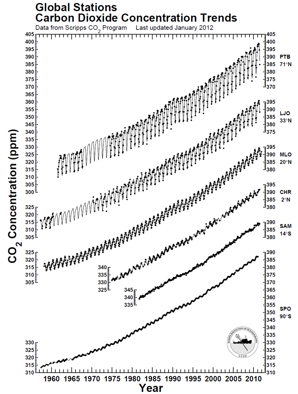
There is clearly a bias toward higher CO2 in the northern hemisphere compared to the southern hemisphere – CO2 is about 10-12 ppm higher near the north pole. This piece of information – this data – reflects the higher abundance of sources of CO2 in the northern hemisphere and the relatively slow transport times required for air to move across the equator (like a slow drip compared to the winds we feel every day in the USA). The graph also effectively conveys another dimension of information: Regardless of the specific location of CO2 measurement, the long-term trend is essentially the same worldwide, indicating that CO2 continues to accumulate in the atmosphere worldwide at about the same pace. The trend could relatively easily be quantified, but sometimes qualitative analysis is enough. From the webpage where I found the figure, the station identifiers are PTB = Point Barrow, LJO = La Jolla, MLO = Mauna Loa Observatory, CHR = Christmas Island, SAM = Samoa, and SPO = South Pole. You can also find some commonality in the stations at NOAA’s website. All in all, a great data visualization that can be done entirely in black-and-white!

CO2 time line for May 2013

The month of May is officially over, and perhaps the Earth is about to take a big breath in and begin to draw down CO2 from its year 2013 peak. The last tweets by @Keeling_curve showed a relatively (emphasis on relatively!) sharp decrease from May 29 to May 30 with CO2 falling from 400.33 ppm to 398.41 ppm, and then May 31 had variability that was too high as tweeted here. Funny side note was that for whatever reason, this “data too variable” drew the attention of one well-known (but not well-respected) blog, to which @Keeling_curve replied “see here“. Geez, you’d think seasoned bloggers would click a couple of web links before tweeting a question like that. The values of CO2 should start their annual decrease from the peak value in the Northern Hemisphere as the plant life in temperate and polar zones comes to life, but in the mean time, we’re living in the age of a 400 ppm CO2 world, which is very unusual in recent geological history, as discussed here and shown here. Here’s the time line of CO2 concentrations for this historic May 2013co2-2013-05
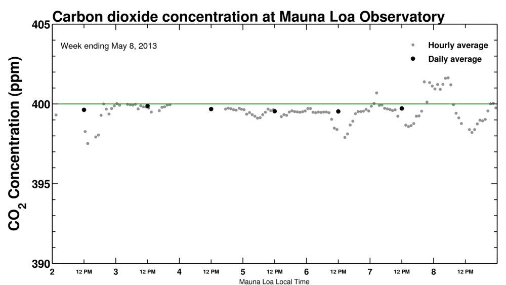
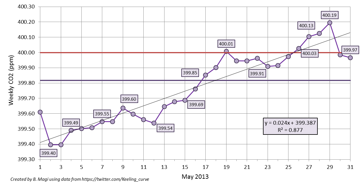
which shows the weekly-averaged CO2 from the daily-averaged values posted on Twitter (ok, tweeted). The straight horizontal purple line is the monthly-averaged CO2 of 399.82 ppm (wow!), and the straight red line is the mystical 400 ppm CO2. I calculated the weekly-average as the value of the previous 7 days up. For example, May 15 weekly-average is the average of values from May 9 through May 15. The weekly-average ideally is 7 data points, but occasionally a daily-averaged value is not tweeted due to high variability in the data. From the figure you can see that we reached our first weekly-averaged CO2 concentration greater than 400 ppm on May 19. I actually thought that would be it for the year, but from May 24 to May 29, daily values were again well over 400 ppm. This brought the number of weekly-averaged values greater than 400 ppm up to 5. Roughly, about 33% of the days in May 2013 had CO2 greater than 400 ppm. The decline should begin soon with the annual minimum in September-October reaching values of about 394-395 ppm, noting that the annual minimum for 2013 will probably be very close to the maximum from only 2 years ago. Below is the data shown in the graph above. An impressive May, and one that will be recorded in the history books.

                       carbon dioxide (ppm)
year    month   day     daily   weekly
2013	5	1	*	399.61
2013	5	2	399.29	399.40
2013	5	3	*	399.40
2013	5	4	399.68	399.49
2013	5	5	399.54	399.50
2013	5	6	399.52	399.51
2013	5	7	399.71	399.55
2013	5	8	*	399.55
2013	5	9	399.73	399.64
2013	5	10	399.4	399.60
2013	5	11	399.46	399.56
2013	5	12	399.41	399.54
2013	5	13	400.16	399.65
2013	5	14	399.91	399.68
2013	5	15	399.74	399.69
2013	5	16	400.25	399.76
2013	5	17	400.04	399.85
2013	5	18	399.8	399.90
2013	5	19	400.15	400.01
2013	5	20	399.73	399.95
2013	5	21	399.91	399.95
2013	5	22	399.85	399.96
2013	5	23	399.88	399.91
2013	5	24	400.09	399.92
2013	5	25	400.2	399.97
2013	5	26	400.53	400.03
2013	5	27	400.27	400.10
2013	5	28	400.06	400.13
2013	5	29	400.33	400.19
2013	5	30	398.41	399.98
2013	5	31	*	399.97

*data was too variable over the course of the day. no value was reported on twitter.

CO2 in the very merry month of May

The whole month has been an edge-of-your-seat wait-and-see when CO2 will stop hovering above and below 400 ppm and just stay above. Unlike Miguel Cabrera‘s triple crown of 2012 or the thoughts that he could repeat that feat in 2013 or even be the first since Ted Williams to hold a 400 batting average (can he do it – this evidence says yes), the increase in CO2 above 400 ppm is inevitable. Inevitability means you just need patience. Patience for me means more time to think about the numbers.

CO2 data are available from a number of sites

Sites around the world that are monitoring CO2 and other gases in the atmosphere.

Sites around the world that are monitoring CO2 and other gases in the atmosphere.

and there are differences in hemispheric CO2 concentrations that are completely expected due to emissions source location and atmospheric transport times, as discussed earlier. The Mauna Loa CO2 measurements are the ones I’ve been watching with more interest than this year’s baseball season and the daily-averaged CO2 concentrations are reported on the web and via twitter, among other places. Twitter is turning out some good and interesting data like this.

According to the twitter feed, daily-averaged CO2 exceeded 400 ppm on May 13 with CO2 of 400.16 ppm. By my own calculations using the daily tweets, weekly-averaged CO2 exceeded 400 ppm for the first time in the week ending May 19 (CO2 was 400.01 ppm). The next milestone is when the monthly-averaged CO2 exceeds 400 ppm, and then annually-averaged, and so on. We are approaching what should be the peak CO2 this calendar year as the growing season begins and CO2 is drawn down from plants breathing in CO2. Eventually, the Earth will be perpetually impacted by more than 400 ppm CO2 and even the seasonal drawdown in CO2 of 5-6 ppm from May to October every single year as plants in the biosphere convert CO2 into oxygen via photosynthesis will not overcome the long-term trend in CO2. The CO2 will remain in our atmosphere for 100s-1000s of years. The Earth will slowly re-equilibriate to this elevated CO2 through a myriad of processes that include ocean uptake, plant growth, chemical weathering, and finally increased surface and lower atmospheric (tropospheric) temperatures due to the absorptive power of CO2 in the infrared part of the electromagnetic spectrum. The impacts of increased CO2 and other atmospheric components that can force climate into a new state are the main reason climate science remains active. In a post that will be ready as soon as the data is available (June 2), I’ll show the weekly-averaged CO2 trend in the month of May based on the Keeling Curve twitter feed. In other words, I’ll show inevitability.

CO2 and climate sensitivity

On Thursday, May 16, 2013, the official daily-averaged CO2 concentration in the atmosphere was reported by Scripps as (drumroll please)co2-2013-05-16Like I pointed out, 400 ppm is inevitable because CO2 increases by 2 ppm every year, but to actually see a value like that reported makes it more real. Now we await a value that is over 400 ppm for an entire week, and then for a month, and then it’s just a matter of time when we are in a world with 400 ppm of CO2, remembering how different this is than any time in Earth’s recent history as shown in the figure to the right (click to make larger).co2_800kRemember that CO2 in the atmosphere is a pretty simple physical perturbation on the Earth’s energy budget – more CO2 will result in an atmosphere that absorbs more of the infrared energy that the Earth emits to space to try and cool off. The energy that does not escape and is absorbed is then re-emitted towards the surface (and towards space). This forces the Earth to warm in response to try to bring the energy budget back into balance since balance is inevitably what everything in the universe seeks to achieve. This forcing of the Earth’s temperature has never been in doubt. The real question is how the Earth SYSTEM will respond to the extra energy or extra warmth. The SYSTEM is something I will start talking about here and it is certainly the most complicated aspect of climate science. Imagine the complexities associated with trying to understand how the atmosphere, ocean, land and plants, ice, and even humans and animals will all respond and how each affects the other! That is the heart of Earth system science and the heart of the very current discussion about climate sensitivity – a measure of how the system in total will respond to perturbations like more CO2 in the atmosphere. A very nice op-ed in the New York Times by Justin Gillis this week highlights the frank evaluation and debate about climate sensitivity occurring in the scientific community that has arisen from the apparent slowdown in the increase in globally averaged temperature (since about 2002 in the GISS time series or slightly more evident in the NCDC time series below)global-201101-201112The issue is getting a load of attention and, as Gillis wisely acknowledges, the analysis and studies in the peer-reviewed scientific literature will take a couple of years to “settle” on an answer. I agree. The public and policy makers and just about everyone wants to know the answer though so every publication or even statement about climate sensitivity will be intensely amplified. I’ve been reading about this issue myself, mostly as I prepare to bring the very current discussion into the classroom (here, here), but also because I am as concerned about the Earth as anyone. Here’s a final statement by Gillis that I also agree with.

Even if climate sensitivity turns out to be on the low end of the range, total emissions may wind up being so excessive as to drive the earth toward dangerous temperature increases. So if the recent science stands up to critical examination, it could indeed turn into a ray of hope — but only if it is then followed by a broad new push to get the combustion of fossil fuels under control.

Regardless of the climate sensitivity, changes to our lifestyles are inevitable. Will our society and will the USA be seen as forward-thinking or will we revert to the simplest and most destructive way to get energy?

CO2 hovering above and below 400 ppm

An update from the measurements being reported from Scripps that I discussed earlier. Here’s the screen shot when I checked the “box scores” for our favorite greenhouse gasco2-2013-05-07
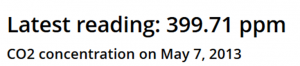
whew! I know if I patiently wait, the CO2 concentration will rise above 400 ppm in earnest since CO2 concentrations have been increasing by about 2 ppm/year
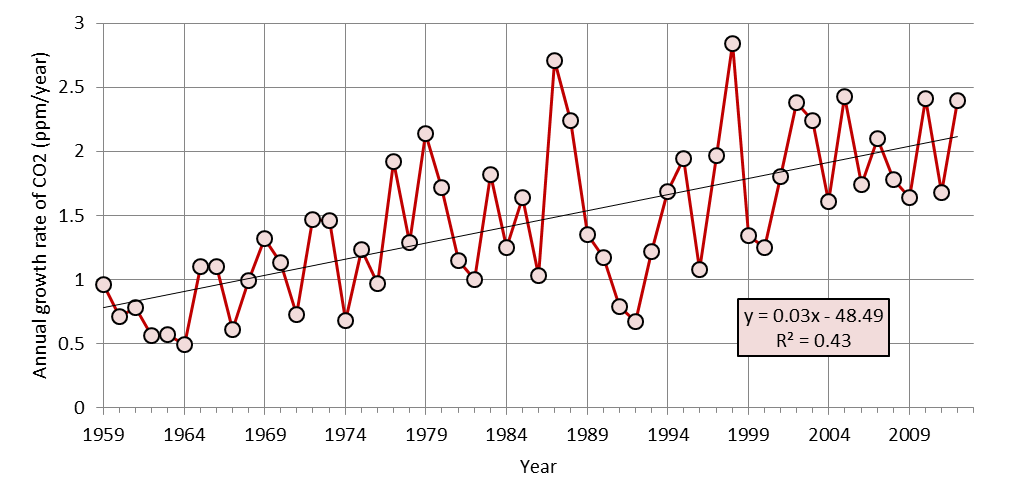
Global growth rate of atmospheric concentration of CO2

Global growth rate of atmospheric concentration of CO2 from 1959 to 2012 (data from NOAA ESRL in link below). 1959 is the start of in situ measurements. The best-fit line is overlaid for reference. You can see that the correlation coefficient is high. In this case, the R2 = 0.43 means that a line captures about 43% of the variance in the annual data. That, in turn, means that a line is a good approximation for predicting where we are going in the near-future.

for a long time with some indication of acceleration in the last few years as the NOAA ESRL CO2 data repository data indicates. Finally, note that hourly measurements of CO2 have already jumped over 401 ppm at times as shown in this figure from Scripps. 400 ppm is inevitable, but what this means for the world is something that science is trying to figure out.mlo_one_week-2013-05-07