Building on a previous discussion about a seasonal forecast product from NOAA Climate Prediction Center (CPC), I am still really curious about how robust the features in the seasonal weather patterns in the USA are. “Weather” in this case is referring to temperature and precipitation (T and PCP), and features refer to 3-month boxcar averages of T and PCP anomalies compared to the corresponding 3-month climatologies. So this is not the normal day-to-day weather or even the recent weather. Here are some new figures, which I explore below in terms of features that seem to be “robust” and features that seems to be “ephemeral”.
First, temperature in two plots:
Then, precipitation in two plots:
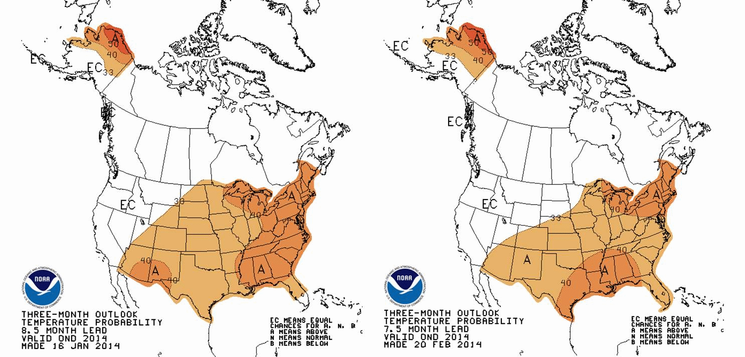
 Watch the figures carefully. All the animations start with a forecast for 3-month averaged T and PCP for March-April-May (MAM). Then, they step forward to April-May-June (AMJ)The CPC data product seems intended to provide an idea of whether T and PCP will be above or below average for the USA (including Alaska). In a previous discussion, I looked at CPC outlooks for 2014 and early 2015, and their figures and analysis were produced using actual mid-January 2014 conditions.
 New data
Now another month of data is in and CPC has updated their seasonal forecast to begin with mid-February 2014 conditions. A natural expectation is that the seasonal forecast would be better earlier in the overall forecast period. In other words, as the animation above progresses, the confidence in the forecast should decrease with time. Sometimes, however, larger patterns of atmospheric variability that emerge somewhere else in the world can exert some level of control on weather patterns (T and PCP) in the USA. El Nino-Southern Oscillation (ENSO, or sometimes just “El Nino”) is the best known example.There could be all sorts of speculative lines of thinking in terms of causes, so for now, I’ll focus on the features that seem to hold up after another month of data. I’ll call these robust, and point out one overall theme that is worth watching as winter releases its grip on much of the USA.
Robust Features
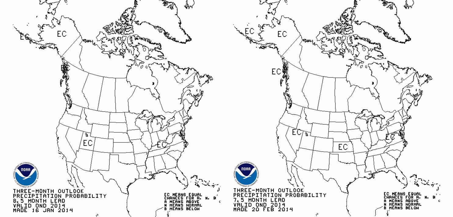
The Southwestern USA and often the Western USA in general is facing what will likely be a warmer than average year until about October. I think this is a pretty safe prediction. There is almost no evolution after more data was considered, except perhaps that the Pacific Coast tends towards higher probability of above average warmth. Upper Alaska is also holding up to the earlier forecast of warmth, especially in the northernmnost reaches. Both these regions are well known as fire prone under unusual warmth. Uh-oh. By November-December, the above average warmth shifts to the mid-Atlantic and the Southeast USA. The Northeast USA drifts towards unusual warmth starting in the summertime, maybe July, and ending about, oh, early next calendar year. For precipitation, much of the USA seems to be a normal water year. The problem is that in the near term, California remains dryer than average. Other features in a featureless prediction are that the deep South is dry in the spring, while the Ohio River Valley is wetter than average. Northern Florida and the coastal SE USA tend towards dry late in the calendar year.*Summary and What the AVERAGE Year Looks Like
Overall, the story remains clear: The USA should experience another warmer than average year. Warmer than average is a relative term. Remember that NOAA (and CPC) define the normal temperature and precipitation amounts by the 1981-2010 30 year average. This is a particularly irritating 30 year timeframe mainly because climate is clearly warming most rapidly during the 1970 to present day period. It is what it is, but sometimes the simpler message is lost. The CPC forecast is for a year that is warmer than the 1981-2010 average. So what is the 1981-2010 average?? This is what the 1895-2013 temperature and precipitation trends for the contiguous USA (no Alaska) from NOAA NCDC with the baseline average 1981-2010 average temperature overlaid.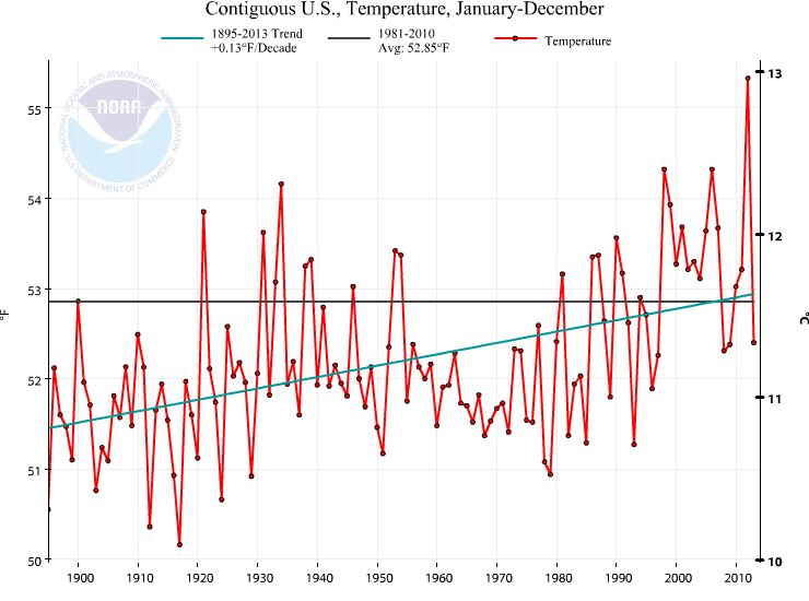
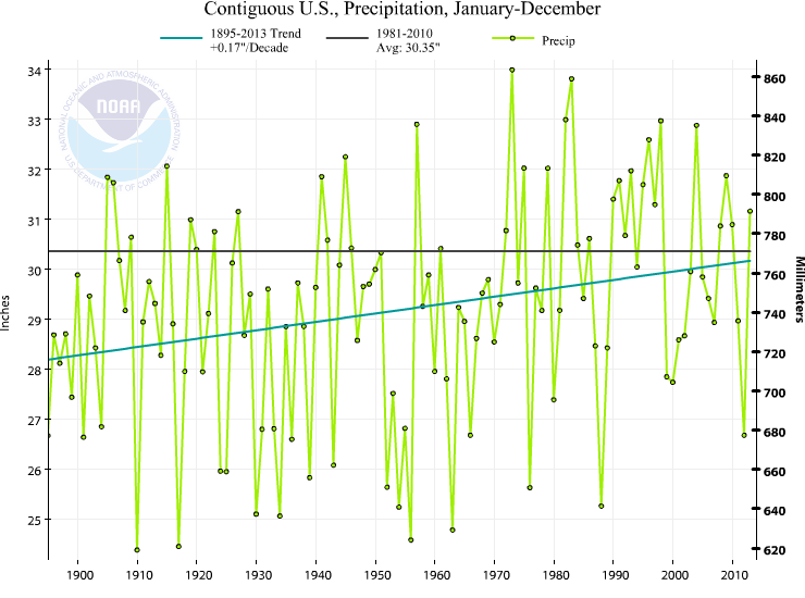 The precipitation is not the story, in my mind. The story is that we should expect a warmer than 1981-2010 year. The average of 1981-2010, without doing any math, is clearly warmer than most of the years this past century. Quickly eyeballing this number says that 82 of the 100 years in the last century are colder than the 1981-2010 average. This is really important in terms of perception of the significance of a warmer than “average” year. 1981-2010 is not a very good choice for the “average”. Gonna be a warm year according to CPC. Nowhere is there a robust and spatially significant feature suggesting below average temperatures, by the way.
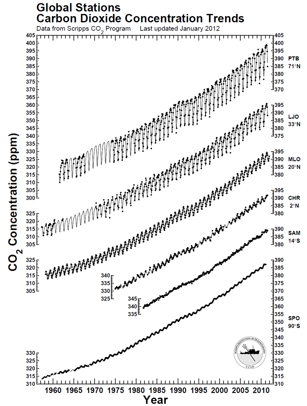 There is clearly a bias toward higher CO2 in the northern hemisphere compared to the southern hemisphere – CO2 is about 10-12 ppm higher near the north pole. This piece of information – this data – reflects the higher abundance of sources of CO2 in the northern hemisphere and the relatively slow