Associate Professor, Department of Geography and Earth Sciences
AUTHOR

Brian Magi

Beijing air quality and agricultural fires

As I browsed through my favorite twitter feeds which includes @BeijingAir and the other US Embassies, I saw there was some really really poor air quality in Beijing. The US Embassies in China tweet particulate matter 2.5 (PM2.5) concentrations in the atmosphere on an hourly basis and also provide 24 hour average PM2.5 per the (USA) EPA regulatory methods. Namely, 24 hour PM2.5 is what’s regulated by the EPA in our country, and since US Embassies are US territory (as I understand it from The Simpsons Bart vs Australia episode), then US-relevant metrics are tweeted in addition to the hourly data. I tweeted about the very poor air quality in Beijing today

and

The second tweet was an tribute to an Onion article saying something like EPA tells people to stop breathing but I couldn’t find a link. Ok. So after I sent out that 2nd tweet, I began to wonder: What the heck is going on in Beijing? PM2.5 is above 400 ug/m3* for hours on end during the day and the 24 hour average PM2.5 just got tweeted as nearly 300 ug/m3. This is extremely hazardous, both on the EPA scale of Air Quality Index (AQI) and on the scale of I-Cannot-Breathe-Long-Enough-To-Finish-This-Sente… (no link to that scale). As the title of the post implies, the answer is related to burning practices – and I think it’s worth more that a couple of tweets. I’m asserting that the main problem is emissions from local/regional agricultural fires. This touches on my own research into fires and the peculiar human-influenced fire seasonality as a function of where you are in the world. Now, take it easy, I tell myself. Why? Every scientist loves to talk about science, but we especially love talking about our own research. I’ll try not to go on and on, is what I’m saying.

How can we do a first-order (read as “informal”) test of this hypothesis? First, let’s check satellites. There is some very accessible information from NASA that can be used to study problems that aren’t in the data-rich part of the world or in the parts of the world where I don’t even know what the characters are for “fire”. NASA has a satellite called Terra reporting data since November 2000. From this page, I googled the lat-lon of Beijing (40 N, 116 E) and created my own custom satellite image of Eastern China with the approximate location of Beijing marked.
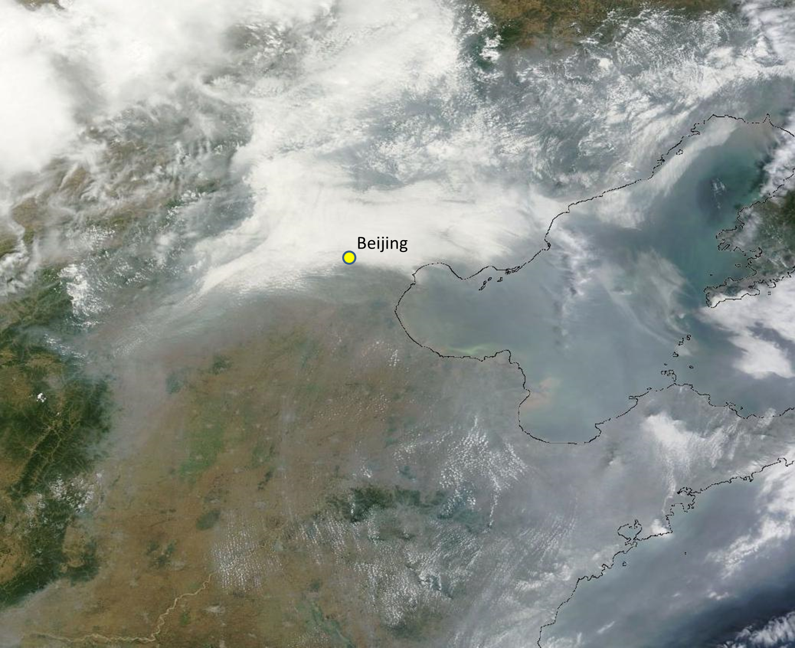
Satellite image from MODIS sensor on the NASA Terra satellite for June 28 2013.  Beijing location is approximate.

Satellite image from MODIS sensor on the NASA Terra satellite for June 28 2013. Beijing location is approximate.
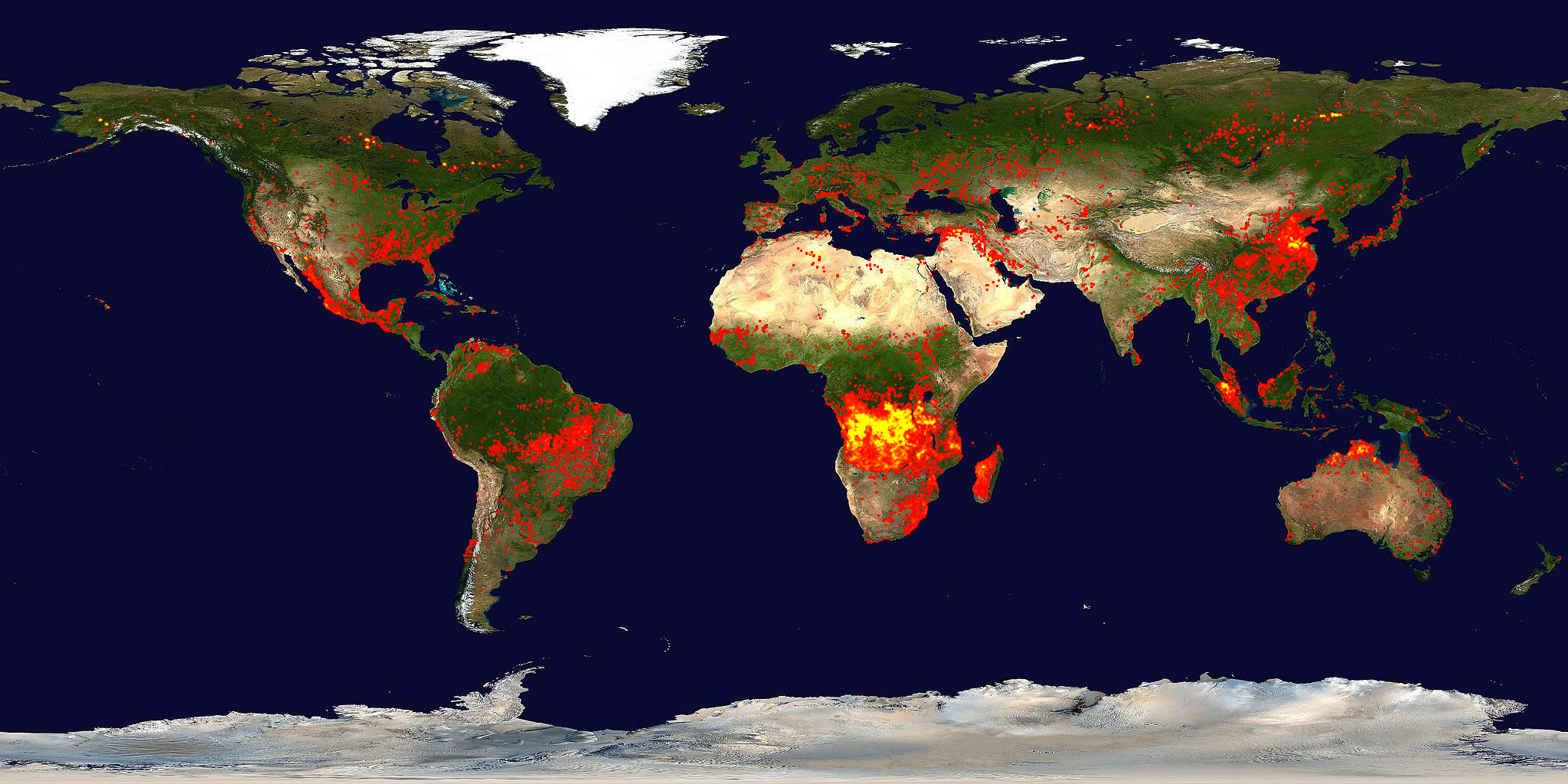
Right away, you see there are clouds. But there are also signs of gray-ish haze very similar to my research page header up at the top (smoke pouring off of southern Africa). So smoke is a distinct possibility. Now we can use data from the same NASA satellite (Terra) and same sensor (MODIS) but using a different wavelength of electromagnetic radiation. Namely, the parts that we feel/sense as heat – or thermal infrared radiation. Turns out, NASA has a whole team of scientists looking at this data and there is a data product called the Thermal Anomaly product. Something more “operational” (meaning it’s available at a semi-regular and rapidly updated way, like weather data is for weather forecasting models) for global fires is available at the same NASA website as I used to get the image above. Here’s the global view of fires
Global fire activity from the last 10 days ending on June 28 2013.

Global fire activity from the last 10 days ending on June 28 2013.

Clearly, fires are active in Eastern China – so we’re almost at the bottom of the mystery of why @BeijingAir is not the place for breathing deeply right now. You can download a map file showing fires from the last 48 hours for different regions by going to the KML tab and opening the KML file in Google Earth. I downloaded the “Russia and Asia” KML file and produced this
Active fires from the MODIS sensor on the NASA Terra for the 48 hours ending on June 28 2013.

Active fires from the MODIS sensor on the NASA Terra for the 48 hours ending on June 28 2013.

where you can see that my Google Earth has the Beijing Embassy location saved as a placemark. Regardless of the clouds, the pollution from the fires is certainly pouring into the atmosphere over Beijing and affecting surface air quality to the point that the AQI values are nearly off the scale again, but this time, it is not because of the combination of meteorology and emissions from fossil fuel consumption.

The winter and spring months – the months related to the very poor air quality referred to in the report above and here – are plagued by deep near surface temperature inversions that act to inhibit mixing. What does this mean? Well, if pollution is emitted from cars and factories in Beijing in the winter-spring, it will tend to stay in the first 500 meters (1800 ft) above the ground – roughly. The pollution gets trapped. On a day without a temperature inversion, the pollutants emitted are probably about the same, but mix into a much deeper atmosphere (say about 2000-3000 meters, or about 4-6 times deeper layer). The pollution is thus more dilute. I haven’t checked meteorology in the case of todays very poor air quality, but I suspect the effect of meteorology (even if mixing is deep and efficient) is overwhelmed by the emissions from all the fires southeast of Beijing.

What kind of fires? Or why are they burning? Great question! Are these forest fires like the lightning-triggered fires plaguing the Western USA right now? No! When you mask out the Terra MODIS fire data in a way that you only look at data from land that is mostly cropland (agriculture) in Eastern China, then you find something related to our findings in the Biogeosciences paper.
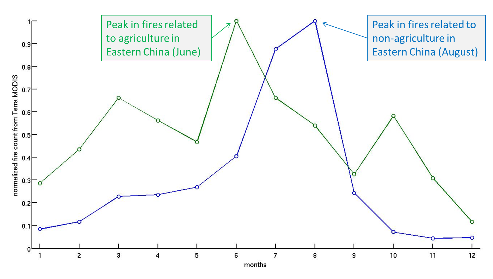
Fire season for land that is mostly agriculture (cropland in Eastern China) and land that is mostly non-agriculture (forests, grasslands).  This is based on the average over 10 years of data from MODIS.  More analysis like this in the link to my paper below.

Fire season for land that is mostly agriculture (cropland in Eastern China) and land that is mostly non-agriculture (forests, grasslands). This is based on the average over 10 years of data from MODIS. The region considered is roughly Mongolia and China. Other parts of the world look much different – more analysis like this in the link to my paper below.

The figure above shows that while the land with a low fraction of cropland (less than 20%) tends to burn in July-August, the land with a high fraction of cropland (greater than 80%) tends to burn in (you guessed it) June-July. As the caption states, these “average” seasonalities are based on over 10 years of Terra MODIS fire observations. When you average 10+ years of Junes for the low and high fraction of cropland, you get the data point in month six for blue and green curves above. In other words, the fires are right on schedule, Eastern China! Hopefully for the citizens of Beijing, the burning will be short-lived and meteorology will transport the smoke away and dilute it down with clean air in the process.

All that being said, a full scientific analysis of the air quality requires much more than this post offers. Sensitivity, ground-based analysis, meteorological analysis, and actual counting of the fires among other things would be required to prove with a much higher degree of confidence that my hypothesis does not fail, but usually scientists make hypotheses because they observe an event/phenomenon that is consistent or inconsistent within some sort of framework. In this case, what I saw in China air quality was inconsistent with what I understood about the meteorology there (for this time of year) and consistent with the work I did with colleagues regarding fire seasonality.

*The unit of concentration for PM2.5 is micrograms per cubic meter which is often written as ug/m3 even though the “u” should be the Greek letter “mu” which itself means “micro” which is one millionth and “m3” should be “m” with a superscript “3” to indicate “cubed”)

The Climate Change Speech transcript and video

Here’s an update from my post yesterday about the Climate Change Speech. Link to the video on Youtube via whitehouse.gov. The video is downloadable (mp4) so you can show students how a speech embodies leadership on an issue that will, in my opinion, define this and the next generation. Link to the transcript of the speech at Georgetown University.

When I review the transcript, I think about the speech Margaret Thatcher gave to the UN in 1989. Thatcher opened her speech about global warming with the voyages of Charles Darwin. Obama opened his speech with the voyages to space by US astronauts.

President Obama said on a hot summer day (92 F air, 67 F dewpoint means about 96 F heat index) in Washington DC in June 2013

On Christmas Eve, 1968, the astronauts of Apollo 8 did a live broadcast from lunar orbit. So Frank Borman, Jim Lovell, William Anders — the first humans to orbit the moon -– described what they saw, and they read Scripture from the Book of Genesis to the rest of us back here. And later that night, they took a photo that would change the way we see and think about our world. It was an image of Earth -– beautiful; breathtaking; a glowing marble of blue oceans, and green forests, and brown mountains brushed with white clouds, rising over the surface of the moon. And while the sight of our planet from space might seem routine today, imagine what it looked like to those of us seeing our home, our planet, for the first time. Imagine what it looked like to children like me. Even the astronauts were amazed. “It makes you realize,” Lovell would say, “just what you have back there on Earth.”

Prime Minister Margaret Thatcher said in November 1989

During his historic voyage through the south seas on the Beagle, Charles Darwin landed one November morning in 1835 on the shore of Western Tahiti. After breakfast he climbed a nearby hill to find advantage point to survey the surrounding Pacific. The sight seemed to him like “a framed engraving”, with blue sky, blue lagoon, and white breakers crashing against the encircling Coral Reef. As he looked out from that hillside, he began to form his theory of the evolution of coral; 154 years after Darwin’s visit to Tahiti we have added little to what he discovered then.

What if Charles Darwin had been able, not just to climb a foothill, but to soar through the heavens in one of the orbiting space shuttles? What would he have learned as he surveyed our planet from that altitude? From a moon’s eye view of that strange and beautiful anomaly in our solar system that is the earth? Of course, we have learned much detail about our environment as we have looked back at it from space, but nothing has made a more profound impact on us than these two facts.

First, as the British scientist Fred Hoyle wrote long before space travel was a reality, he said “once a photograph of the earth, taken from the outside is available … a new idea as powerful as any other in history will be let loose”. That powerful idea is the recognition of our shared inheritance on this planet. We know more clearly than ever before that we carry common burdens, face common problems, and must respond with common action.

And second, as we travel through space, as we pass one dead planet after another, we look back on our earth, a speck of life in an infinite void. It is life itself, incomparably precious, that distinguishes us from the other planets. It is life itself—human life, the innumerable species of our planet—that we wantonly destroy. It is life itself that we must battle to preserve.

I could read those words over and over again and never feel any less attached to the idea of a global community and the potential role that science can play in achieving this goal. After yesterday, the goal seems attainable.

President Obama takes the offensive on climate change

Categories: Group News

Wow. What a speech this afternoon by President Obama on the Georgetown University campus – and a beautiful follow up to his Inaugural Address in January and his State of the Union speech shortly thereafter – noting one satire piece that is worthy of watching. He stepped onto the stage at about 2pm Eastern time and delivered. The backbone was the announcement of the President’s Climate Action Plan (click for PDF). The papers were buzzing – Washington Post for example but there were many many more “responses” to the unveiling of the Climate Action Plan. Twitter was super active from about 2-5 pm Eastern time with #ActOnClimate trending high. I haven’t been around Twitter long enough to see the electricity flowing like this, but watching the speech and the tweets at the same time was pretty inspiring. Entertaining too. Twitter was like a race to see who could point out a quote by @BarackObama the fastest. Obama said a lot of great things, but I like this one.

We don’t have time for a meeting of the Flat Earth society

He pointed out that the Clean Air Act only promoted American innovation and did NOT destroy the economy, and noted that the Clean Air Act passed nearly unanimously with only ONE DISSENTING VOTE. Times have changed! He metaphorically referred to the economic potential of moving to clean energy as the building of a new engine, referring (I presume) to the innovation of the automobile industry in America throughout the 20th century. Clean energy is here in this country now. He said that 75% of wind energy is in Republican districts (!). The community organizer in our President emerged as he gave credit to past Republican efforts to help our environment – the EPA was created under the Nixon administration, for example.

I haven’t found the transcript or the high quality video yet, but June 25, 2013 was a very memorable moment for the USA. I hope it marks the turning point and that the USA leads – like it should, says this US Citizen – the development of a global community around the issue of global warming. I’ll leave you with an amazingly long graphic from the White House page.climate_change_report_62513_final_0

Interactive USA wildfire map from Climate Central

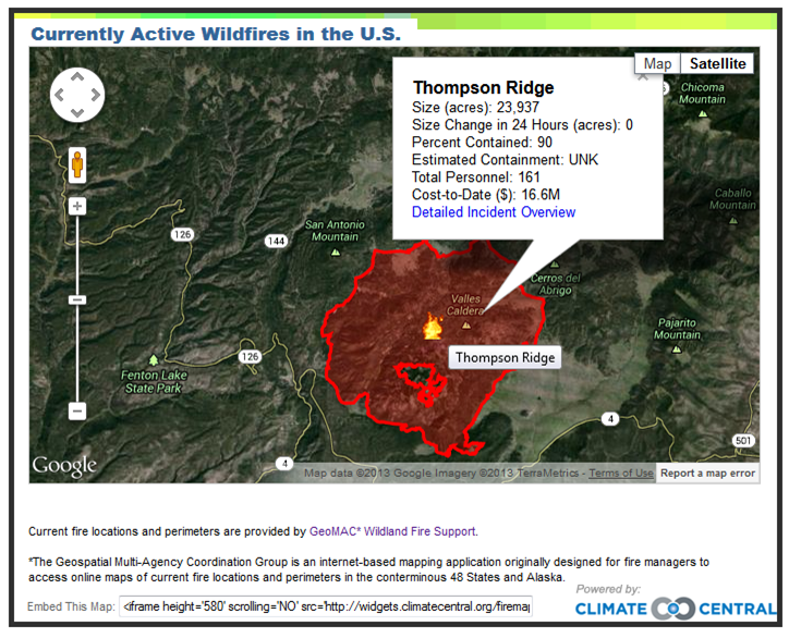
Amazing what a team of scientists, techs, and a pile of data will bring you. I tried to embed a great map interface by the group at Climate Central here, but it didn’t work so here’s a screenshot of the information the interactive map provides when you zoom into one of the large fires affecting the USA right now (this one near Los Alamos, New Mexico).climatecentral-firemapGo to their widget here or to the more detailed posting about the widget here. Essentially, Climate Central is posting updated USA (or maybe North America) fire locations with really useful (and frightening) details as they roll in from daily reports by fire and land managers. Respect and praise for this great product of the intersection between science, technology, and public outreach. I wish the fire crews the best as they battle against an unforgiving enemy.

May 2013 climate in North Carolina and the world

With global warming and all of the impacts, it’s very important to constantly consider the question of time and space scales. May 2013 is a good example for those of us living in the Southeastern USA or North Carolina. Namely, North Carolina’s normal-to-cool spring is not at all indicative of how the global temperature is evolving. Let’s see how we can quickly use NOAA NCDC graphs to figure this out.

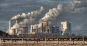
Global warming refers to the increase in average temperature of the entire Earth. The last part – the entire Earth – is the spatial scale. And that’s a huge spatial scale! When a scientist talks about global warming or that global warming has been detected, you have to step back and say WOW. What on Earth could warm an entire planet? coal_fired_power_plantOver long time scales, of course there are a number of possible reasons (changes in the Sun, Earth’s orbital shape/proximity around the Sun, plate techtonics), but these take so long, they aren’t relevant to the concept of global warming. Even my statement that What on Earth could warm an entire planet? should be more precise and say something like What on Earth could warm an entire planet over a relatively short time period? The simplest, if somewhat incomplete, answer is the combination of greenhouse gases and aerosols emitted into the atmosphere from human activities. Period.
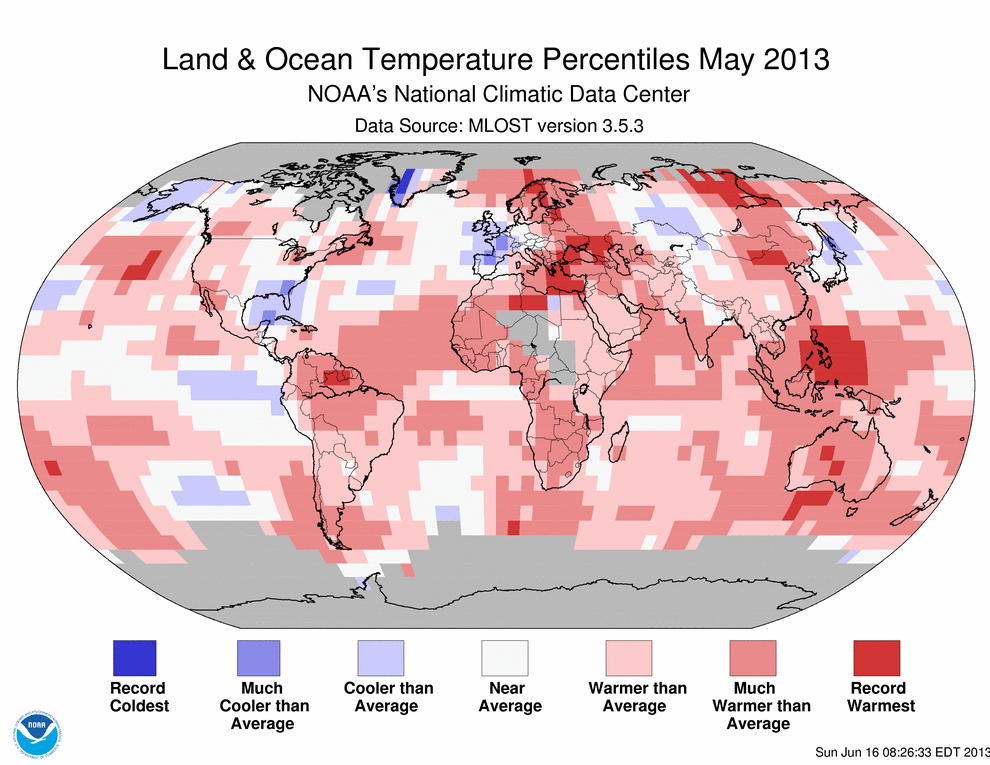
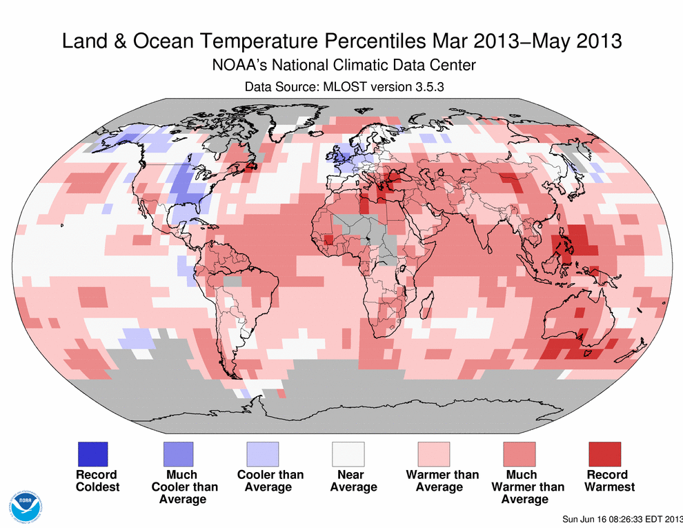
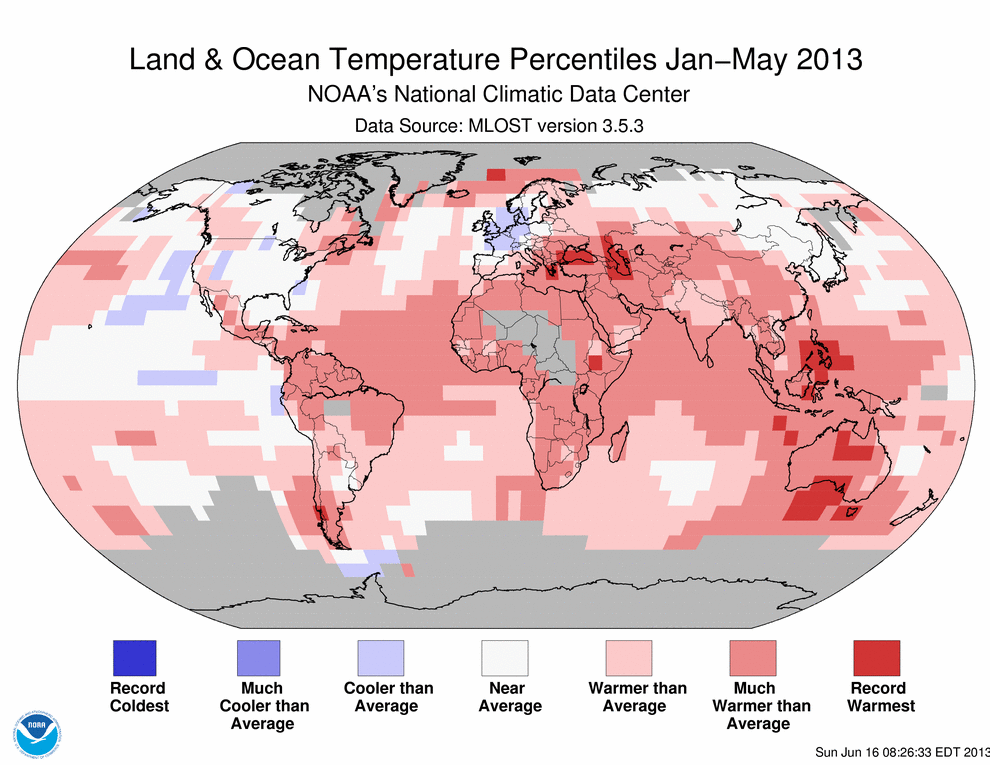
May 2013 analysis of global temperatures are trickling out. NOAA NCDC as always has a wonderfully complete report of climate news for May and for all previous months. My favorite part is the plethora of hyperlinks. NOAA NCDC should really be commended for their public outreach! Here is one of the figures from that webpage201305where you can see how different the Southeast USA is from the world in May 2013 – the world is shades of red, while the Southeast USA is shades of blue (cooler than normal). We’ve had a very pleasant spring in North Carolina. Pull back on the temporal (time) scale to see the March-April-May seasonal average201303-201305 and you can see that the cool spring extends well beyond May in terms of the anomaly. By this, I mean that the blues become deeper when you consider a three month period (March-April-May) and that implies without any quantitative work that March-April were more cooler-than-average. Pull back slightly further to the year-to-date rankings201301-201305and here you see that the Southeastern USA and in fact most of the USA and even Alaska have been right at the climatological normal (which for NCDC is the average temperature from 1981-2010). The short story is that North Carolina below average temperatures for the period from January to May, March to May or just plain old May are not indicative of global temperatures. The real question is why?

Coffee is the greatest and healthiest drink on the planet

Categories: Group News

Agent Dale Cooper from the Twin Peaks TV series.  He relished his cup of coffee.

Agent Dale Cooper from the Twin Peaks TV series. He relished his cup of coffee.

Ok, maybe this article/post doesn’t exactly say what I chose to title this. But I like coffee, so all my scientific training goes out the window and I just nod at every self-reinforcing statement in that article. I’ll admit that I won’t even bother to do any level of fact-checking on this. It just has to be true!

I evolved about 6-7 years ago and drink black coffee about 95% of the time. I think I switched from milk-coffee to black because I spent my free birthday starbucks coffee on a pumpkin spice latte. Gross. I’ll still get a (non pumpkin spice) latte every now and then, but a good cup of espresso or black at the right temperature… wow. Grab a cup, and watch a wordsmith talk about how little we should care about the facts (in this case). Long live coffee! Long live Agent Cooper! And, heck, long live chocolate too! It’s good for you – prove me wrong.

Twitter and science

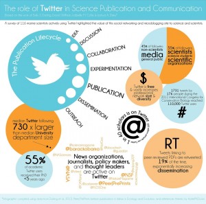
I’ve been starting to use twitter – mainly to supplement my research interests. I have zero confidence in facebook as a useful platform for anything remotely scientific or supportive of science, but twitter somehow seems different. The first twitter account I followed was @BeijingAir early this calendar year as reports of ridiculously bad air quality emerged yet again. I was quickly impressed by this informal but rigorous reporting of hourly (!) air quality relevant metrics such as particulate matter (PM2.5) concentrations.twitter-scienceI even started to develop discussions around the US Embassy in Beijing twitter feed in my Atmospheric Chemistry class this past Spring semester, drawing comparisons between my published research from Africa (of essentially PM2.5) and the measurements reported @BeijingAir. I haven’t read my course reviews yet, so I don’t know whether my students liked these discussions or the problem sets that I made related to twitter. I liked it though because it was current and relevant in questions of applied atmospheric chemistry and thinking about our global society. The problems in our backyard are relevant, but I love to think that we as a global civilization can solve problems in a collective way. This philosophy is a natural fit with the concept of social media, and my opinion is that twitter is a better fit than other social media.

Then while I’m flipping through one of my various science digest emails over lunch one day, I see this article and realize that there is apparently a collective move of scientists to employing twitter as a serious way to connect. The figure above was posted in that article and you can click and see the higher resolution version. The analysis in that post resonates with how I’m thinking about twitter – namely it allows the science I do to have the potential to be much more relevant. Given that many undergraduates leave the university without even knowing what it is that an “assistant professor” does or what the difference is between an “assistant” and “associate” professor (or that the difference exists), I would say it is critical that the academy makes sure that the future minds walk away from their college degrees with some idea of what it is the professionals in front of the classroom or giving seminars are doing. Most of us assistant professors, for example, are not sitting around after classes stop for the summer drinking margeritas, but in all this surveying of people about climate change and global warming, I haven’t seen questions probing this awareness of what the academy is. Thin Ice actually touches on this topic in terms of what it is an Earth scientist does and why.

Which brings me back to twitter. The graphic above has the key points that I will watch for in twitter: 1. 45% of followers are non-scientists, media, general public, and 2. median twitter following is 730 times median department size. The other points are pretty darn good too! If you want to see what I’m tweeting, thinking, following, etc., visit my twitter feed @brianmagi. I’ll continue to sort through ideas and thoughts and announcements on my personal webpage and blog, but twitter will be great during the academic year when teaching takes a big chunk of my time.

Global carbon emissions increased in 2012

Unlike the somewhat misleadingly rosy picture painted by President Obama about (USA) carbon emissions in his Inaugural Address and his State of the Union speech in 2013, the global carbon emissions are what matter. So if the USA continues to mine coal and ship it elsewhere, it is not an improvement except for the USA emissions portfolio. It’s like a gambler who doesn’t count losses at casinos other than the one he or she is sitting at. The International Energy Agency released a report stating that global carbon emissions are up 1.4%.bluemarble.eastI haven’t read the IEA report, but I came across the press release via the excellent energy/economy reporting they are doing. Then I heard the same WA Post reporter on the Diane Rehm show this morning (available for mp3 download via ITunes, for example). Then I read about the IEA article on Climate Central. Whew!
The Diane Rehm show had a good panel, with a requisite global warming “skeptic” (whatever that means!). That skeptic role was played by an analyst from The Heritage Foundation*. The other roles on the panel were the Post journalist, an analyst at the Environmental Defense Fund**, and a research scientist from Rutger’s University***. I would say that Diane Rehm handled the panel well, and I think that the Heritage Foundation representative overplayed his hand to the point where his comments were generally made irrelevant. In other words, he spoke too much and too glibly (is that a word) and made points that undermined his real argument that adaptation may be the most likely pathway (which is actually kind of interesting). The other panelist laid into the sillier points that the skeptic made and shut him down. Rehm left it that way.

Shutting down those punchline-style quips (memes) is really how the discussion should be every time. The Earth is warming. CO2 and other greenhouse gas concentrations continues to rise. The conversation should be about how it is our civilization needs to adapt and change. This is what the IEA discusses. Mitigation of carbon emissions is a huge discussion in the science journals. The IEA report is highlighting that we as a civilization are heading towards a major point in our hunger for fossil fuel based energy. This hunger has been targetted by scientist since the 1980s and arguably since the late 1800s! Think about solutions and strategies when you are thinking of how you want to make an impact on your community or your country or even the world. Think about our Earth and our future. The world needs you.

*The Heritage Foundation webpage states: Founded in 1973, The Heritage Foundation is a research and educational institution—a think tank—whose mission is to formulate and promote conservative public policies based on the principles of free enterprise, limited government, individual freedom, traditional American values, and a strong national defense.

**The Environmental Defense Fund webpage states: We are passionate, pragmatic environmental advocates who believe in prosperity and stewardship. Grounded in science, we forge partnerships and harness the power of market incentives.

***Dr. Jennifer Francis is deeply involved in improving our understanding of how the Arctic affects the USA – see google scholar or video of her talking about her work

Bring on double-blind peer review

My peer-reviewed publication record isn’t long yet, but I have participated in the anonymous peer-review process in a number of different scientific journals. I’ve read some great science that I thought was ready to be published only to see it rejected at the editor level of the journal. I’ve read grant proposals (how scientists fund their research but also how they gain recognition well beyond their immediate sphere of colleagues) that I would recommend and support, but that are rejected. I’ve read other manuscripts that I reject repeatedly to the point that I tell the editor asking me to review the article yet again that I simply will not read that article anymore. Science is built on recognizing incremental progress towards a solution, and more rarely on that great leap forward. Underneath it all, however, is the peer-review process.

Peer-review is the gateway to publications in technical journals, acceptance into conferences and workshops, and earning money to conduct research through grant proposals from funding agencies like NSF and NASA (among others). All professors hired to do research face these basic metrics when their professional activities are reviewed. Did they publish? Were they awarded a grant? Did they attend conferences? Other than organizing travel around teaching (and family), the last one is the easiest professional activity to participate in. I have never been rejected from a conference, for example. Conferences also carry the least weight when professional activities are reviewed.

So it comes back to publications and grants – two activities that are strongly dependent on peer-review. When I began reviewing articles submitted for publication as a graduate student, I couldn’t believe that the process of review was anonymous only from the reviewer side. Right away, I thought the review should be anonymous from both sides – the reviewer should not know who the authors (usually there are multiple) are and the author(s) should not know who reviewed the paper. Imagine a 4th year PhD student receiving a paper to review from a prominent journal that is co-authored by a scientist who has 100+ publications (a large number in climate and related sciences – usually meaningful in the sense that this person has done some serious work. Check out James Hansen’s peer-reviewed publication list) What kind of bias does the reputation/track-record of that author introduce into the review process for that poor graduate student? The same issue of a heavy hitter can play out the other way too. Imagine that prominent scientist is reviewing the second paper you’ve ever published and they’ve never heard your name or anything about your research. They might (might!) more easily dismiss your work than they would of a fellow heavy-hitter. The question of bias is hard to answer quantitatively. All that being said, I have had some great informal interactions with reviewers of my papers who voluntarily disclosed their identity. And even without knowing the reviewer’s name, their comments have almost always helped to improve my paper in some way. Still, bias is a nasty beast and scientists are human. That link goes to a paper published last year that concludes

The dearth of women within academic science reflects a significant wasted opportunity to benefit from the capabilities of our best potential scientists, whether male or female. Although women have begun to enter some science fields in greater numbers, their mere increased presence is not evidence of the absence of bias. Rather, some women may persist in academic science despite the damaging effects of unintended gender bias on the part of faculty. Similarly, it is not yet possible to conclude that the preferences for other fields and lifestyle choices that lead many women to leave academic science (even after obtaining advanced degrees) are not themselves influenced by experiences of bias, at least to some degree. To the extent that faculty gender bias impedes women’s full participation in science, it may undercut not only academic meritocracy, but also the expansion of the scientific workforce needed for the next decade’s advancement of national competitiveness.

Maybe the tone of that conclusion is reflected in this “letter” to Harvard University published recently in the Washington Post. I’m not convinced that the letter is really effective, but the point I took from it was that bias has consequences that may not be evident right away. Clearly, bias (intended, but more likely unintended as the PNAS article concludes) is, as I said before, a nasty beast.

Getting back to peer review and how it’s susceptible to bias, the simplest solution is that both sides remain anonymous and this is known as a double-blind peer-review. Finally, the journal Nature, which has a long history and is internationally-recognized and is so large it is now a publishing group with a number of disciplinary publications, has decided to include the option for double-blind peer-review in the journals Nature Geosciences and Nature Climate Change. This move is in my mind really important and I hope it is successful. Nature Geosciences published this editorial. The key point in this editorial is

In a reader survey last year (Nature Geosci. 5, 585; 2012), three-quarters of respondents were supportive of double-blind peer review, with only 16% unconvinced. Interestingly, those who might benefit did not preferentially support a double-blind process: the ratios of males to females, established scientists to young researchers, and people from western countries to scientists elsewhere in the world, were all very similar (down to a per cent or so) between supporters of double-blind peer review and the entire group of respondents.

Towards the future we go!

CO2 trends from around the world

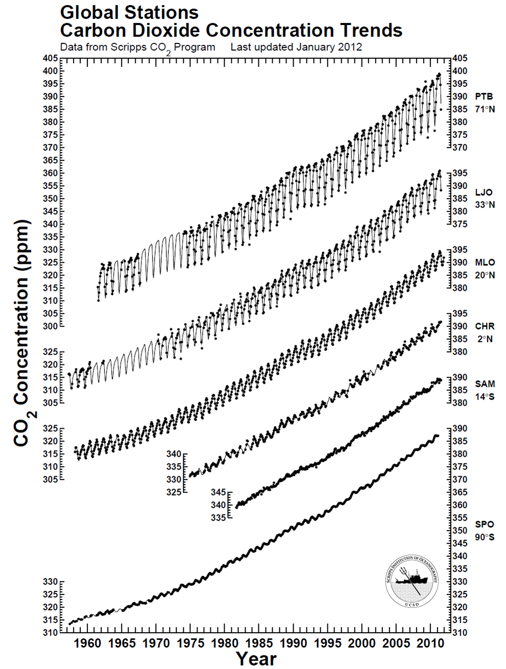
Time series are profilic in climate science. This is a dataset that shows the how a measurement changes over some period of time. The best known in our world is the global warming time series displayed as the globally-averaged surface temperature trend, which is compiled from thermometer measurements. A few research groups worldwide maintain this analysis (NASA GISS, UK Met Office, NOAA NCDC). Since CO2 is in the news, and since there is variability from one measurement location to another, it is useful to see how the best-known station in Mauna Loa, Hawaii (source of the data shown in the Keeling curve graph). Once you navigate the shifting axes (y-axis on the right and left, and the time series begin at different points in the past) and digest the information visualized here, the graph below is very useful in quickly understanding variability in CO2 concentration from the northernmost latitudes to the southernmost, noting the latitude is listed under the three-letter station identifier but that the graph is arranged north to south.co2-globaltrendsThere is clearly a bias toward higher CO2 in the northern hemisphere compared to the southern hemisphere – CO2 is about 10-12 ppm higher near the north pole. This piece of information – this data – reflects the higher abundance of sources of CO2 in the northern hemisphere and the relatively slow transport times required for air to move across the equator (like a slow drip compared to the winds we feel every day in the USA). The graph also effectively conveys another dimension of information: Regardless of the specific location of CO2 measurement, the long-term trend is essentially the same worldwide, indicating that CO2 continues to accumulate in the atmosphere worldwide at about the same pace. The trend could relatively easily be quantified, but sometimes qualitative analysis is enough. From the webpage where I found the figure, the station identifiers are PTB = Point Barrow, LJO = La Jolla, MLO = Mauna Loa Observatory, CHR = Christmas Island, SAM = Samoa, and SPO = South Pole. You can also find some commonality in the stations at NOAA’s website. All in all, a great data visualization that can be done entirely in black-and-white!