air quality

Unusually Bad Air Quality in North Carolina

Categories: Research News

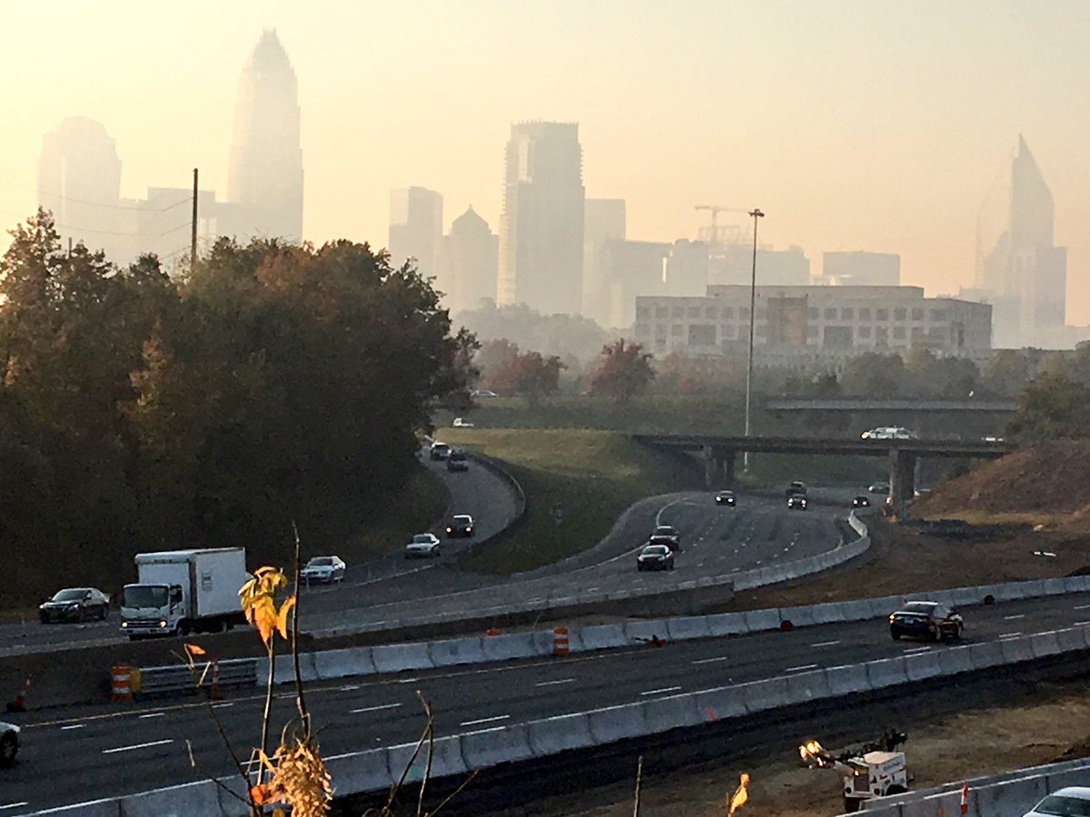
Many communities in western North Carolina and in the Queen City of Charlotte have been and continue to be impacted by smoke pollution from fires on the eastern side of the Appalachian Mountains near Lake Lure and South Mountain State Park. The smoke is moving through the near-surface atmosphere with the wind and being trapped
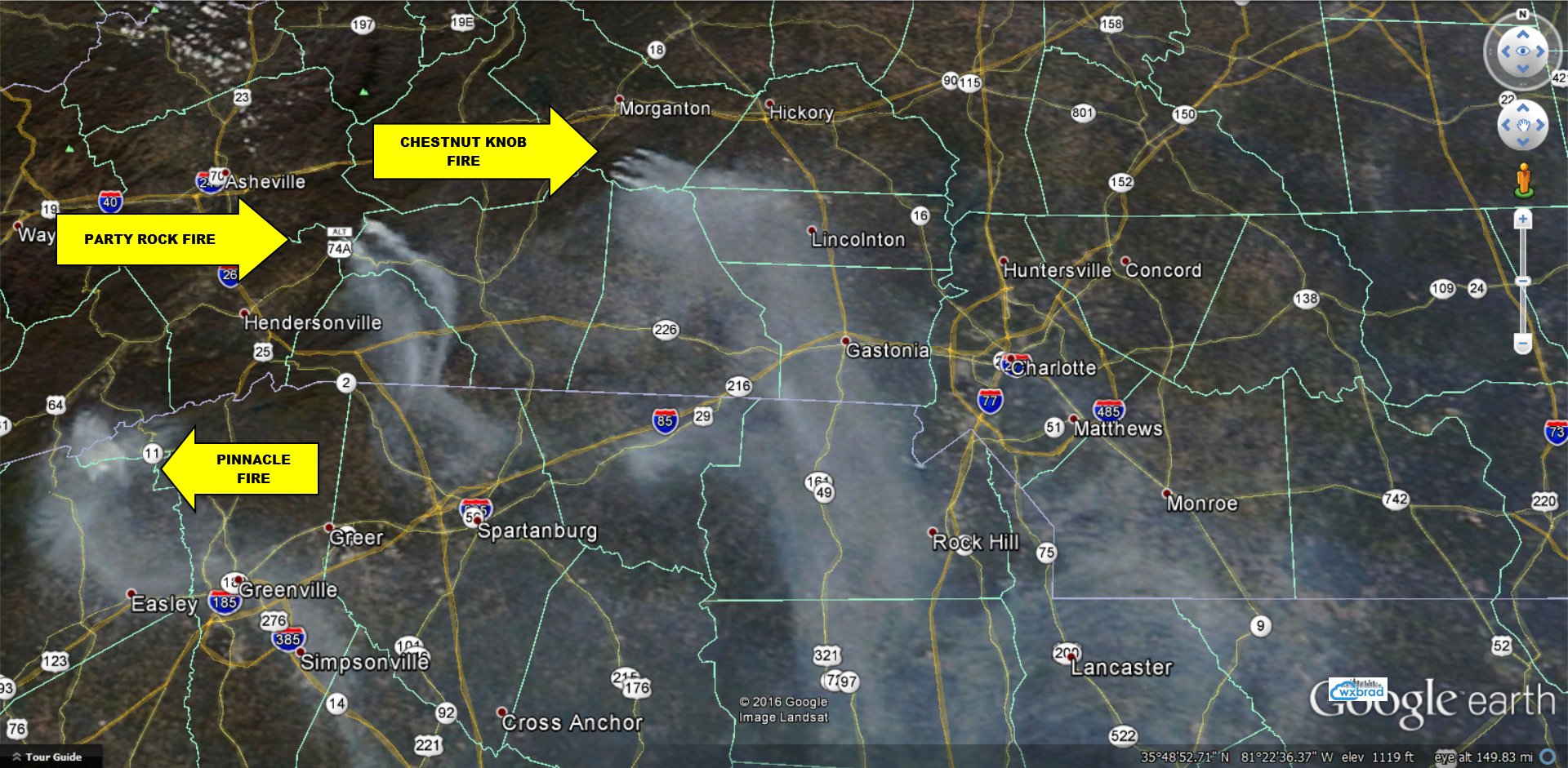
Image from the NASA MODIS sensor tweeted out by Brad Panovich at https://twitter.com/wxbrad/status/798969527417634823

Image from the NASA MODIS sensor tweeted out by Brad Panovich at https://twitter.com/wxbrad/status/798969527417634823

near the surface by a cold layer of air that forms overnight under what is called a surface temperature inversion. The inversion means that colder, denser air resides below warmer air, and because this is a relatively stable situation, the inversion traps any surface pollution near the surface. This is bad for people, since the surface is the part of the atmosphere we all live in, but the pollution event presents a very unique opportunity to collect data. Unique data is always interesting to scientists.

Earlier this calendar year, I worked as a part of an art-data-science initiative called Keeping Watch on Air, which was a big team of people from UNC Charlotte and Clean Air Carolina to work on how we talk about Air Quality in the Queen City. Clean Air Carolina spearheaded the Particle Falls art-science exhibition, which I hope everyone saw – it was amazing. Keeping Watch was/is a grassroots effort (no one gets paid) to bring broad expertise, stakeholders, and other agents together on a problem we all agree is important. One part of that project was an effort to figure out how to think about the air quality data scientists like me try to understand. Usually this kind of data is presented in “micrograms per cubic meter” or as an index called the Air Quality Index. I was working with Alisa Wickliff at the UNC Charlotte Center for STEM Education and a group of K-8 Teachers and Students on a science project where they collected air quality data, and I analyzed/processed it. Perfect for everyone! Crista Cammaroto (College of Arts and Architecture, Director of the Projective Eye Gallery at UNC Charlotte Center City) and I thought up a way to talk about Keeping Watch data that was in terms of something we all think about with air pollution: Particles per breath. We wanted to give people a sense of how much your body deals with in every breath, and what it looks like for polluted conditions. The posters Crista and I put together using the school data, my particles per breath calculation, and her eye for visual display are below. The dots show how many particles per breath and the imagery is from the students at the school to remind everyone why we should care about this stuff.
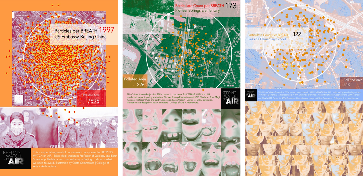
keeping-watch-sampleSo I applied our Keeping Watch on Air methods/thinking to the air quality data from today. Here’s what I found.
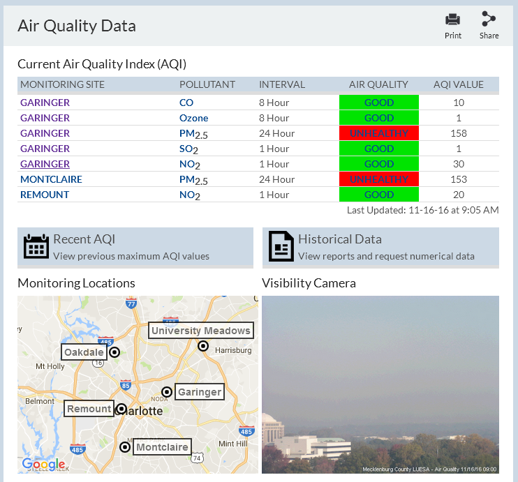
2016-11-16-09local-charmeckaqThis morning, Charlotte/Mecklenburg was in Code Red air quality, which is an unusually high value of AQI that we have not experienced in the last five years at least (thankfully!). Our AQI was 158 this morning from Garinger High School, which is managed by our county air quality office so they can report official numbers to the Environmental Protection Agency (EPA) and they can check our county against the national standards for pollution that have been established by science. The 158 AQI is determined from the average PM2.5 over the past 24 hours. Within that 24 hour period, there was a morning peak of AQI of 188 when I looked at the NC Division of Air Quality data. When I convert the 158 AQI to particles per breath via the methods I used for Keeping Watch on Air, then I found that we were breathing about 1000 particles per breath over the past 24 hours. The background “typical” PM2.5 concentration in Mecklenburg is much lower – around 100-200 particles per breath. So the air we were breathing today had about 10 times as many particles in every breath we took! And it was even higher – around 1700 particles per breath – during the peak of the pollution.

For comparison, I tweeted about how our air quality compared with the super-polluted megacity of Beijing, which is home to more than 10 million people. Our State Department USA embassy in Beijing has a high-quality air monitor system there and sends out automated tweets https://twitter.com/BeijingAir which is what i looked at to build a comparison. Their 24 hour avereage PM2.5 from about the same day as Queen City’s air pollution showed PM2.5 AQI of 180, which I translated into about 1500 particles per breath. Essentially, for this kind of quick “back of the envelope” type of calculation, our air quality and Beijing’s air quality were about the same. Said another way, if you felt discomfort or worse in today’s air quality, imagine living in Beijing or another mega-city without the policies that regulate pollution for us to actually have clean air.
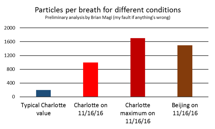
2016-11-16-comparison-nameBottom line, for much of the day we were breathing more than 10 times as many particles in every breath than usual. This is like a semi-typical day in Beijing where 50% of the days have AQI greater than 169 according to this peer-reviewed analysis by atmospheric chemists. I am working with staff at Clean Air Carolina and at least one UNC Charlotte student (Calvin Cupini) on analyzing data we collected around this pollution event, but results are TBD. It’s rare to have super high air pollution here, so as scientists we try to learn about what this means. As a fellow citizen of Mecklenburg, I do worry about what even a few days of high pollution means for all of our neighbors, and especially kids. For now, try to enjoy more colorful sunsets while the Queen City is impacted by all the smoky gunk in the atmosphere, and breathe deep when this pollution event subsides.
smoky-sunset-mark-barber-wsoc9

Life expectancy reductions in the polluted air of China

Shockingly little has been published in the peer-reviewed literature about the air pollution in China, although there has been plenty of press coverage. I talked a little bit about the US Embassy twitter data and how fires polluted the air over Beijing*. The health impacts of the exposure of humans to sustained levels of unhealthy or hazardous air pollution levels is widely expected to increase mortality rates due to cardiorespiratory failure and increased instances of cancer. The question then is raised: What hard evidence exists that proves this hypothesis? Modeling studies seemed like they would have to suffice. Until now.

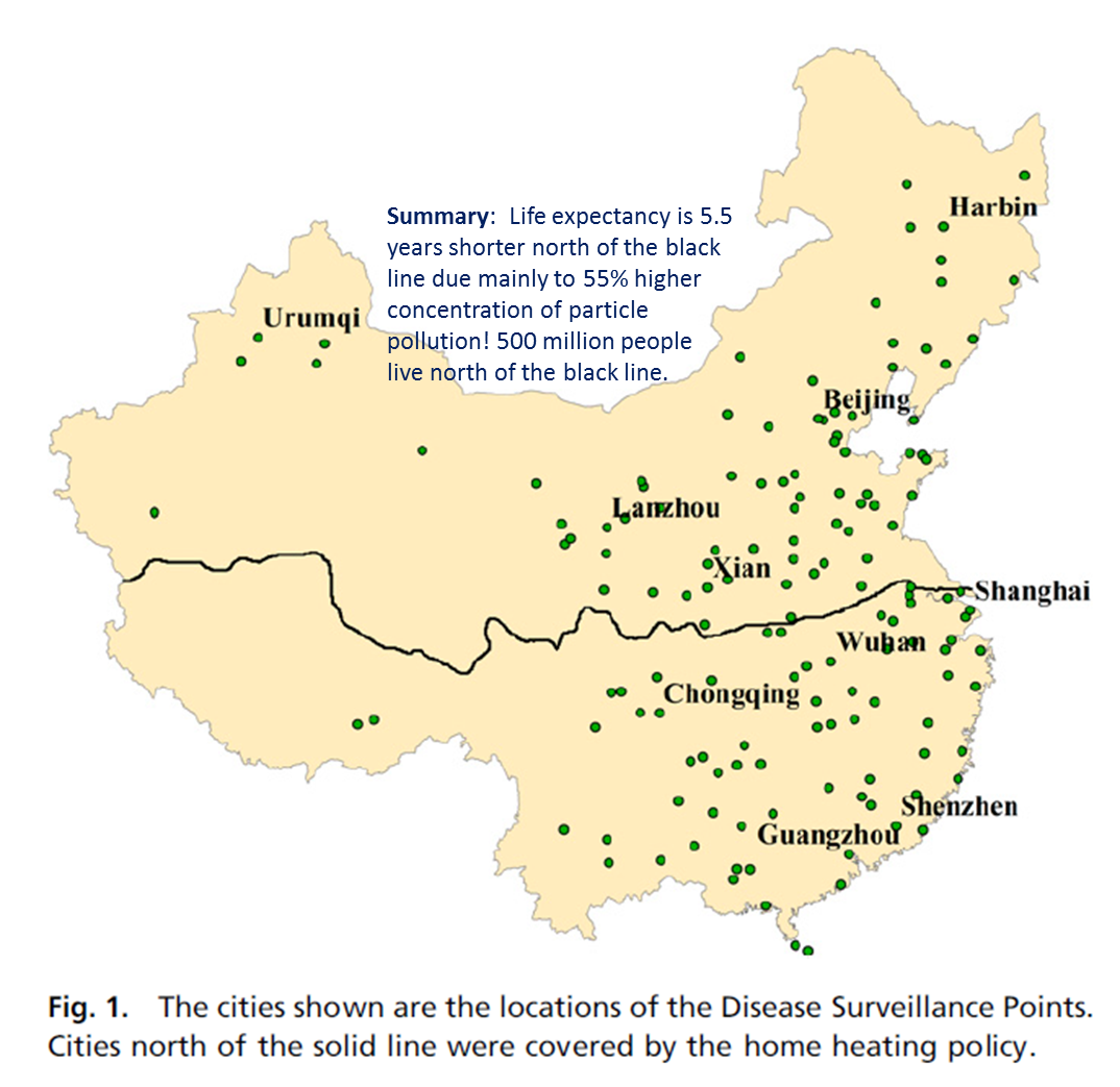
Researchers from China, Israel, and the USA just published what I would call a very important study that concludes that elevated particle pollution in Northern China compared to Southern China has reduced life expectancy by 5.5 years. They took advantage of a dataset that emerged as a result of a Chinese policy employed from 1950-1980 that provided free coal for heating for everyone living north of the Huai River that runs right through the center of China and shown as the black line in the figure below.

This is Figure 1 from the Chen et al. (2013) study published in PNAS.  The PDF of their work is available for free - open access - by clicking on the figure.  The annotation is my own summary of the key finding.

This is Figure 1 from the Chen et al. (2013) study published in PNAS. The PDF of their work is available for free by clicking on the figure. The annotation is my own summary of the key finding.

What they found was that particle pollution concentrations were 55% higher in Northern China due to the availability of free coal. This strong and significant difference between the north and south as a result of the Huai River policy (as the researchers call it) set up an experimental control scenario on a large enough scale (population wise) that the statistics were robust. The statistical model combined the particle concentration difference with proximity to the Huai River, detailed mortality statistics from a program in China called the Disease Surveillance Points (DSPs), and a number of other possible factors that may influence mortality to prove with high confidence that their results were robust. The life expectancy of the Chinese citizens north of the Huai River (which includes Beijing, Lanzhou, and Xian) is on average 5.5 years less than those of citizens living south of the Huai River. The decrease in life expectancy, the research shows, was almost entirely attributable to the 55% increase in particle pollution concentrations. The paper is worth reading, especially given the current state of Chinese air quality referred to above.

*I mentioned the effect of smoke from agricultural fires on Beijing particulate matter (PM2.5) concentrations, and there has been a lot of internet discussion of the US Embassy twitter feeds documenting PM2.5 concentrations in now 5 major urban centers of China that are geographically distributed from Shenyang in the Northeast to Beijing and Shanghai in the East, and Chengdu in central China, and finally in the south in the city of Guangzhou which is north of Hong Kong. PM2.5 refers to the mass concentration of particles with diameters less than 2.5 micrometers or 0.0000025 meters and is without a doubt the most devastating form of particulate matter air pollution for the human body. This stems from the simple idea that smaller particles can be inhaled more deeply into the respiratory system. Smaller? Smaller than what? Well, other categories of PM also exist. PM10 refers to mass concentrations of particles with diameters less than 10 micrometers, or 10 millionths of a meter or 0.000010 meters. Still very small. Then there is the less precise category of total suspended particles (TSP) which presumbably includes some fraction of particles greater than 10 micrometers in diameter while also including the mass of the smaller particles. Typically, PM10 and TSP are closely related because particles larger than 10 micrometers tend to fall out of the atmosphere much more quickly. Regardless of the PM (PM2.5, PM10, TSP), they are all bad.

Beijing air quality and agricultural fires

As I browsed through my favorite twitter feeds which includes @BeijingAir and the other US Embassies, I saw there was some really really poor air quality in Beijing. The US Embassies in China tweet particulate matter 2.5 (PM2.5) concentrations in the atmosphere on an hourly basis and also provide 24 hour average PM2.5 per the (USA) EPA regulatory methods. Namely, 24 hour PM2.5 is what’s regulated by the EPA in our country, and since US Embassies are US territory (as I understand it from The Simpsons Bart vs Australia episode), then US-relevant metrics are tweeted in addition to the hourly data. I tweeted about the very poor air quality in Beijing today

and

The second tweet was an tribute to an Onion article saying something like EPA tells people to stop breathing but I couldn’t find a link. Ok. So after I sent out that 2nd tweet, I began to wonder: What the heck is going on in Beijing? PM2.5 is above 400 ug/m3* for hours on end during the day and the 24 hour average PM2.5 just got tweeted as nearly 300 ug/m3. This is extremely hazardous, both on the EPA scale of Air Quality Index (AQI) and on the scale of I-Cannot-Breathe-Long-Enough-To-Finish-This-Sente… (no link to that scale). As the title of the post implies, the answer is related to burning practices – and I think it’s worth more that a couple of tweets. I’m asserting that the main problem is emissions from local/regional agricultural fires. This touches on my own research into fires and the peculiar human-influenced fire seasonality as a function of where you are in the world. Now, take it easy, I tell myself. Why? Every scientist loves to talk about science, but we especially love talking about our own research. I’ll try not to go on and on, is what I’m saying.

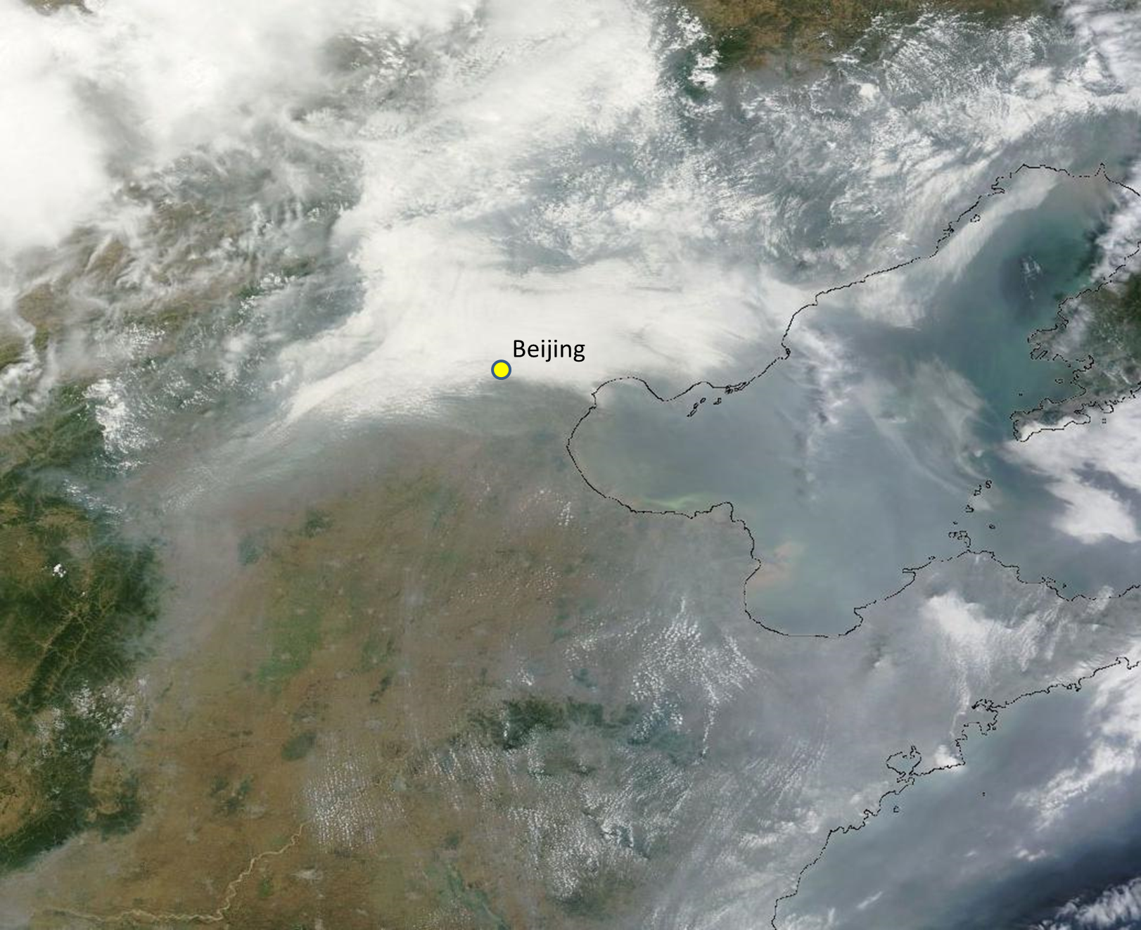
How can we do a first-order (read as “informal”) test of this hypothesis? First, let’s check satellites. There is some very accessible information from NASA that can be used to study problems that aren’t in the data-rich part of the world or in the parts of the world where I don’t even know what the characters are for “fire”. NASA has a satellite called Terra reporting data since November 2000. From this page, I googled the lat-lon of Beijing (40 N, 116 E) and created my own custom satellite image of Eastern China with the approximate location of Beijing marked.

Satellite image from MODIS sensor on the NASA Terra satellite for June 28 2013.  Beijing location is approximate.

Satellite image from MODIS sensor on the NASA Terra satellite for June 28 2013. Beijing location is approximate.

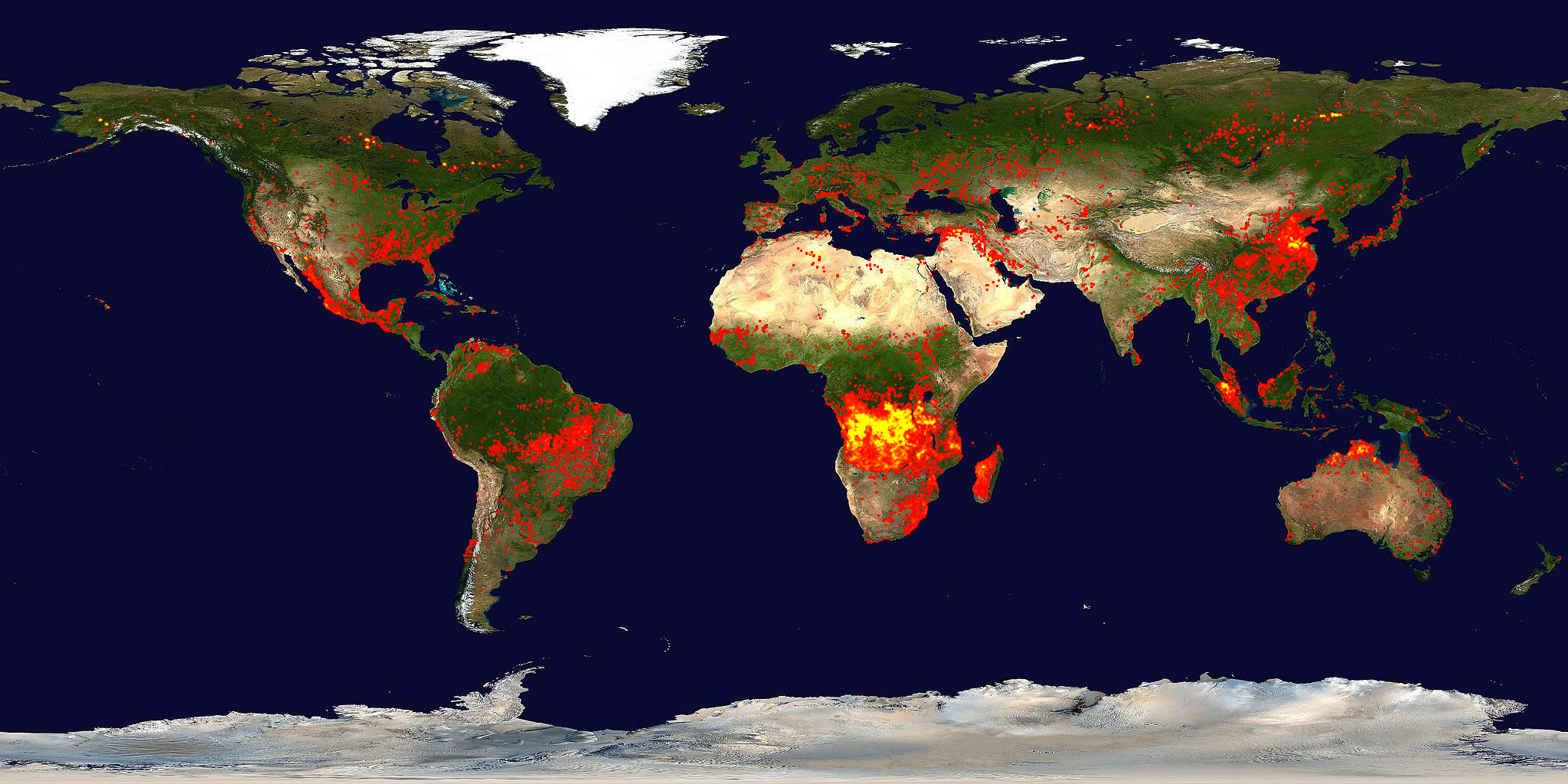
Right away, you see there are clouds. But there are also signs of gray-ish haze very similar to my research page header up at the top (smoke pouring off of southern Africa). So smoke is a distinct possibility. Now we can use data from the same NASA satellite (Terra) and same sensor (MODIS) but using a different wavelength of electromagnetic radiation. Namely, the parts that we feel/sense as heat – or thermal infrared radiation. Turns out, NASA has a whole team of scientists looking at this data and there is a data product called the Thermal Anomaly product. Something more “operational” (meaning it’s available at a semi-regular and rapidly updated way, like weather data is for weather forecasting models) for global fires is available at the same NASA website as I used to get the image above. Here’s the global view of fires
Global fire activity from the last 10 days ending on June 28 2013.

Global fire activity from the last 10 days ending on June 28 2013.

Clearly, fires are active in Eastern China – so we’re almost at the bottom of the mystery of why @BeijingAir is not the place for breathing deeply right now. You can download a map file showing fires from the last 48 hours for different regions by going to the KML tab and opening the KML file in Google Earth. I downloaded the “Russia and Asia” KML file and produced this
Active fires from the MODIS sensor on the NASA Terra for the 48 hours ending on June 28 2013.

Active fires from the MODIS sensor on the NASA Terra for the 48 hours ending on June 28 2013.

where you can see that my Google Earth has the Beijing Embassy location saved as a placemark. Regardless of the clouds, the pollution from the fires is certainly pouring into the atmosphere over Beijing and affecting surface air quality to the point that the AQI values are nearly off the scale again, but this time, it is not because of the combination of meteorology and emissions from fossil fuel consumption.

The winter and spring months – the months related to the very poor air quality referred to in the report above and here – are plagued by deep near surface temperature inversions that act to inhibit mixing. What does this mean? Well, if pollution is emitted from cars and factories in Beijing in the winter-spring, it will tend to stay in the first 500 meters (1800 ft) above the ground – roughly. The pollution gets trapped. On a day without a temperature inversion, the pollutants emitted are probably about the same, but mix into a much deeper atmosphere (say about 2000-3000 meters, or about 4-6 times deeper layer). The pollution is thus more dilute. I haven’t checked meteorology in the case of todays very poor air quality, but I suspect the effect of meteorology (even if mixing is deep and efficient) is overwhelmed by the emissions from all the fires southeast of Beijing.

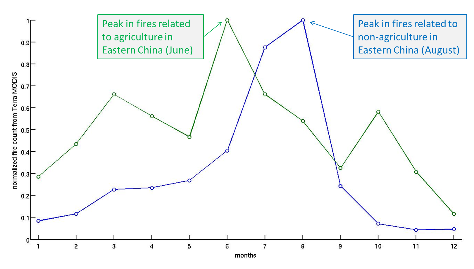
What kind of fires? Or why are they burning? Great question! Are these forest fires like the lightning-triggered fires plaguing the Western USA right now? No! When you mask out the Terra MODIS fire data in a way that you only look at data from land that is mostly cropland (agriculture) in Eastern China, then you find something related to our findings in the Biogeosciences paper.

Fire season for land that is mostly agriculture (cropland in Eastern China) and land that is mostly non-agriculture (forests, grasslands).  This is based on the average over 10 years of data from MODIS.  More analysis like this in the link to my paper below.

Fire season for land that is mostly agriculture (cropland in Eastern China) and land that is mostly non-agriculture (forests, grasslands). This is based on the average over 10 years of data from MODIS. The region considered is roughly Mongolia and China. Other parts of the world look much different – more analysis like this in the link to my paper below.

The figure above shows that while the land with a low fraction of cropland (less than 20%) tends to burn in July-August, the land with a high fraction of cropland (greater than 80%) tends to burn in (you guessed it) June-July. As the caption states, these “average” seasonalities are based on over 10 years of Terra MODIS fire observations. When you average 10+ years of Junes for the low and high fraction of cropland, you get the data point in month six for blue and green curves above. In other words, the fires are right on schedule, Eastern China! Hopefully for the citizens of Beijing, the burning will be short-lived and meteorology will transport the smoke away and dilute it down with clean air in the process.

All that being said, a full scientific analysis of the air quality requires much more than this post offers. Sensitivity, ground-based analysis, meteorological analysis, and actual counting of the fires among other things would be required to prove with a much higher degree of confidence that my hypothesis does not fail, but usually scientists make hypotheses because they observe an event/phenomenon that is consistent or inconsistent within some sort of framework. In this case, what I saw in China air quality was inconsistent with what I understood about the meteorology there (for this time of year) and consistent with the work I did with colleagues regarding fire seasonality.

*The unit of concentration for PM2.5 is micrograms per cubic meter which is often written as ug/m3 even though the “u” should be the Greek letter “mu” which itself means “micro” which is one millionth and “m3” should be “m” with a superscript “3” to indicate “cubed”)

Twitter and science

I’ve been starting to use twitter – mainly to supplement my research interests. I have zero confidence in facebook as a useful platform for anything remotely scientific or supportive of science, but twitter somehow seems different. The first twitter account I followed was @BeijingAir early this calendar year as reports of ridiculously bad air quality emerged yet again. I was quickly impressed by this informal but rigorous reporting of hourly (!) air quality relevant metrics such as particulate matter (PM2.5) concentrations.twitter-scienceI even started to develop discussions around the US Embassy in Beijing twitter feed in my Atmospheric Chemistry class this past Spring semester, drawing comparisons between my published research from Africa (of essentially PM2.5) and the measurements reported @BeijingAir. I haven’t read my course reviews yet, so I don’t know whether my students liked these discussions or the problem sets that I made related to twitter. I liked it though because it was current and relevant in questions of applied atmospheric chemistry and thinking about our global society. The problems in our backyard are relevant, but I love to think that we as a global civilization can solve problems in a collective way. This philosophy is a natural fit with the concept of social media, and my opinion is that twitter is a better fit than other social media.

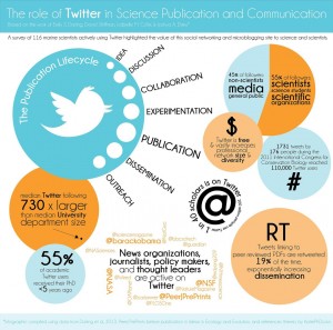
Then while I’m flipping through one of my various science digest emails over lunch one day, I see this article and realize that there is apparently a collective move of scientists to employing twitter as a serious way to connect. The figure above was posted in that article and you can click and see the higher resolution version. The analysis in that post resonates with how I’m thinking about twitter – namely it allows the science I do to have the potential to be much more relevant. Given that many undergraduates leave the university without even knowing what it is that an “assistant professor” does or what the difference is between an “assistant” and “associate” professor (or that the difference exists), I would say it is critical that the academy makes sure that the future minds walk away from their college degrees with some idea of what it is the professionals in front of the classroom or giving seminars are doing. Most of us assistant professors, for example, are not sitting around after classes stop for the summer drinking margeritas, but in all this surveying of people about climate change and global warming, I haven’t seen questions probing this awareness of what the academy is. Thin Ice actually touches on this topic in terms of what it is an Earth scientist does and why.

Which brings me back to twitter. The graphic above has the key points that I will watch for in twitter: 1. 45% of followers are non-scientists, media, general public, and 2. median twitter following is 730 times median department size. The other points are pretty darn good too! If you want to see what I’m tweeting, thinking, following, etc., visit my twitter feed @brianmagi. I’ll continue to sort through ideas and thoughts and announcements on my personal webpage and blog, but twitter will be great during the academic year when teaching takes a big chunk of my time.