Let’s Get Visual, Visual, I wanna get Visual
Let Me See Your Visuals Talk
Visuals Talk
Chapter 6: “Designing Illustrations”
Much of a technical communicator’s job is devoted to making documents consistent and user friendly. Let’s talk about an often-overlooked concept and misconstrued concept:
- User friendly documents
- User-centered documents
- System-centered documents
As a side note, ENGL 4182 “Information Design and Digital Publishing” devotes an entire semester to the topics of Information Design and Visual Rhetoric. I’ll see some of you in the fall.
Have you ever encountered the following “dialogue” box?

Visual Perception
I know it seems silly, but we actually perceive things based on light reflection and responses to visual stimuli. What we see is based on how our brains (through stimuli received by our eyes) interpret patterns of light. We distinguish colors, patterns, and entire objects through perceptions of light. While we could get very complicated in our discussions from biological perspectives, we won’t go that far.
Visual Culture
Being the cultural, social creatures that we are, much of our visual world is shaped by our experiences. I know some don’t like to hear this, but we are rarely able to free ourselves from the cultures into which we’re born. Even the choices you think you have are simply choices on a cultural menu, a group that’s socially constructed.
A former professor of mine told our class that people hate being told that their culture is based on societal constructions and has no connection to absolute truth: (paraphrased from memory) “cultural pride deals in absolute value or worth—they don’t want to hear it’s contextual” (Thomas Van).
But there’s good news about cultural constructions and perceptions. Because members of a culture share commons backgrounds and ideologies, designers can tap into that shared knowledge. You might not be conscious of it, but, when you use idioms, refer to Seinfeld episodes, and use language, you’re engaging in socially constructive activities.
Some topics for us:
- Visual cues
- Language conventions (visual language)
- Intercultural Communication
- Semiotics: how meaning is constructed or understood; signs and symbols for objects in the referential world
- Language and hegemony
- Ethics or “Why so many American flags in advertisements?”
Visual Rhetoric
Ok, I know what you’re thinking: Isn’t rhetoric just BS…empty political speech? While empty political speech is a definition of rhetoric, it’s too reductive a definition for enlightened college students such as yourselves. Rhetoric is much more involved than the unfortunate popular definition. For this class (and others) you should have a broader view of rhetoric. I like to define rhetoric as “what builds meaning into something.” That something can be an object, belief, event, or system, but, whatever it is, meaning is attached personally and culturally.
Take the following words for example: Communism and Feminism. Both have denotations and connotations. The denotative definitions (from the dictionary) are below.
- Communism: an economic system based on total equality and ownership of the means of production.
- Feminism: a philosophy recognizing and attempting to change women’s subordinate status in patriarchal society; a philosophy promoting the equality of all people.
Connotations are the feelings, allusions, and values a group (such as a culture) associates with certain words. Likewise, conscious and unconscious rhetoric describes what gives messages (even visual ones) their meaning–explicitly and implicitly.
Some topics for us:
- Ethos: presentation of one’s character or credibility.
- Pathos: appeal to emotions; evoking emotional responses.
- Logos: appeals to logic or facts in a message.
Fonts and Typefaces
There’s no need to go into serious detail on this subject, but I’d like to mention several conventions for typefaces:
- Be consistent
- Sans Serif is good for short readings—headings, short letters, titles
- Be consistent
- Serif is best for long readings—body text
- Be consistent
- Decorative font is normally cheesy unless it’s on a diploma
- Be consistent
- Bold, italics, underline,
strikethrough, 21st, H2O - Be consistent
- Make headings grammatically consistent (parallel)
Visuals
Hey, visuals are our friends. They do all kinds of stuff. In fact, we’re going to talk about what they do for your documents. Let’s focus on the visuals below. I’m going to call on one of you to answer the benefits or reasons to choose one of the following:
- Tables (p. 114-116)
- Column Graph (p. 118 & 121)
- Bar Graph (p. 119 & 120)
- Circle Graph aka. Pie Chart…yummy (p. 123)
- Line Graph (p. 124 & 125)
- Organizational Chart (p. 127)
- Flow Chart (p. 129 & 130)
- Project Chart (p. 133)
- Diagram/Illustration (p. 134 & 143)
- Pictures (p. 136 & 137)
- Infographic (p. 139)
What are some important aspects of visuals according to your reading? Also, discuss the reasons behind NOT using a particular visual for a particular representation. For instance, would you use a pie chart to show changes in temperature over time?
Book Exercise #4 on p. 146: “Teen Distracted Driver Data”
Ethics and Visuals
We’ll discuss this more when we cover ethics in technical communication, but, for now, take a look at the “Deceptive Illustration” on p. 120.
Other Visuals
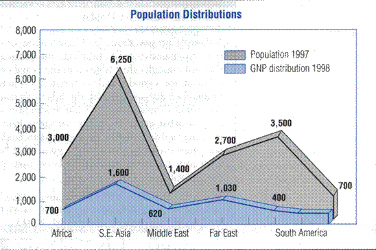
Take a look at the visual below. It’s a graph that was included in an old business writing textbook as a good example of an area graph. What do you think? What does the graph represent?

Most bizarre, huh? This “image” comes from the following Business Writing Textbook:
Murphy, Herta A., Herbert W. Hildebrant, and Jane P. Thomas. Effective Business Communication. 7th ed. Boston: McGraw-Hill, 1997: 575.